Build area charts with Kibana
Serverless Stack
Area charts are line charts with the area below the line filled in with a certain color or texture. Area charts work with numeric metrics over the horizontal axis (typically time) and are ideal to display quantitative values over an interval or time period, to show trends for time series like traffic, CPU, revenue, or error rates.
You can create area charts in Kibana using Lens.
To build an area chart:
-
Access Lens
Lens is Kibana's main visualization editor. You can access it:
- From a dashboard: On the Dashboards page, open or create the dashboard where you want to add an area chart, then add a new visualization.
- From the Visualize library page by creating a new visualization.
-
Set the visualization to Area
New visualizations often start as Bar charts.
Using the Visualization type dropdown, select Area.
-
Define the data to show
Select the data view that contains your data.
Drag a time-based field to the Horizontal axis and numeric field to the Vertical axis. You can use aggregation functions like
Date histogramsandFilters, or create custom calculations with formulas.
Optionally, you can add more numeric fields to create additional series, or drag a categorical field to Break down to split the series.
-
Customize the chart to follow best practices
Tweak the appearance of the chart to your needs. Consider the following best practices:
- Choose the right stack mode
- Use Stacked to show contribution to a whole, Percentage for normalized share, or Unstacked when absolute trends matter more than composition.
- Handle gaps and noise
- For sparse data, configure Missing values and Line interpolation to avoid misleading gaps or sharp edges. See Visualization appearance options.
- Use color purposefully
- Apply colors to highlight important data or patterns. Avoid using too many colors that might distract from the data. You can also assign consistent colors to key categories.
- Label clearly
- Provide a descriptive title and axis labels so users can interpret trends quickly.
Refer to Area chart settings to find all configuration options for your area chart.
-
Save the chart
- If you accessed Lens from a dashboard, select Save and return to save the visualization and add it to that dashboard, or select Save to library to add the visualization to the Visualize library and reuse it later.
- If you accessed Lens from the Visualize library, select Save. A menu opens and offers you to add the visualization to a dashboard and to the Visualize library.
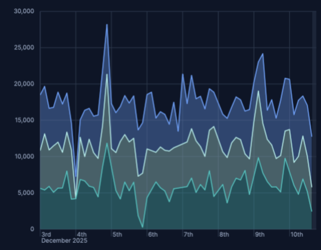
Use stacking to show how categories contribute to a total over time.
Create an area chart with a time-based Horizontal axis.
Break down the series by a categorical field, for example,
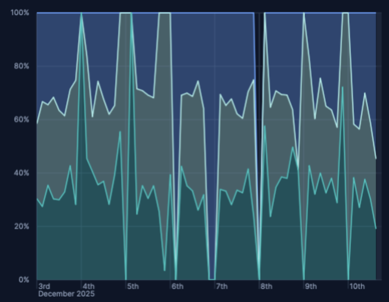
agent.keyword,response.keyword. You can set the area chart stack mode to:Stacked — Show cumulative totals and category contributions.
Percentage (100%) — Normalizes each timestamp to 100% to emphasize shares rather than magnitudes.
Optionally, set Rank by for the breakdown dimension to control stacking order.
In Area charts, you can enable time shift to compare different periods and identify deltas.
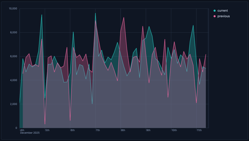
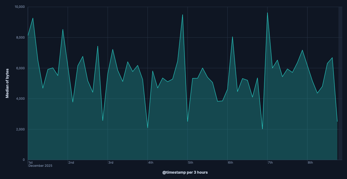
- Create an area chart with a time-based Horizontal axis and your main metric on the Vertical axis, for example,
bytes. - From the three-dot menu in the upper-left of the layer panel, select Duplicate layer.
- From the duplicated layer, open the Advanced of the Vertical axis and set Time shift to
1w. Check also Compare differences over time for more details. - Use a different color and set Stacking to None so areas overlay rather than stack.
- Update the legend to show “Current” and “Previous”.
You can also compute the relative change using a formula, for example:
(average(bytes) - average(bytes, shift='1w')) / average(bytes, shift='1w')
Customize your area chart to match the information you need and how you want it displayed.
- Data
- Functions: Allow you to group your data. For example, you can use
Date histogramto group data points into time-based buckets, orFiltersto divide values into predefined subsets. - Fields: Determine which field from your data will be used for the horizontal axis.
- Minimum interval: Determine the smallest time bucket that your data will be grouped into (for example, seconds, minutes, hours, days).
- Appearance
- Name: By default, the chart uses the function or formula as title. It's a best practice to customize this with a meaningful title.
- Data
-
To represent the metrics or values you want to visualize, you can use quick functions like
Average,Count,Percentile,Counter rate, or create custom calculations with formulas. Refer to Lens > Use formulas to perform math for examples, or to the Formula reference available from Lens.Advanced settingsDepending on the data you defined, you can use the following options to apply additional filtering:
- Filter by: Specify a query.
- Time shift: Compare current data with historical data by shifting the time frame of your metrics.
- Appearance
-
Configure series-level options, including:
- Name: Customize the series label.
- Value format: Control how numeric values are displayed on your vertical axis and in tooltips.
- Series color: Determine the color of your data series in the visualization.
- Axis side: Determine which side of the chart the vertical axis appears on.
You can optionally split your series by a categorical field to create multiple stacked or overlapping areas.
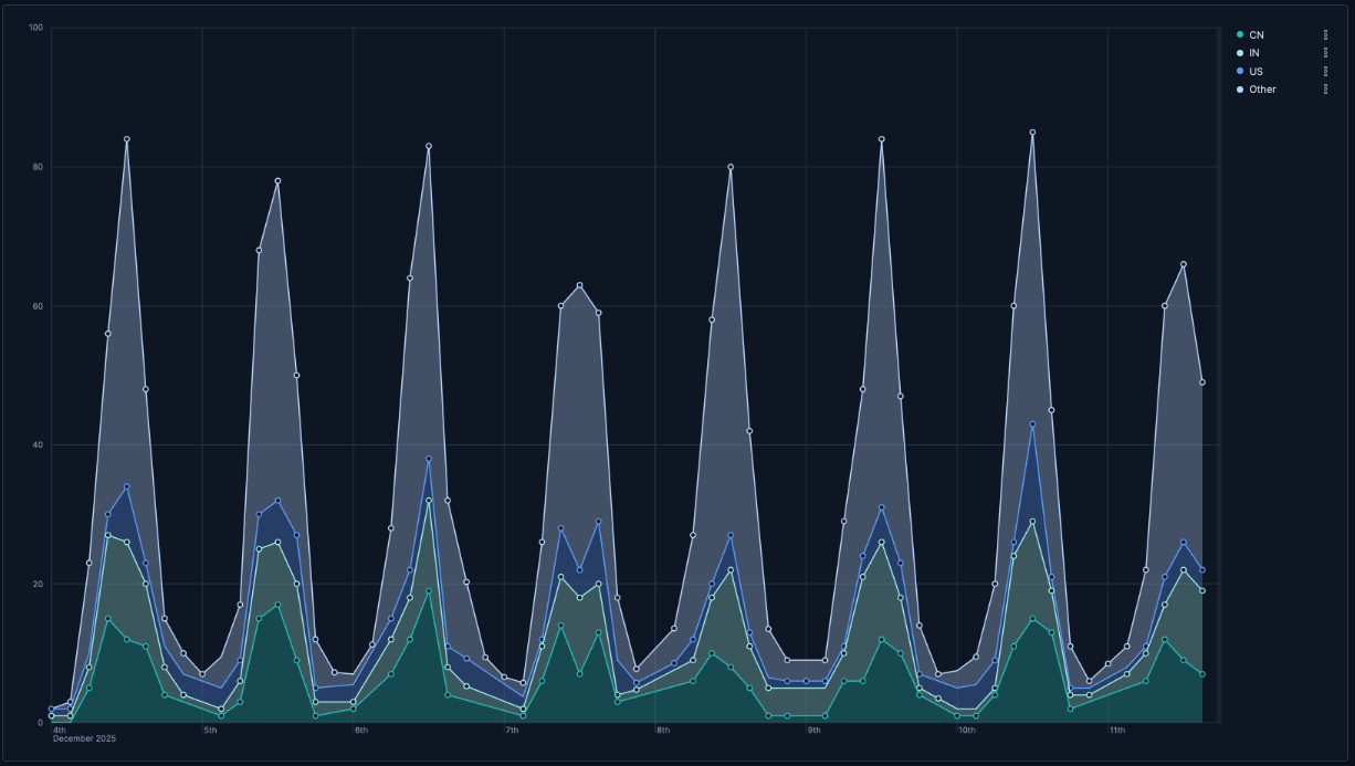
- Traffic by geographic region
-
Visualizing which geographic regions generate the most traffic:
- Horizontal axis:
@timestamp(Date histogram) - Vertical axis:
records - Breakdown:
geo.dest
- Horizontal axis:
- Response code over time with annotations
-
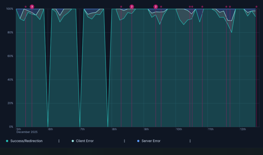
Visualizing HTTP response codes over time, highlighting the proportion of success, client error, and server error responses, with annotations for key events:
- Horizontal axis:
@timestamp(Date histogram) - Vertical axis:
Count of records - Breakdown:
- Success/Redirection
response.keyword >= 200 and response.keyword < 400 - Client Error
response.keyword >= 400 and response.keyword < 500 - Server Error
response.keyword >= 500 - Stacking:
Percentageto show the distribution relative to the total count at each point in time. - Annotation Query:
tags:error AND tags:security
- Horizontal axis:
