Build line charts with Kibana
Serverless Stack
Line charts are ideal for visualizing how metrics evolve over time, spotting seasonal patterns, and detecting spikes or regressions at a glance. Use them for KPIs like response time, error rate, throughput, or utilization, and compare multiple series or previous periods on the same chart. You can create line charts from any numeric data using aggregations (for example, Average, Percentile, Counter rate) or with custom formulas.
You can create line charts in Kibana using Lens.
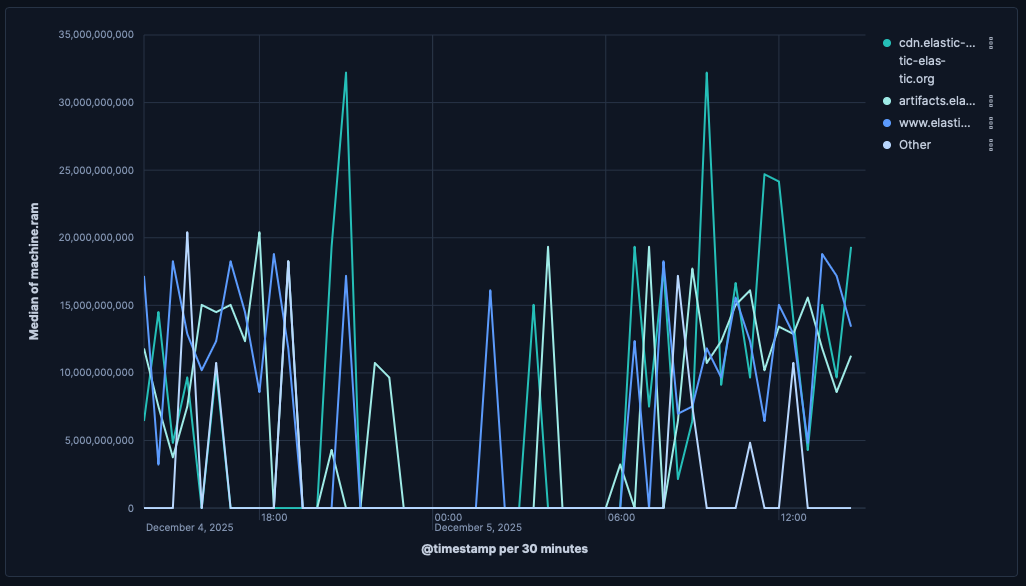
To build a line chart:
-
Access Lens
Lens is Kibana's main visualization editor. You can access it:
- From a dashboard: On the Dashboards page, open or create the dashboard where you want to add a line chart, then add a new visualization.
- From the Visualize library page by creating a new visualization.
-
Set the visualization to Line
New visualizations default to Bar.
Using the visualization type dropdown, select Line.
-
Define the data to show
- Select the data view that contains your data.
- Drag a time field to the Horizontal axis and a numeric field to the Vertical axis. Kibana automatically selects an appropriate aggregation function compatible with the selected field.
Optionally:
- Add more numeric fields to create additional series, or drag a categorical field to Break down by to split the series.
- Add a reference line to mark targets or SLOs.
-
Customize the chart to follow best practices
You can tweak the appearance of your chart by adjusting axes, legends, and series styles from the chart settings. Consider the following best practices:
- Use color wisely
- Assign colors that match your users' expectations and consider your specific context.
- Provide context
- Add descriptive axis titles or remove them for obvious axes.
For layout, hierarchy, and color guidance on dashboards, check the EUI’s Dashboard good practices. For more chart configuration options, go to the Line chart settings section.
-
Save the chart
- If you accessed Lens from a dashboard, select Save and return to save the visualization and add it to that dashboard, or select Save to library to add the visualization to the Visualize library.
- If you accessed Lens from the Visualize library, select Save. The Save menu also lets you add the visualization to a dashboard and the Visualize library.
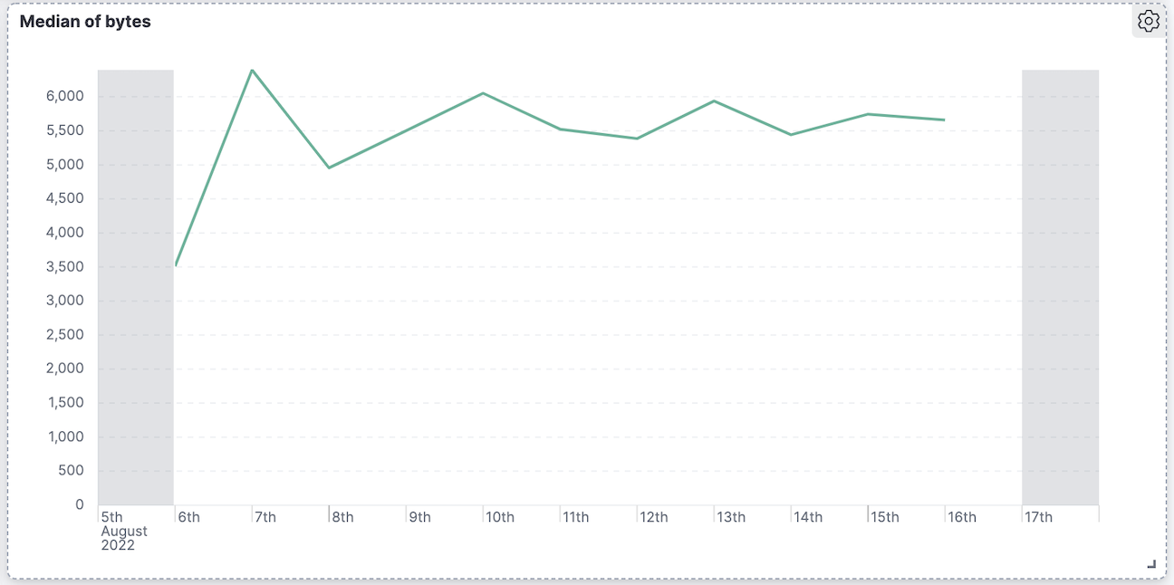
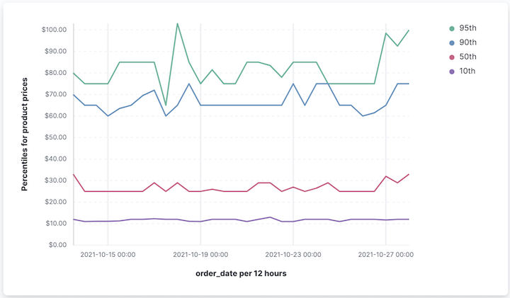
Compare the current value with a prior time range using time shift to quickly see deltas.
- Create a line series for the current value, for example:
average(response_time). - Add a second series with a time shift, for example:
average(response_time, shift='1w'). - Use the legend labels to clarify “Current” versus “Previous (1w)”.
| Single series | With previous period |
|---|---|
 |
 |
You can also compute the relative change as a separate series using a formula, for example:
(average(response_time) - average(response_time, shift='1w')) / average(response_time, shift='1w')
Use reference lines to indicate SLOs or alert thresholds.
- In the chart settings, add a Reference line (for example,
200ms or0.95). - Give it a label (for example,
TargetorSLO), choose a color, and optionally a band.
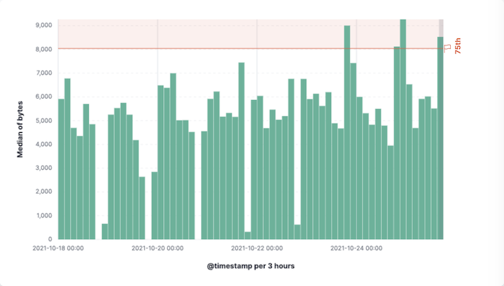
Customize your line chart to display exactly the information you need, formatted the way you want.
- Data
- Functions: Allow you to group your data. For example, you can use
Date histogramto group data points into time-based buckets, orIntervalsto group values along specific numeric ranges. - Fields: Determine which field from your data will be used for the horizontal axis.
- Number of values: Control how many distinct values or data points are displayed along the horizontal axis.
- Rank by: Choose which metric determines the order of your data.
- Rank direction: Sort values from highest to lowest.
- Appearance
- Name: By default, the chart uses the function or formula as title. It's a best practice to customize this with a meaningful title.
- Data
-
To represent the metrics or values you want to visualize, you can use quick functions like
Average,Count,Percentile,Counter rate, or create custom calculations with formulas. Refer to Lens > Use formulas to perform math for examples, or to the Formula reference available from Lens.Advanced settingsDepending on the data you defined, you can use the following options to apply additional filtering:
- Normalize by unit: Normalize the metric values to show per unit of time.
- Filter by: Specify a query that is going to be applied to the entire formula.
- Reduced time range: Reduce the time range specified in the global time filter from the end of the global time filter.
Appearance
- Name: Customize the legend label with a descriptive name.
- Value format: Control how numeric values are displayed on the vertical axis of your visualization.
- Series color: Select a palette or specific color per series.
- Axis side: Control where axis labels and tick marks appear.
The Breakdown bucket lets you compare trends across different categories within the same visualization.
When creating or editing a visualization, open the panel to adjust:
- Title and subtitle: Add context like “Last 24 hours”.
- Axes: Set titles, units, scale (linear/log/percentage), and grid lines.
- Legend: Position and truncation.
- Tooltip: Synchronized tooltips are enabled by default across panels on dashboards.
- Website response time (p95) with target
- Monitor user experience and enforce SLO:
Title: "Response time (p95)"
- X-axis:
Date histogramon@timestamp - Y-axis:
percentile(response_time, percentile=95)- Format:
Duration
- Format:
- Reference line:
200ms labeledSLO

- X-axis:
- Requests throughput with moving average
- Smooth per-minute variation while preserving overall trend:
Title: "Requests per minute"
- X-axis:
Date histogram - Y-axis (raw):
counter_rate(requests) - Y-axis (smoothed):
moving_average(counter_rate(requests), window=5) - Legend: "Raw", "5-interval MA"

- X-axis:
- Error rate versus previous week
- Quickly assess regressions:
Title: "Error rate (now versus previous week)"
- X-axis:
Date histogram - Series A:
count(kql='response.code >= 500') / count()- Format:
Percent
- Format:
- Series B:
count(kql='response.code >= 500', shift='1w') / count(shift='1w')- Format:
Percent
- Format:
- Legend: "Current", "Previous (1w)"

- X-axis:
- Throughput by top countries
- Break down by top N categories:
Title: "Requests per minute by country"
- X-axis:
Date histogram - Y-axis:
counter_rate(requests) - Break down by:
geo.country- Number of values:
10 - Rank by:
Custom>Count>Records
- Number of values:

- X-axis: