Build bar charts with Kibana
Serverless Stack
Bar charts are one of the most versatile and widely used visualizations for comparing values across categories. They're perfect for showing distributions, rankings, and comparisons—making complex data understandable at a glance.
They work with any type of data: numeric values, counts, averages, or calculations. You can compare sales by region, track errors by service, analyze user engagement by feature, or rank products by revenue. Using bar charts, you can display data horizontally or vertically, stacked (to show part-to-whole relationships), or grouped (to compare multiple metrics side by side).
You can create bar charts in Kibana using Lens.

To build a bar chart:
-
Access Lens
Lens is Kibana's main visualization editor. You can access it:
- From a dashboard: On the Dashboards page, open or create the dashboard where you want to add a bar chart, then add a new visualization.
- From the Visualize library page by creating a new visualization.
-
Set the visualization to Bar
New visualizations default to creating Bar charts, so you don't need to change the chart type selection.
-
Define the data to show
Select the data view that contains your data.
Set the Horizontal axis (for vertical bar charts) or the Vertical axis (for horizontal bar charts) to define categories for your data. This is typically a dimension like a category field, date histogram, or terms aggregation. This setting creates the individual bars.
Set the Vertical axis (for vertical bar charts) or the Horizontal axis (for horizontal bar charts) to define the numerical values or quantities being measured. This metric determines the height or length of your bars.
Optionally:
- Add a Break down by dimension to split each bar into segments, creating stacked or grouped bar charts.
- Add multiple metrics to compare different measures side by side.
- Configure the axis settings to customize scale, labels, and gridlines.
Refer Build bar charts with Kibana > Bar chart settings for all data configuration options for your bar chart.
-
Customize the chart to follow best practices
Tweak the appearance of the chart to your needs. Consider the following best practices:
- Select appropriate orientation
- Use vertical bars for time-based data and horizontal bars when category labels are long or you have many categories to display.
- Use color strategically
- Apply colors to distinguish between categories or highlight important values. Use consistent color schemes across related dashboards.
- Keep it focused
- Avoid cluttering with too many bars or categories. If you have more than 10-15 categories, consider filtering to show top values or using a different visualization type.
- Label clearly
- Use descriptive axis labels and titles. Add value labels when exact numbers are important.
- Sort meaningfully
- Sort bars by value (ascending or descending) to make comparisons easier, or keep them in alphabetical/chronological order when the sequence matters.
Refer to Build bar charts with Kibana > Bar chart settings for a complete list of options.
-
Save the chart
- If you accessed Lens from a dashboard, select Save and return to save the visualization and add it to that dashboard, or select Save to library to add the visualization to the Visualize library and be able to add it to other dashboards later.
- If you accessed Lens from the Visualize library, select Save. A menu opens and offers you to add the visualization to a dashboard and to the Visualize library.
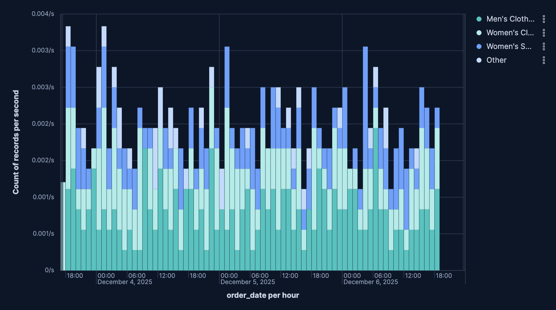
Stacked bar charts show how different components contribute to a total value. Each bar is divided into colored segments representing different categories, allowing you to view both the total and the breakdown.
Stacked bar charts work best when:
- You want to show part-to-whole relationships
- The total value is meaningful
- You have 2-7 segments per bar (more becomes hard to read)
- The segments don't vary wildly in size
To create a stacked bar chart:
- Create a Bar visualization with your metric on the vertical axis.
- Add a dimension to the horizontal axis (this creates your bars).
- Add a second dimension to Break down by. This splits each bar into stacked segments.
- In the chart settings, ensure Stacked is selected under the layout options.

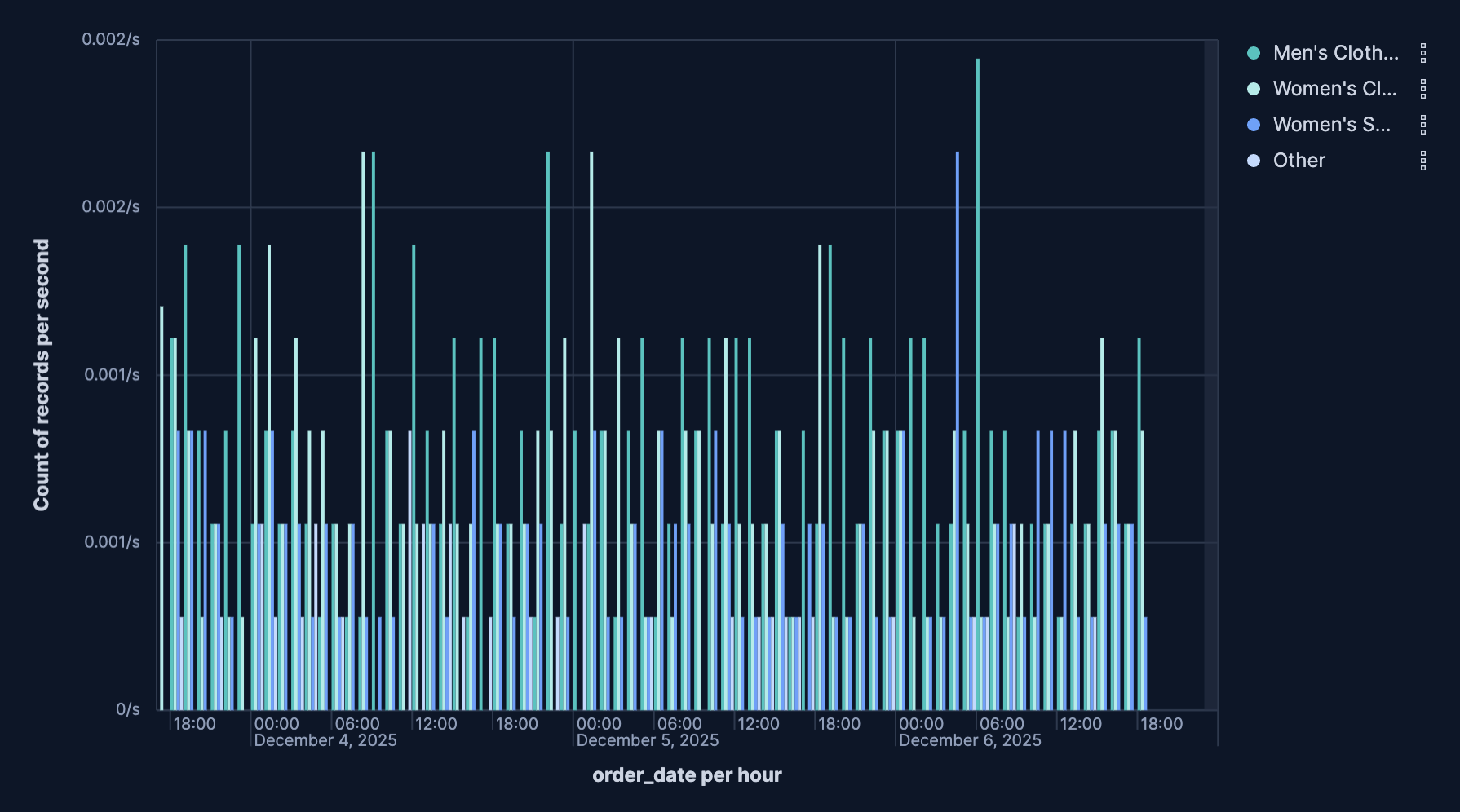
Unstacked bar charts display multiple bars side by side for each category, allowing you to compare different metrics or time periods.
Use unstacked bar charts when:
- You need to compare 2-4 metrics across categories
- Direct comparison between metrics is more important than viewing totals
- The metrics have similar scales
To create an unstacked bar chart:
- Create a Bar chart visualization with your first metric on the vertical axis.
- Add a dimension to the horizontal axis.
- Add a second dimension to Break down by. This splits each bar into grouped segments.
- In the chart settings, select Unstacked under the layout options.

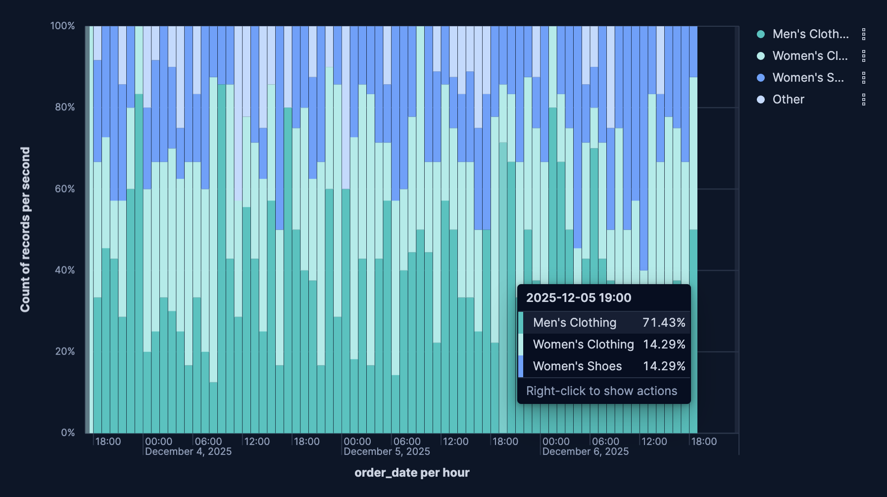
Percentage mode converts your bar values to percentages of the total, allowing you to compare proportions even when absolute values differ greatly.
Use percentage mode when:
- Relative proportions matter more than absolute values
- You're comparing composition across categories with different totals
- Showing market share, demographic breakdown, or category distribution
To enable percentage mode:
- Create a stacked bar chart and breakdown the data.
- In the chart settings, select Percentage under the layout options.
Each bar now shows segments as percentages of that bar's total (summing to 100%).

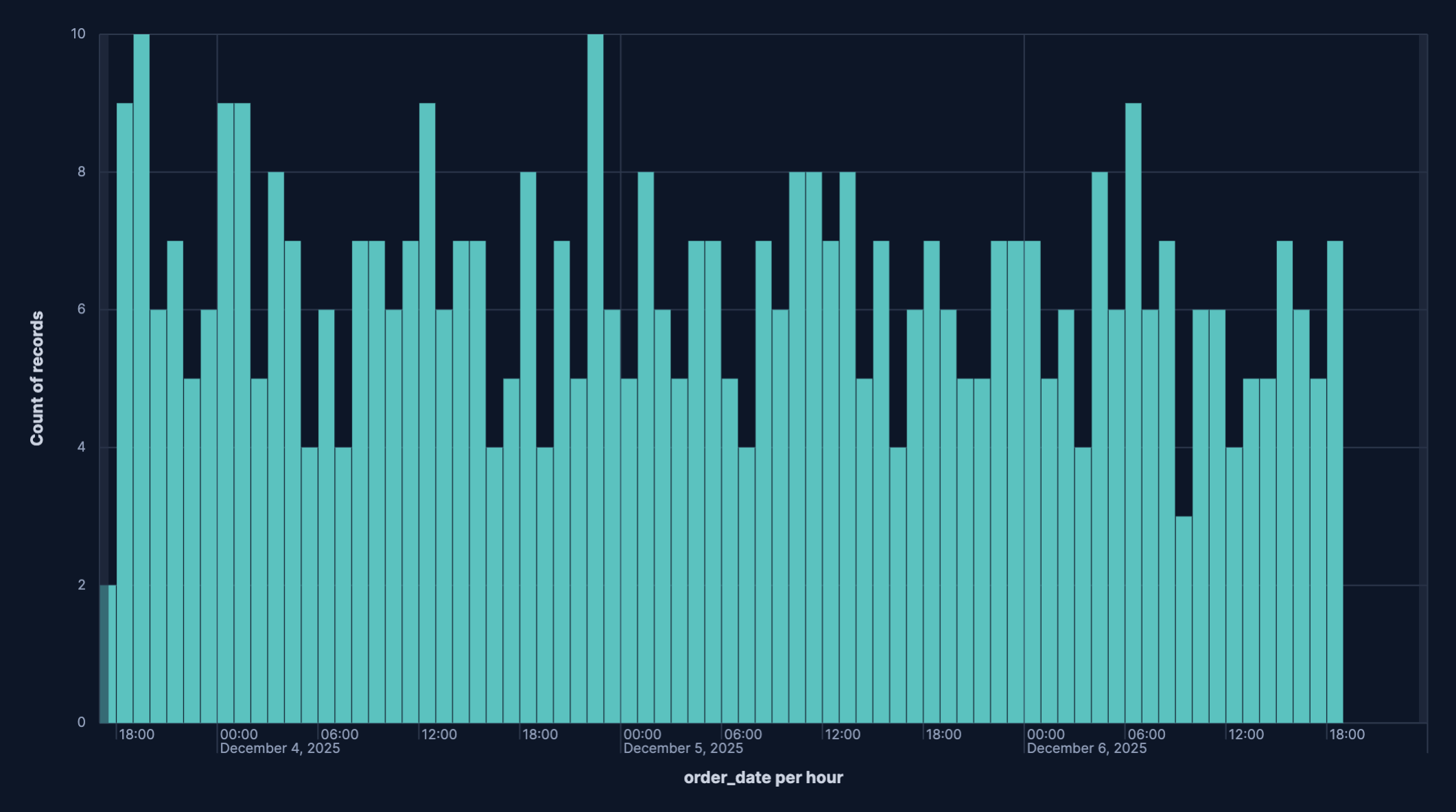
Bar charts excel at showing trends over time when you need to compare specific time periods or view the distribution of values.
Time-based bar charts are great for:
- Comparing values across discrete time periods
- Showing seasonal patterns or cyclical trends
- Highlighting specific days, weeks, or months
- When the exact values for each period matter
For continuous trends, consider using a line chart instead.
To create a time-based bar chart:
- Create a Bar chart visualization.
- Set the Vertical axis to your metric (like count, sum, or average).
- Set the Horizontal axis to a date field using the Date histogram function.
- Configure the minimal time interval (auto, millisecond, second, minute, hour, day, week, month, year).
- Optionally add a Break down by dimension to split each bar into segments, creating stacked bar charts.
Reference lines help viewers understand context by showing thresholds, goals, or averages directly on your bar chart.
Reference line are great for:
- Showing sales targets, SLA thresholds, or performance benchmarks
- Displaying mean or median values for comparison
- Indicating maximum capacity or acceptable ranges
To add a reference line:
- Create a Bar chart visualization.
- Click Add layer, select the Reference lines layer type, then select the data view.
- (Optional) Configure the vertical left axis. By default, Static value is selected and a reference line is placed at a fixed coordinate on the chart’s vertical left axis. You can also configure the Reference line value, which sets the numeric position of the x-axis line. To have the value computed instead, select Quick function or Formula.
- Configure the reference line's appearance:
- Name: The name of the reference line.
- Value format: Controls how any label for the line is displayed (default formatting or other available numeric/date formats).
- Text decoration: Selects whether the label shows nothing or the line’s name.
- Icon decoration: Allows adding an icon next to the label.
- Line: Sets stroke width (1 px) plus pattern (solid or dashed).
- Fill: Decides whether to shade the area above or below the reference line. None leaves the area unfilled.
- Color: Sets the line (and fill) color.
Serverless Stack
Annotations are a powerful way to add context to your visualizations by marking important events directly on your charts, helping viewers understand the relationship between your data and real-world events. They appear as vertical lines or bands across your visualization, making it easy to correlate data patterns with known events.
Annotations are great for:
- Marking deployment events
- Highlighting system maintenance windows
- Indicating configuration changes
- Marking business events that might impact metrics
To add an annotation:
- Create a Bar chart visualization.
- Click Add layer, then select the Annotations layer type. Create a new annotation or select an existing one from your library.
- For new annotations, select a data view. It can be any Elasticsearch index containing timestamp data.
- Click the newly-created annotation to edit it.
- Select the annotation's placement. It can be a static date that you choose or a based on a custom query. Choose a static date if you want to manually mark a specific point on the bar chart. Choose a query-based annotation to dynamically mark events based on data.
- Customize how the annotation appears:
- Name: The name of the annotation.
- Icon decoration: Allows adding an icon next to the label.
- Text decoration: Selects whether the label shows nothing or the annotation's name.
- Line: Sets stroke width (1 px) plus pattern (solid or dashed).
- Color: Sets the line color.
- Hide annotation: Hides or displays the annotation. By default, this setting is turned off and the annotation is displayed.
- Tooltip: Adds additional fields to the annotation label.
- Click Close to apply the configurations. Your bar chart will now display the annotations at the appropriate time points.
To edit existing annotations click on them in the annotations list. If you no longer need an annotation, you can delete it.
Customize your bar chart to display exactly the information you need, formatted the way you want.
- Data
-
The dimension that creates your individual bars. Common options include:
- Date histogram: Create time-based bars with configurable intervals.
- Filters: Define custom categories using KQL queries.
- Intervals: Group data into numerical ranges.
- Top values: Specify fields for which to gather top values.
- Appearance
-
Define the formatting of the horizontal axis, including:
- Name: Customize the axis label to describe what the bars represent.
- Value format: Select to display values as number, percent, bytes, bits, duration, or with a custom format.
- Data
-
The metric that determines the height of your bars. When you drag a field onto the vertical axis, Kibana suggests a function based on the field type. You can change it and use aggregation functions like
Sum,Average,Count,Median,Min,Max, and more, or create custom calculations with formulas. Refer to Lens > Use formulas to perform math for examples, or to the Formula reference available from Lens.Advanced settingsDepending on the data you defined, several options allow you to apply additional filtering to the data taken into account to compute the metric's value:
- Normalize by unit: Normalize the metric values to show per unit of time.
- Filter by: Specify a query.
- Reduced time range: Reduce the time range specified on the dashboard's time filter by the specified duration.
- Time shift: Shift the time range by the specified duration. This is useful if the value should use a different time range than the one selected on the dashboard.
- Hide zero values: Don't show values equal to zero. This option is on by default.
- Appearance
-
Define the formatting of the vertical axis, including:
- Name: By default, the chart uses the function or formula as the axis label. It's a best practice to customize this with a meaningful title.
- Value format: Select to display values as number, percent, bytes, bits, duration, or with a custom format.
- Series color: Assign a specific color to bars.
- Axis side: Choose to display the veritical axis on the left or right side of the graph. By default, the axis displays on the left.
- Data
-
Split your bars into segments or groups based on another dimension. Each unique value creates its own segment or bar, allowing you to show composition or compare metrics across multiple dimensions. Common options include:
- Date histogram: Create time-based bars with configurable intervals
- Filters: Define custom categories using KQL queries
- Intervals: Group data into numerical ranges
- Top values: Specify fields for which to gather top values
- Appearance
-
Define the formatting of the breakdown, including:
- Name: Customize the legend label.
- Value format: Select to display values as number, percent, bytes, bits, duration, or with a custom format.
- Color mapping: Select a color palette or assign specific colors to categories.
When creating or editing a visualization, you can customize several appearance options. Use the toolbar above the chart to access these settings.
- Appearance
- Select the bar chart orientation. It can be Horizontal or Vertical. Click the icon to access these settings.
- Titles and text
-
Specify to hide or show bar values on bar charts:
- Hide: Removes the numeric value from the bars entirely; only the bar height represents the magnitude.
- Show, if able: Attempts to draw the value inside each bar, but the label will only render when there’s enough vertical space to keep text legible; crowded bars will not have labels.
Your selection applies to the entire chart layer, so you can turn labels on for quick KPI-style charts or keep them off for dense histograms.
- Bottom axis
-
Bottom-axis controls for Lens bar charts let you tune how the horizontal scale looks and behaves. Key options are:
- Title: Set the label that appears under the axis (for example), “Date”); you can hide the label entirely if the layout is tight.
- Gridlines: Toggles vertical guide lines across the chart, which help compare bar positions against the axis scale.
- Tick labels: Show or hide the textual values beneath the ticks. When visible, the orientation picker lets you rotate them (horizontal, angled, vertical) to avoid overlap on dense timelines.
- Orientation: Set the placement of the bottom axis title. It can be Horizonta, Vertical, or Angled.
- Axis scale: Select linear (default), log, or square-root scaling. Even though this is the bottom axis, it matters for horizontal bar charts or numeric bucketed X-axes.
- Bounds & rounding: Manually clamp the axis to a min/max or let Lens round to nice intervals; for numeric histograms this also controls whether “nice” bucket labels are used.
- Left axis
-
Left-axis controls for Lens bar charts let you tune how the vertical scale looks and behaves. Key options are:
- Title: Set the label that appears under the axis (e.g., “Date”); you can hide the label entirely if the layout is tight.
- Gridlines: Toggles vertical guide lines across the chart, which help compare bar positions against the axis scale.
- Tick labels: Show or hide the textual values beneath the ticks. When visible, the orientation picker lets you rotate them (horizontal, angled, vertical) to avoid overlap on dense timelines.
- Orientation: Set the placement of the bottom axis title. It can be Horizonta, Vertical, or Angled.
- Partial data markers: Highlights buckets at the edges of the time range that only contain partial data—useful for time-based bar charts so viewers know the first/last bucket might be incomplete.
- Current time marker: Draws a vertical marker for “now” on time charts, so you can see how recent the latest bar is.
- Legend
-
Configure elements of your bar chart's legend. Configurable options include:
- Visiblity: Specify whether to automatically show the legend or hide it.
- Position: Choose to show the legend inside or outside the chart, then pick the side (left, right, top, or bottom) and fine-tune alignment (vertical/horizontal) for grid-style layouts.
- Width: Set the width of the legend.
- Statistics: Choose one or more statistic to show (for example, average, min, max, last value), Lens appends those numbers to every series label so you don’t have to hover over the chart to see headline figures.
- Label truncation: Choose whether to truncate long series labels, and set a limit for how many lines render when it's inside the chart.
The following examples show various configuration options that you can use for building impactful bar charts.
- Sales by product category
-
Display total sales broken down by product category to identify top performers:
- Title: "Total Sales by Product Category"
- Vertical axis:
sum(sales_amount)- Name: "Total Sales"
- Value format:
Currencywith$prefix - Sort by:
Valuein descending order
- Horizontal axis:
terms(product_category)- Name: "Product Category"
- Number of values:
10
- Layout: Basic (unstacked)
- Monthly website traffic by source
-
Track website visits over time, broken down by traffic source:
- Title: "Monthly Website Traffic by Source"
- Vertical axis:
count()- Name: "Page Views"
- Value format:
Number
- Horizontal axis:
date_histogram(timestamp, interval='1M')- Name: "Month"
- Break down by:
terms(traffic_source)- Number of values:
5 - Colors: Custom palette (Organic=green, Paid=blue, Social=purple, Direct=orange, Referral=teal)
- Number of values:
- Layout:
Stacked - Legend: Right side, showing traffic source
- Error rate by service (with threshold)
-
Monitor error rates across microservices with a target threshold line:
- Title: "Error Rate by Service"
- Vertical axis:
count(kql='log.level: "error"') / count() * 100- Name: "Error Rate %"
- Value format:
Percent - Color by value: Dynamic coloring (green below 1%, yellow 1-5%, red above 5%)
- Horizontal axis:
terms(service.name)- Name: "Service"
- Number of values:
15 - Sort by: Error rate descending
- Reference line: Value
5(5% threshold)- Label: "Maximum acceptable error rate"
- Color: Red, dashed line
- Layout: Horizontal orientation (for better service name readability)
- Resource usage comparison across regions
-
Compare CPU, memory, and disk usage across different geographic regions:
- Title: "Resource Usage by Region"
- Vertical axis: Multiple metrics:
average(cpu_usage_percent)- Name: "CPU %"average(memory_usage_percent)- Name: "Memory %"average(disk_usage_percent)- Name: "Disk %"- Value format:
Percent
- Horizontal axis:
terms(cloud.region)- Name: "Region"
- Number of values:
8
- Layout:
Clustered(side by side) - Colors: Different color for each metric
- Legend: Show at top with metric names
- E-commerce conversion funnel
-
Display conversion rates at each stage of the purchase funnel:
- Title: "Conversion Funnel - Homepage to Purchase"
- Vertical axis: Custom formulas for each stage:
count(kql='page.name: "homepage"')- 100%count(kql='page.name: "product"')- Product viewscount(kql='page.name: "cart"')- Add to cartcount(kql='event.type: "purchase"')- Purchases
- Horizontal axis:
filters()with custom labels:- "Homepage Visits"
- "Product Views"
- "Added to Cart"
- "Completed Purchase"
- Value format: Show both count and percentage
- Layout: Basic bars with gradient colors (green to blue)
- Sort: Keep in funnel order (not by value)
TipAdd value labels on bars showing both the count and the percentage drop-off from the previous stage to make conversion rates immediately visible.
- Customer satisfaction scores by department
-
Show average satisfaction ratings for different departments with target line:
- Title: "Customer Satisfaction by Department (Q4 2024)"
- Vertical axis:
average(satisfaction_score)- Name: "Average Rating"
- Value format:
Numberwith 1 decimal place - Axis bounds: Custom (0 to 5)
- Horizontal axis:
terms(department)- Name: "Department"
- Sort by: Alphabetical
- Break down by:
terms(satisfaction_category)with 3 values: "Promoter", "Passive", "Detractor" - Layout:
Percentage modeto show proportion of each rating category - Reference line: Value
4.0for target satisfaction score- Label: "Target"
- Color: Green, solid line
- Colors: Promoter=green, Passive=yellow, Detractor=red