Build tables with Kibana
Serverless Stack
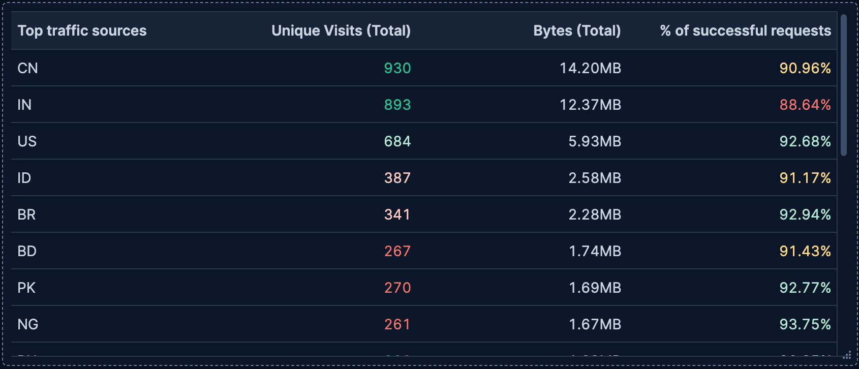
Tables are versatile visualizations that display your data in rows and columns, making them ideal for detailed data analysis and comparison. They're perfect for displaying multiple metrics side-by-side, showing individual records, or creating pivot tables that summarize data across different dimensions.
Tables work with any type of data: numeric values, strings, dates, and more. You can organize data using rows, add metrics to analyze, and optionally split metrics into separate columns to create pivot-style views. Tables offer extensive customization options including sorting, filtering, formatting, and coloring.
You can create tables in Kibana using Lens.

To build a table:
-
Access Lens
Lens is Kibana's main visualization editor. You can access it:
- From a dashboard: On the Dashboards page, open or create the dashboard where you want to add a table, then add a new visualization.
- From the Visualize library page by creating a new visualization.
-
Set the visualization to Table
New visualizations default to creating Bar charts.
Using the dropdown indicating Bar, select Table.
-
Define the data to show
- Select the data view that contains your data.
- Define your table structure by dragging fields defining functions for one or more of these dimensions:
- Metrics: The values to display in columns. You can use aggregation functions like
Sum,Average, andCount, or create custom calculations with formulas. - Rows (optional): Fields that create the rows of your table. Each unique value becomes a row. You can use functions like Top values, Date histogram, Intervals, or Filters to organize your rows. You can add multiple fields as rows to create hierarchical groupings and break down the data more granularly.
- Split metrics by (optional): Break metrics into separate columns based on a categorical field, creating a pivot table view.
- Metrics: The values to display in columns. You can use aggregation functions like
- Optionally, customize individual columns by clicking on any dimension in the layer pane to configure formatting, alignment, coloring, and more.
Refer to Build tables with Kibana > Table settings to find all configuration options for your table.
-
Customize the table to follow best practices
Tweak the appearance of the table to your needs. Consider the following best practices:
- Make it scannable
- Use consistent formatting and alignment. For example, you can right-align numbers for easier comparison, and left-align text for readability.
- Use color purposefully
- Apply color to values or cells to highlight important data or patterns. Avoid using too many colors that might distract from the data.
- Add context with summary rows
- Use summary rows to show totals, averages, or other aggregate values that help users understand the overall picture.
- Enable interactivity
- Turn on Directly filter on click to let users click on values to filter the dashboard or drill down into data.
- Control density
- Adjust table density based on your use case. Use Compact for fitting more rows, Expanded for better readability.
Refer to Build tables with Kibana > Table settings for a complete list of options.
-
Save the table
- If you accessed Lens from a dashboard, select Save and return to save the visualization and add it to that dashboard, or select Save to library to add the visualization to the Visualize library and be able to add it to other dashboards later.
- If you accessed Lens from the Visualize library, select Save. A menu opens and offers you to add the visualization to a dashboard and to the Visualize library.
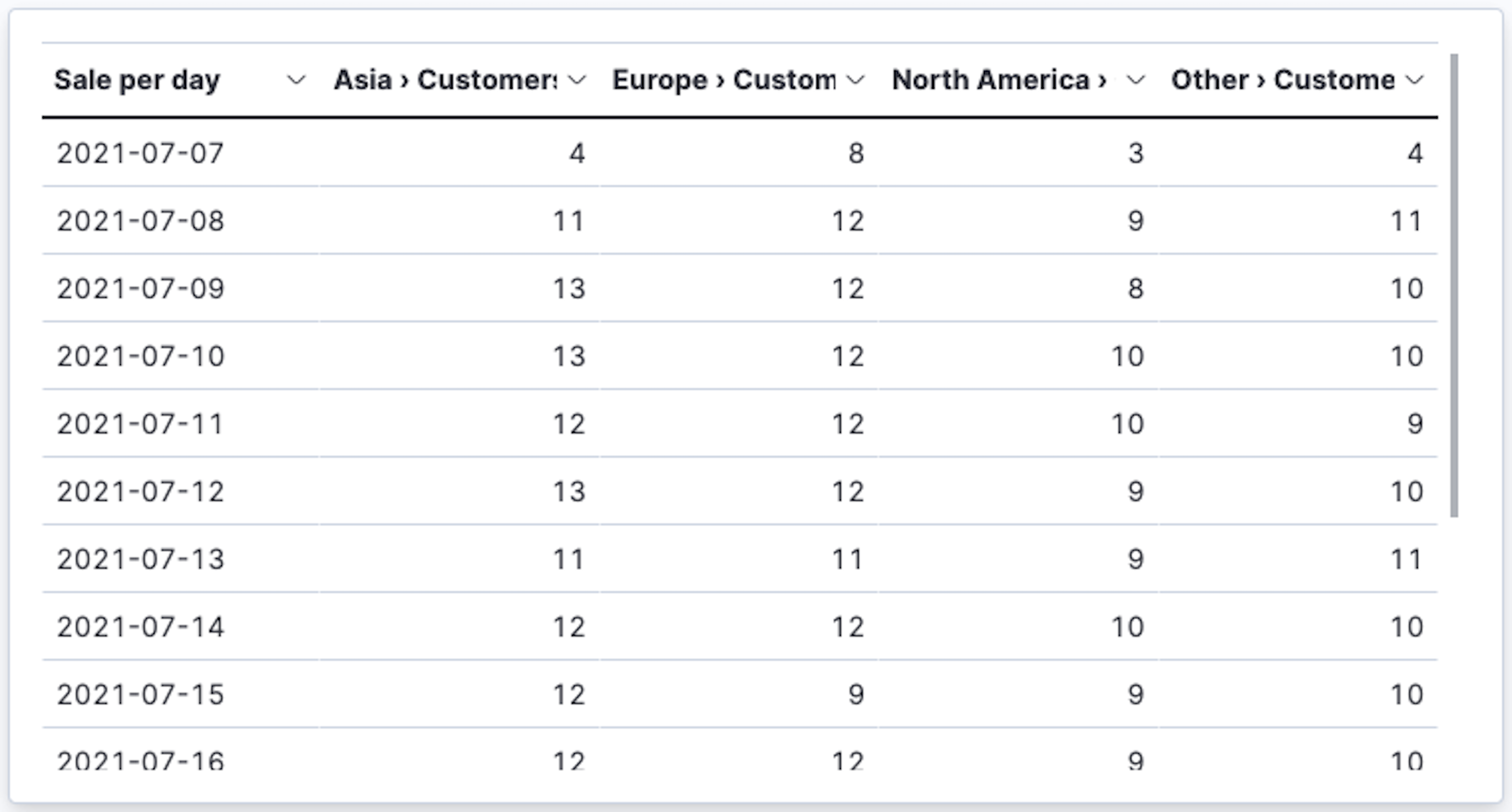
Tables can display data in a pivot-style format by using the Split metrics by dimension. This creates separate columns for each unique value of the split field, which is great for comparing metrics across different categories.
To create a pivot table:
- Create a Table visualization.
- Add a dimension to Rows.
- Add one or more metrics.
- Drag a categorical field to Split metrics by to create separate columns for each unique value.
For example, you could show visits per date in rows, split by continent in columns, with visit count as the metric. This creates a pivot table showing visit counts for each continent over time.
Refer to Analyze the data in a table for a detailed example.
Tables support Lens formulas, which lets you create calculated columns with custom logic. You can use formulas to:
- Calculate percentages or ratios between metrics
- Compare current values to time-shifted values
- Apply mathematical operations across multiple fields
- Create conditional calculations
To add a formula to a table:
- In the Metrics dimension, select Add a field.
- Select Formula from the function list.
- Enter your formula using the available functions and fields.
- Customize the column name and formatting.
Refer to Lens > Use formulas to perform math for formula examples and the Formula reference available from Lens.
Customize your table to display exactly the information you need, formatted the way you want.
- Value
-
The metrics to display in your table columns. When you drag a field onto the table, Kibana suggests a function based on the field type. You can change it and use aggregation functions like
Sum,Average,Count,Median, and more, or create custom calculations with formulas.Each metric becomes its own column in the table. If you use Split metrics by, each metric is further split into multiple columns.
Refer to Lens > Use formulas to perform math for examples, or to the Formula reference available from Lens.
Advanced settingsDepending on the data you defined, several options allow you to apply additional filtering to the data taken into account to compute the final value to show.
Based on the type of visualization you're creating, only some of the following options can be available:
- Normalize by unit: Normalize the metric values to show per unit of time.
- Filter by: Specify a query.
- Reduced time range: Reduce the time range specified on the dashboard's time filter by the specified duration.
- Time shift: Shift the time range by the specified duration. This is useful if the value should use a different time range than the one selected on the dashboard.
- Hide zero values: Don't show values equal to zero. This option is on by default.
- Appearance
-
Define the formatting and behavior of each metric column, including:
- Name: The column header label. By default, the chart uses the function or formula name. It's a best practice to customize this with a meaningful title.
Text alignment: Align the values in the column to the Left, Center, or Right.
Color by value: Apply colors to cell backgrounds or text based on values. Choose between:
- None: No coloring (default).
- Cell: Apply colors to the cell's background based on its value.
- Text: Apply colors to the cell's text based on its value. Define color ranges and rules to highlight important data patterns
Color mapping: Define the colors to apply to each cell of the column based on its value. Refer to Lens > Assign colors to terms for more details.
Hide column: Hide this column from the table display while keeping it available for sorting or other operations.
- Summary row: Add a row at the bottom of the table showing an aggregate value for this column. You can choose the aggregation function (
Sum,Average,Min,Max,Count) and customize the Summary label.
- Data
-
Define which fields create the rows of your table. Drag a field to the Rows dimension, and Kibana suggests an appropriate function based on the field type.
- Functions:
- Top values: Show the most common values of a categorical field. Configure the number of values to display, ranking criteria, and sort direction.
- Number of values: How many top values to display
- Rank by: Which metric to use for ranking
- Rank direction: Ascending or descending order
- Date histogram: Group data by time intervals. Configure the time interval and how to handle date formatting.
- Intervals: Create numeric ranges for continuous data. Useful for grouping numeric fields into buckets.
- Filters: Define custom KQL filters to create specific row groups. Each filter creates one row in the table.
- Top values: Show the most common values of a categorical field. Configure the number of values to display, ranking criteria, and sort direction.
- Collapse by: Aggregate rows that share the same value for this field into a single row, combining their metrics (for example, sum or average for each group). This is useful when you want to display a consolidated result for grouped values instead of individual rows.
Advanced settingsSeveral advanced options allow you to refine the behavior of the breakdown:
- Include documents without the selected field: Off by default.
- Group remaining values as "Other": On by default.
- Enable accuracy mode: This option improves results for high-cardinality data, but increases the load on the Elasticsearch cluster.
- Include values: Values from the breakdown dimension to always show a tile for.
- Exclude values: Values from the breakdown dimension to always exclude from the displayed tiles.
- Functions:
- Appearance
-
- Name: Customize the column header label for the row dimension.
Text alignment: Align the values in the column to the Left, Center, or Right.
Color by value: Apply colors to cell backgrounds or text based on values. Choose between:
- None: No coloring (default).
- Cell: Apply colors to the cell's background based on its value.
- Text: Apply colors to the cell's text based on its value. Define color ranges and rules to highlight important data patterns
Color mapping: Define the colors to apply to each cell of the column based on its value. Refer to Lens > Assign colors to terms for more details.
Hide column: Hide this column from the table display while keeping it available for sorting or other operations.
- Directly filter on click: Make the values in this column clickable, so clicking a value adds a filter to your visualization or dashboard for that value. This interactivity is helpful for quickly drilling down into data.
- Data
-
Optionally split your metrics into separate columns based on a categorical field. This creates a pivot table view where each unique value of the split field becomes its own column. This is useful for comparing the same metric across different categories side by side.
You can configure:
- Number of values: How many columns to create
- Rank by: Which metric determines the top values
- Rank direction: Sort order for selecting top values
Advanced settingsSeveral advanced options allow you to refine the behavior of the breakdown:
- Include documents without the selected field: Off by default.
- Group remaining values as "Other": On by default.
- Enable accuracy mode: This option improves results for high-cardinality data, but increases the load on the Elasticsearch cluster.
- Include values: Values from the breakdown dimension to always show a tile for.
- Exclude values: Values from the breakdown dimension to always exclude from the displayed tiles.
- Appearance
-
- Name: Customize the split dimension. This name is not used on the table.
Serverless Stack
When creating or editing a table visualization, you can customize several appearance options. To do that, look for the icon.
- Density Stack Serverless
-
Control how much space each row occupies. Choose between:
- Compact: Minimal spacing, fits more rows in less space
- Normal: Balanced spacing (default)
- Expanded: More generous spacing for improved readability
- Max header cell lines
- Set the maximum number of lines that column headers can span. When header text is longer than this setting, it is truncated with an ellipsis. Use
Autoto let Kibana determine the appropriate height, or set a specific number like1,2, or3. - Body cell lines
- Set the number of lines that body cells display. When cell content exceeds this limit, it is truncated with an ellipsis. Use
Autoto automatically adjust based on content, or set a specific number like1,2, or3for consistent row heights. Setting this to1creates more compact tables, while higher values allow more content to be visible. - Paginate table
-
Toggle pagination on or off. When enabled:
- The table displays a limited number of rows per page.
- Navigation controls appear at the bottom of the table when the table contains at least 10 items. By default, 10 rows appear per page. Users of the dashboard will be able to select a different number.
- This is helpful for tables with many rows to improve performance and readability.
When disabled, all rows appear in a scrollable view (up to the maximum returned by the query).
The following examples show various configuration options you can use for building effective tables.
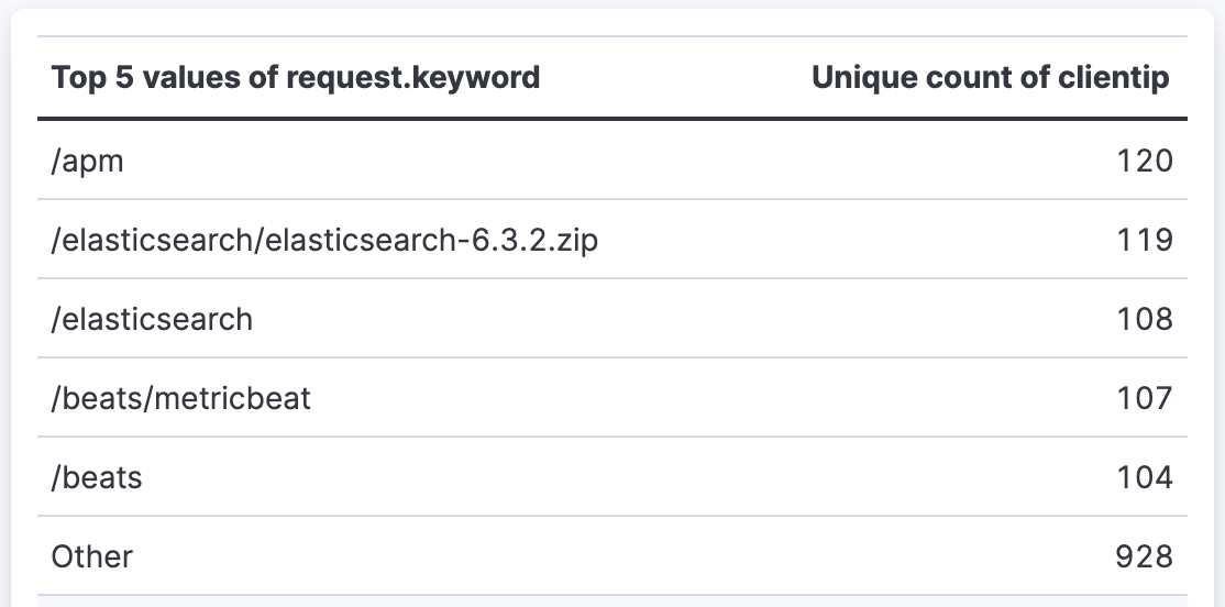
- Top pages by unique visitors
-
Display the most visited pages on your website with the number of unique visitors:
- Rows:
request.keywordfield using Top values function- Number of values:
5
- Number of values:
- Metrics:
clientipfield using Unique count function- Value format:
Number - Text alignment:
Right
- Value format:

- Rows:
- Sales by date and continent (pivot table)
-
Create a pivot table showing customer counts across different continents over time:
- Rows:
order_datefield using Date histogram function- Minimum interval:
1d - Name:
Sale per day
- Minimum interval:
- Metrics:
customer_idfield using Unique count function - Split metrics by:
geoip.continent_namefield using Top values set to3

- Rows:
- Document comparison with custom ranges
-
Compare metrics across custom-defined ranges:
- Rows:
bytesfield using Intervals function- Ranges:
0→10240, labeledBelow 10KB10240→+∞, labeledAbove 10KB
- Name:
File size
- Ranges:
- Metrics:
bytesfield using Sum function- Name:
Total bytes transferred - Value format:
Bytes - Text alignment:
Right
- Name:
- Additional styling:
- Color by value: Dynamic coloring to highlight ranges with higher byte transfers
- Rows:
- Weekly sales with percentage change
-
Show week-over-week sales trends with calculated percentage changes:
- Rows:
order_datefield using Date histogram function- Minimum interval:
1w - Name:
Week
- Minimum interval:
- Metrics (two columns):
Recordsusing Count function- Name:
Orders this week
- Name:
- Formula:
count() / count(shift='1w') - 1- Name:
Change from last week - Value format:
Percent, 2 decimals - Color by value: Dynamic (green for positive growth, red for negative)
- Text alignment:
Right
- Name:
- Rows: