Build metric charts with Kibana
Metric charts make important single values stand out on a dashboard. They're perfect for highlighting KPIs such as error rates or SLOs, and for making them understandable at a glance with dynamic coloring or trend indicators.
They work with any numeric data: plain numbers, percentages, or calculations like a count, sum, or average. You can get this numeric data from numeric fields stored in your Elasticsearch documents, or from aggregation functions and formulas that you can apply to any type of field.
You can also display strings by using the Last value aggregation function that picks up the last document, sorted by timestamp, in the current time frame.
You can create metric charts in Kibana using Lens.

To build a metric chart:
-
Access Lens
Lens is Kibana's main visualization editor. You can access it:
- From a dashboard: On the Dashboards page, open or create the dashboard where you want to add a metric chart, then add a new visualization.
- From the Visualize library page by creating a new visualization..
-
Set the visualization to Metric
New visualizations default to creating Bar charts.
Using the dropdown indicating Bar, select Metric.
-
Define the data to show
- Select the data view that contains your data.
- Define the Primary metric by dragging a field from the fields list to the chart. Kibana automatically selects an appropriate aggregation function like Sum, Average, or Count based on the field type. This is the only setting that your metric chart requires to display something.
- Optionally:
- Add a secondary metric. You can use this secondary metric as a comparison value or as a trend indicator to show how the primary metric evolves over time.
- Specify a maximum value.
- Break down the metric into multiple tiles based on another dimension.
Refer to Build metric charts with Kibana > Metric chart settings to find all data configuration options for your metric chart.
-
Customize the chart to follow best practices
Tweak the appearance of the chart to your needs. Consider the following best practices:
- Use color wisely
- Assign colors that match your users' expectations and consider your specific context.
- Format for readability
- Round to an appropriate precision. Showing 1.2M is clearer than 1,234,567.89 for high-level metrics, but use more precision when small changes matter.
- Provide context
- Use titles and subtitles to explain what the metric shows. "45,234" is a number, but "Active Users" as a title gives it meaning, and "Last 24 hours" as a subtitle makes it unambiguous.
Refer to Build metric charts with Kibana > Metric chart settings for a complete list of options.
-
Save the chart
- If you accessed Lens from a dashboard, select Save and return to save the visualization and add it to that dashboard, or select Save to library to add the visualization to the Visualize library and be able to add it to other dashboards later.
- If you accessed Lens from the Visualize library, select Save. A menu opens and offers you to add the visualization to a dashboard and to the Visualize library.
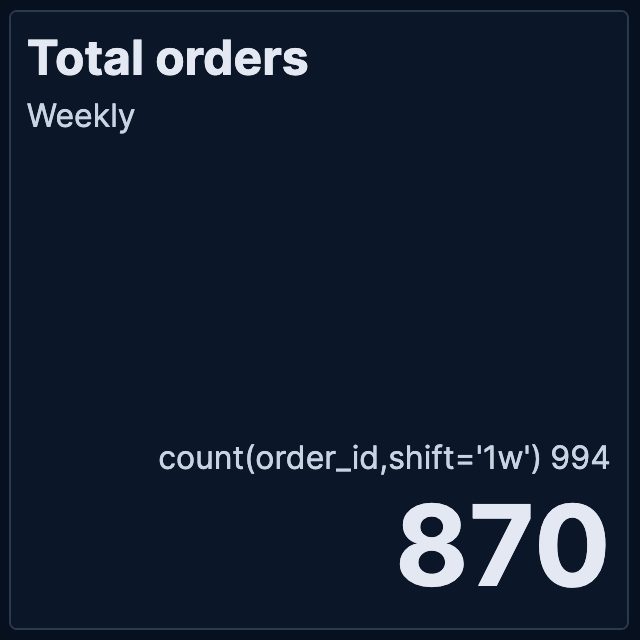
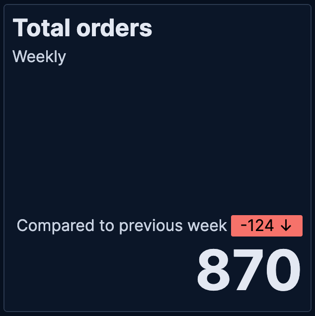
When creating Metric visualizations with numeric data, you can add trend indicators that compare your primary metric to a secondary value. This feature displays colored badges with directional arrows to help you quickly identify whether values are increasing, decreasing, or staying the same.
| Without trend | With trend |
|---|---|
 |
 |
To add trend indicators to your metric visualization:
Create a Metric visualization with a numeric primary metric.
Add a secondary metric that represents the comparison value.
TipUse the
shiftparameter in formulas to compare current values against historical data. For example, if your primary metric is counting orders (based on anorder_idfield) for the current week, you can use thecount(order_id, shift='1w')formula to compare this week's count of orders to last week's count.In the secondary metric configuration, look for the Color by value option. The possible choices are:
- None: No trend indicators (default)
- Static: Shows the secondary metric as a badge with a fixed color that you select
- Dynamic: Enables both color coding and directional icons based on the comparison
Select Dynamic coloring. More options appear.
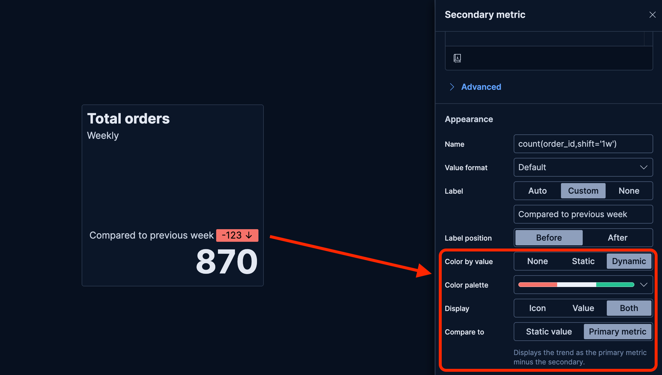
Choose a Color palette that matches how you'd like to represent the comparison.
Configure the Display option:
- Icon: Shows only directional arrows: ↑ for increase, ↓ for decrease, = for no change
- Value: Shows only the secondary metric value
- Both: Shows both the icon and value (default)
The secondary metric does not automatically compare with the primary metric. Define the value for Compare to:
Static value: Compares against a fixed baseline value that you specify
Primary metric: Compares the secondary metric directly against the primary metric by displaying the result of
Primary metric - Secondary metric. This option is only available when the primary metric is numeric.When you select this option, the secondary metric is automatically updated:
- The secondary metric label changes to Difference. You can edit this label.
- If you chose a Display option that shows a value, the secondary metric value is automatically updated to show the difference compared to the primary metric.
Apply your changes.
The metric visualization now shows the secondary metric as a comparison with a trend indicator.
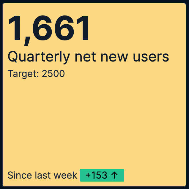
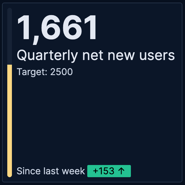
When creating Metric visualizations with numeric data, you can specify a maximum value to show progress toward a goal or capacity limit. When combined with the Bar background chart option, this displays a progress bar that visually represents how close your current metric is to reaching the maximum value.
| Without progress | With progress |
|---|---|
 |
 |
To add a progress bar to your metric visualization:
Create a Metric visualization with a numeric primary metric.
Optionally, customize the appearance of the metric. For example, add dynamic coloring to the primary metric to change colors based on progress: red when below 50%, yellow between 50-80%, and green above 80%. The progress bar will reflect this configuration once you set up a maximum value.
Add a maximum value that represents your goal or upper limit. The maximum value can be a static value, a function, or a formula based on your data.
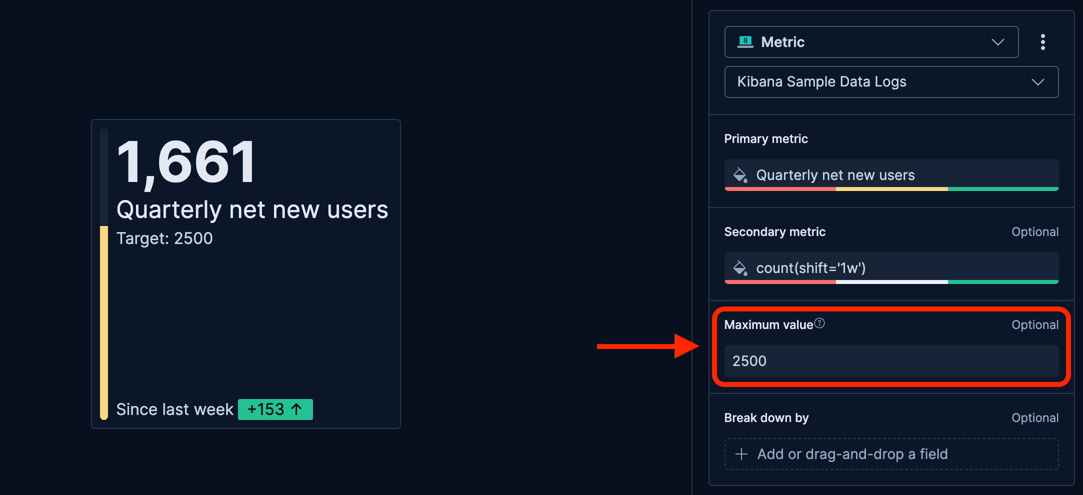
Configure the Primary metric appearance to show the progress bar. Depending on the configuration of the primary metric, Lens might automatically set this option for you. If not, complete these steps:
- In the primary metric configuration, set the Background chart to Bar.
- Optionally, change the orientation of the progress bar as needed.
Apply your changes.
The metric visualization now shows a progress bar indicating how close the current value is to the maximum.
You can combine progress bars with secondary metrics to show both progress toward a goal and trends over time. To do this, add both a maximum value and a secondary metric to your visualization.
Customize your metric chart to display exactly the information you need, formatted the way you want.
- Value
-
The main numeric value that appears prominently in your chart. When you drag a field onto the chart, Kibana suggests a function based on the field type. You can change it and use aggregation functions like
Sum,Average,Count,Median, and more, or create custom calculations with formulas. Refer to Lens > Use formulas to perform math for examples, or to the Formula reference available from Lens.Advanced settingsDepending on the data you defined, several options allow you to apply additional filtering to the data taken into account to compute the metric's value:
- Normalize by unit: Normalize the metric values to show per unit of time.
- Filter by: Specify a query.
- Reduced time range: Reduce the time range specified on the dashboard's time filter by the specified duration.
- Time shift: Shift the time range by the specified duration. This is useful if the value should use a different time range than the one selected on the dashboard.
- Hide zero values: Don't show values equal to zero. This option is on by default.
- Appearance
-
Define the formatting of the primary metric, including:
- Name: By default, the chart uses the function or formula as title. It's a best practice to customize this with a meaningful title.
- Value format: Choose to display the metric as number, percent, bytes, bits, duration, or with a custom format that you can define.
- Icon decoration: Add an icon to the top right corner of the chart.
- Background chart: Options include:
- None: Show a unified background.
- Line: Show a light line chart in the background.
- Bar: Show a progress bar that represents the current value of the chart measured against the Maximum value defined for the chart.
- Bar orientation: Options include Vertical and Horizontal.
- Color mode: Apply colors to the chart. Choose between Static for a unique color and Dynamic for using different colors based on the metric's value. By default, the color applies to the chart's background.
- Static: The color always remains the same and is independent from the metric's value.
- Select color: Pick a color and its opacity.
- Dynamic: Define colors to apply to the chart based on the value of the primary metric.
- Dynamic color mapping: Use the color palette to define custom color ranges.
- Static: The color always remains the same and is independent from the metric's value.
- Value
-
An optional additional value that provides context or enables comparisons. Common uses include:
- Time-shifted values to show trends (for example, last week's sales compared to this week)
- Different aggregations on the same data (for example, showing both average and median response times)
- Related metrics for context (for example, showing total count alongside an average)
Advanced settingsDepending on the data you defined, several options allow you to apply additional filtering to the data taken into account to compute the metric's value:
- Normalize by unit: Normalize the metric values to show per unit of time.
- Filter by: Specify a query.
- Reduced time range: Reduce the time range specified on the dashboard's time filter by the specified duration.
- Time shift: Shift the time range by the specified duration. This is useful if the value should use a different time range than the one selected on the dashboard.
- Hide zero values: Don't show values equal to zero. This option is on by default.
- Appearance
-
Define the formatting of the secondary metric, including:
- Name: By default, the chart uses the function or formula as title. It's a best practice to customize this with a meaningful title.
- Value format: Choose to display the metric as number, percent, bytes, bits, duration, or with a custom format that you can define.
- Label: Define the label displayed next to the secondary metric. By default, the Name shows. You can instead show a Custom value or hide it by selecting None.
- Label position: Choose to show the label Before or After the metric.
- Color by value: Apply colors to the chart. Choose between None, Static for a unique color and Dynamic for using different colors based on the metric's value. This option allows you to use the secondary metric as a comparison point to highlight trends. Refer to Build metric charts with Kibana > Show trends in Metric charts for more details.
- Value
-
An optional reference value that defines the upper bound for your metric. Specifying a maximum lets you show a progress bar in your metric chart. The progress is represented by your primary metric's value on a scale of 0 to the defined maximum value. This option is useful for showing progress toward goals or capacity limits.
NoteIf a progress bar doesn't show after setting a maximum value, manually set the primary metric's Background chart option to Bar.
Advanced settingsDepending on the data you defined, several options allow you to apply additional filtering to the data taken into account to compute the metric's value:
- Normalize by unit: Normalize the metric values to show per unit of time.
- Filter by: Specify a query.
- Reduced time range: Reduce the time range specified on the dashboard's time filter by the specified duration.
- Time shift: Shift the time range by the specified duration. This is useful if the value should use a different time range than the one selected on the dashboard.
- Hide zero values: Don't show values equal to zero. This option is on by default.
- Appearance
-
Define the formatting of the maximum value, including:
- Name: It's a best practice to customize this with a readable title.
- Data
-
Split your metric into multiple tiles based on a categorical field. Each unique value creates its own tile, allowing you to compare metrics across regions, products, time periods, or any other dimensions. You can optionally specify the following options:
- Number of values: The number of tiles to show. If more values are available for the selected breakdown field, an additional tile named Other shows if the Group remaining values as "Other" advanced option is on.
- Rank by: The dimension by which top values are ranked.
- Rank direction: The direction to use for the ranking.
- Collapse by: Aggregate values of the various tiles into a single number. Possible aggregation options are
None(default),Sum,Average,Min, andMax.
Advanced settingsSeveral advanced options allow you to refine the behavior of the breakdown:
- Include documents without the selected field: Off by default.
- Group remaining values as "Other": On by default.
- Enable accuracy mode: This option improves results for high-cardinality data, but increases the load on the Elasticsearch cluster.
- Include values: Values from the breakdown dimension to always show a tile for.
- Exclude values: Values from the breakdown dimension to always exclude from the displayed tiles.
- Appearance
-
Define the formatting of the broken down view of the metric, including:
- Name: It's a best practice to customize this with a meaningful title.
- Layout columns: The number of columns used to lay out the various tiles of your metric chart.
When creating or editing a visualization, you can customize several appearance options. To do that, look for the icon.
- Primary metric
- Define the formatting of the primary metric in terms of Position, Alignment, and Font size.
- Title and subtitle
- Enter a subtitle and define the relevant Alignment and Font weight.
- Secondary metric
- Define the Alignment of the secondary metric.
- Other
- Choose the Icon position.
The following examples show various configuration options that you can use for building impactful metrics.
- Ratio of successful requests
-
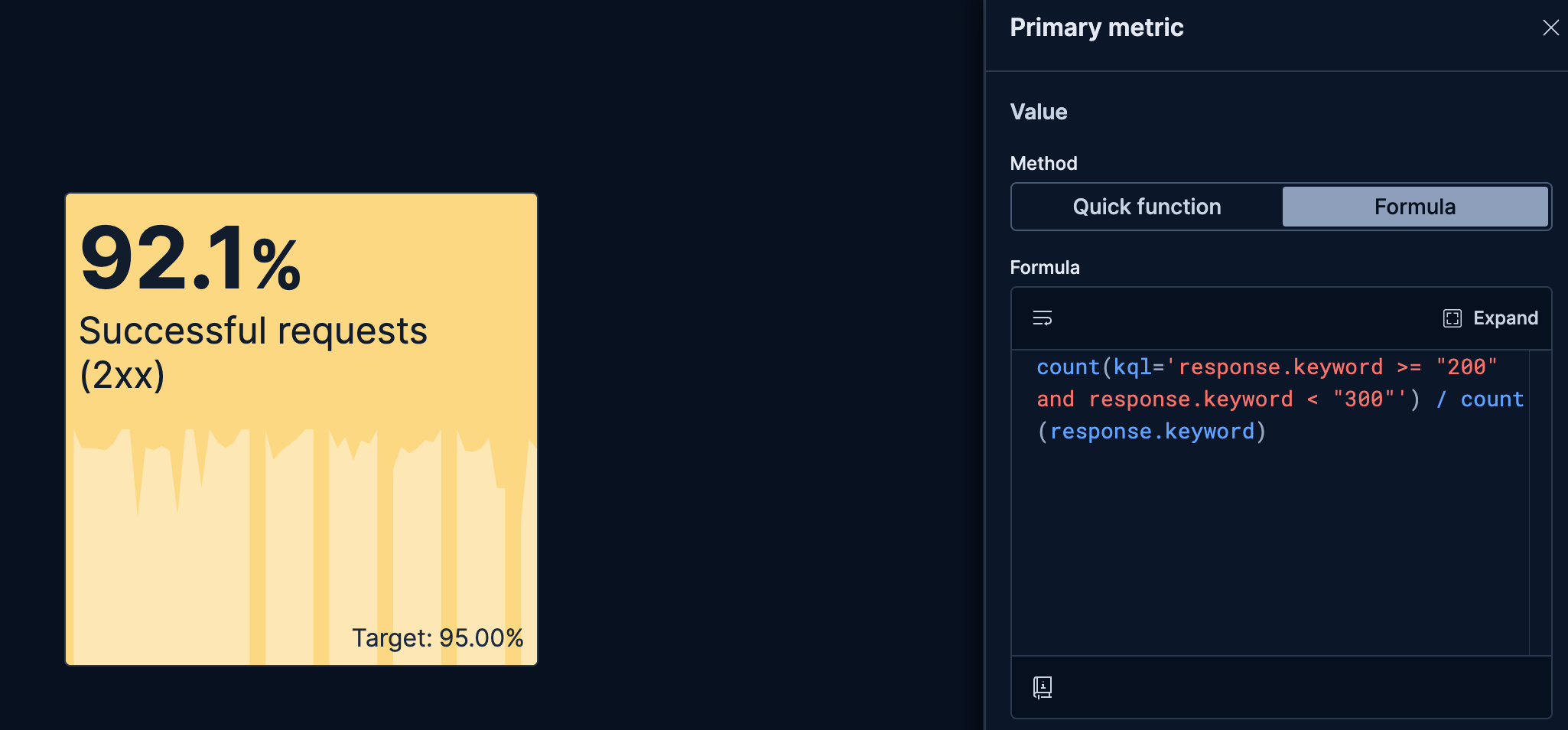
Display the percentage of successful requests on a monitoring dashboard:
- Title: "Successful requests (2xx)"
- Primary metric:
count(kql='response.code >= "200" and response.code < "300"') / count(response.code)- Value format:
Percent - Color by value:
Dynamic(green when above 95%, yellow between 75% and 95%, red when below) - Background chart: "Line" to show evolution over time
- Value format:
- Secondary metric:
0.95formula- Value format:
Percent - Label: Custom, set to
Target:
- Value format:
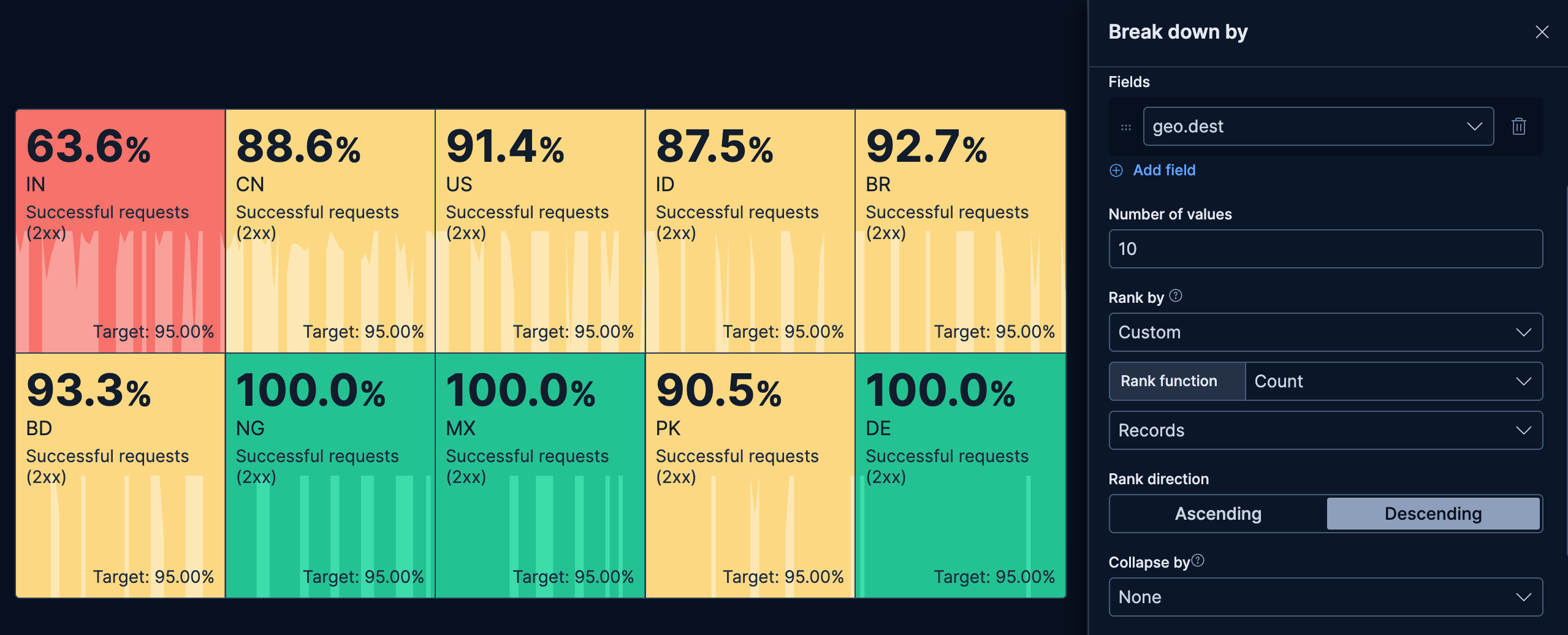
- Ratio of successful requests per origin
-
This example builds on the previous one to display the percentage of successful requests for the 10 countries with the most incoming requests on a monitoring dashboard:
- Title: "Successful requests (2xx)"
- Primary metric:
count(kql='response.code >= 200 and response.code < 300') / count(response.code)- Value format:
Percent - Color by value:
Dynamic. Green when above 95%, yellow between 75% and 95%, red when below - Background chart: "Line" to show evolution over time
- Value format:
- Secondary metric:
0.95formula- Name:
Target: - Value format:
Percent
- Name:
- Break down by:
geo.dest- Number of values:
10 - Rank by:
Custom>Count>Recordsto get countries generating most requests
- Number of values:
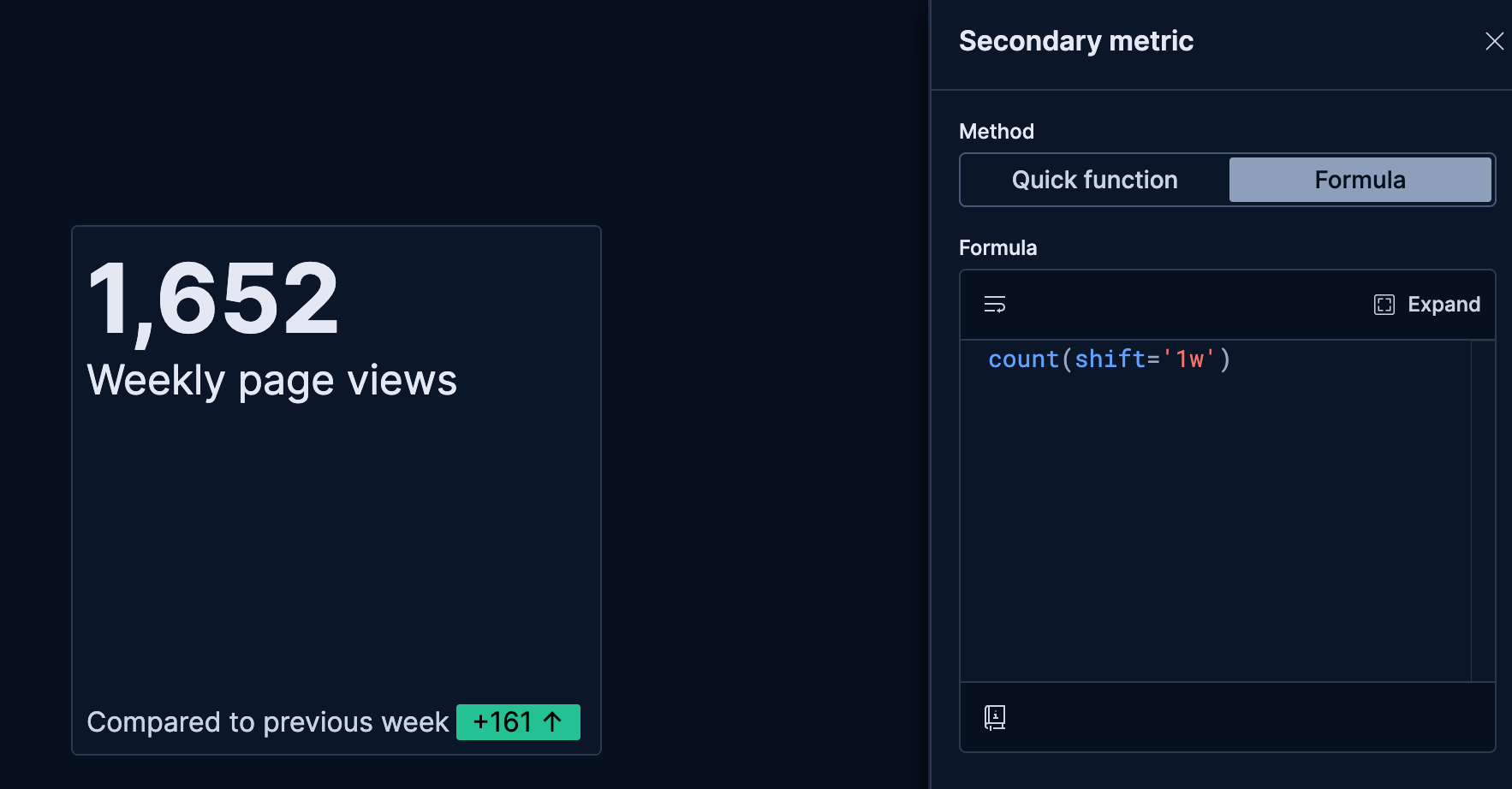
- Website traffic with trend
-
Monitor current traffic and show whether it's increasing or decreasing compared to the previous period:
- Title: "Weekly page views"
- Primary metric:
count()(current week's page views) - Secondary metric:
count(shift='1w')(previous week's page views)- Color by value: Dynamic coloring
- Compare to: Primary metric
- Display: Both icon and value
- Label: "Compared to previous week"
- Color palette: Green for increases (more traffic is positive)
