---
title: Lens visualizations using ES|QL queries
description: Create Lens visualizations with an ES|QL query from Discover or a dashboard, then customize the chart, filters, and time series.
url: https://docs-v3-preview.elastic.dev/elastic/docs-content/pull/9155/explore-analyze/visualize/esorql
products:
- Elastic Documentation
- Kibana
applies_to:
- Elastic Cloud Serverless: Generally available
- Elastic Stack: Generally available
---
# Lens visualizations using ES|QL queries
Creating visualizations using an ES|QL query is particularly useful when you need to:
- Query data across multiple indices without a pre-configured data view
- Apply complex filtering, transforms, or custom calculations in a single query
- Prototype a visualization directly from an ES|QL query in Discover
For less advanced aggregations on a known index, [the point-and-click mode](https://docs-v3-preview.elastic.dev/elastic/docs-content/pull/9155/explore-analyze/visualize/lens) is a good alternative.
You can add ES|QL visualizations to a dashboard directly from queries in Discover, or you can start from a dashboard.
If your visualization's query uses exactly one `STATS` command, dashboard users can turn on `bolt` **Fast mode** to get faster, estimated results for it. Refer to [Use ES|QL in Kibana > Get faster results with approximate STATS](/elastic/docs-content/pull/9155/explore-analyze/query-filter/languages/esql-kibana#approximation-fast-mode).Elastic Cloud Serverless: Preview Elastic Stack: Planned A `bolt` badge in the panel header shows when approximation was applied. Refer to [Interpret approximate results](/elastic/docs-content/pull/9155/explore-analyze/query-filter/languages/esql-kibana#esql-kibana-approximation-columns).
## Edit and add from Discover
In Discover, an [ES|QL query](https://docs-v3-preview.elastic.dev/elastic/docs-content/pull/9155/explore-analyze/query-filter/languages/esql-kibana) shows a visualization when the query transforms the results, for example, with `STATS` or `KEEP`, or when the results have a time field. The time field is `@timestamp`, or the field that the query compares with the `?_tstart` and `?_tend` parameters. The query determines the visualization type, such as a histogram or a bar chart. To change the visualization type and display options, select `pencil` **Edit visualization**.
To add the visualization to an existing or a new dashboard, select `app_dashboard` **Save visualization to dashboard**. In earlier versions, select `save` **Save visualization**.
## Create from dashboard
1. Add a new panel from your dashboard.
- Elastic Cloud Serverless: Generally available Elastic Stack: Generally available since 9.2 Select **Add** in the application menu and, if required, **New panel**.
- Elastic Stack: Generally available from 9.0 to 9.1 Select **Add panel** in the application menu.
If you haven't created a [data view](https://docs-v3-preview.elastic.dev/elastic/docs-content/pull/9155/explore-analyze/find-and-organize/data-views) and you don't have a dashboard yet, the **Dashboards** page offers you the possibility to **Try ES|QL** right away. By selecting this option, a dashboard is created with an ES|QL visualization that you can interact with and configure using ES|QL.
2. Select **Create visualization (query)** (**Visualization (query)** or **ES|QL** under **Visualizations** in earlier versions).
An ES|QL editor appears and lets you configure your query and its associated visualization. The **Suggestions** panel can help you find alternative ways to configure the visualization.
Check the [ES|QL reference](https://docs-v3-preview.elastic.dev/elastic/elasticsearch/tree/main/reference/query-languages/esql) to get familiar with the syntax and [optimize your query](https://docs-v3-preview.elastic.dev/elastic/elasticsearch/tree/main/reference/query-languages/esql/esql-query-performance).
3. When editing your query or its configuration, run the query to update the preview of the visualization.
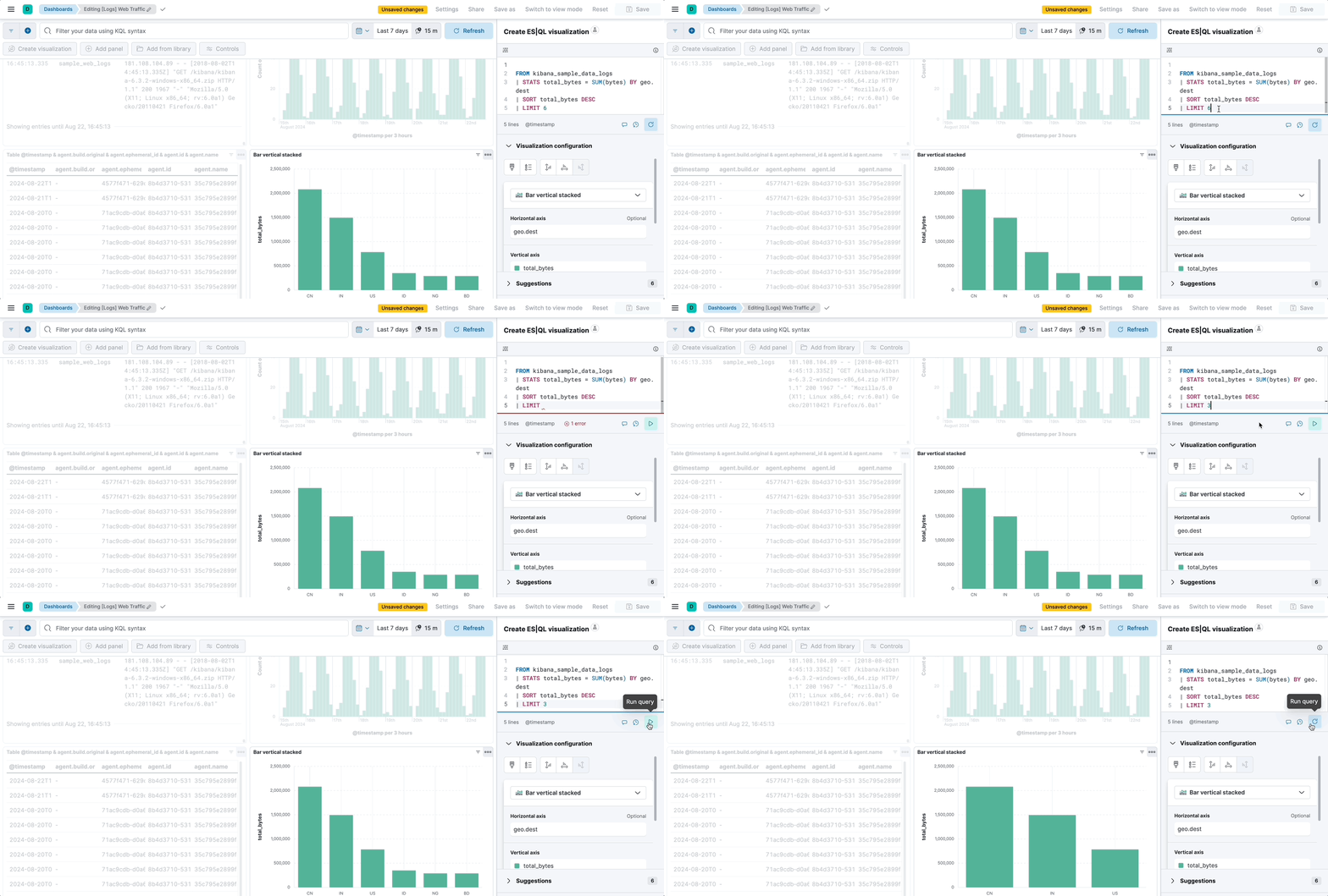
When you edit the query and run it again, the visualization configuration persists as long as it is compatible with the query changes. Refer to [Lens visualizations using ES|QL queries > Chart configuration persistence over ES|QL query update](#chart-config-persist) for more details.
4. You can bind controls to your ES|QL visualizations in dashboards by creating [ES|QL controls](https://docs-v3-preview.elastic.dev/elastic/docs-content/pull/9155/explore-analyze/visualize/add-variable-controls).
5. Select **Apply and close** to save the visualization to the dashboard.
### Customize the appearance of your ES|QL visualization
When editing an ES|QL visualization, you can customize the appearance of the chart. To do that:
1. Click one of the fields representing an axis of the chart to open its details.
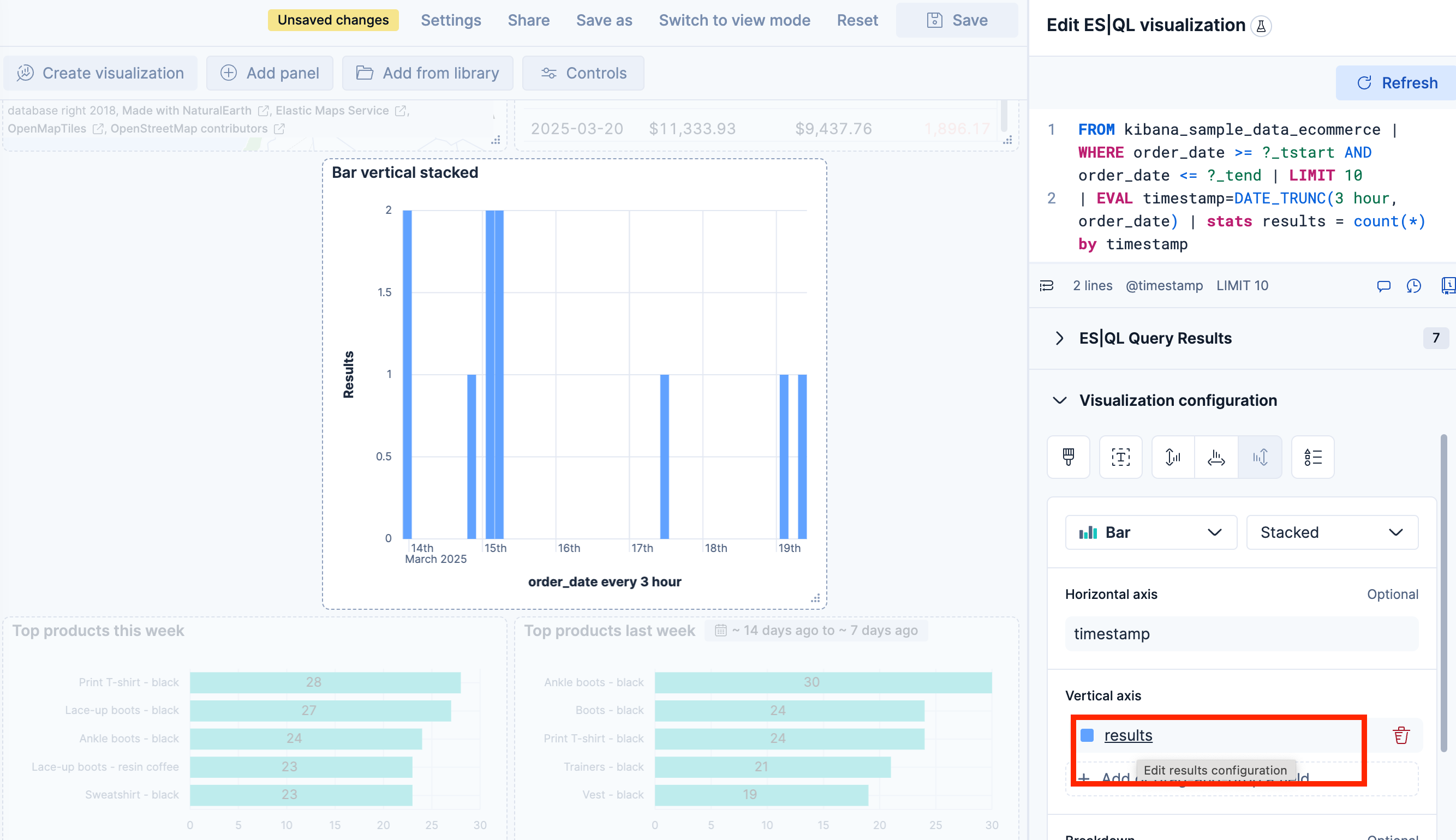
2. Define the appearance of your choice from the available options.
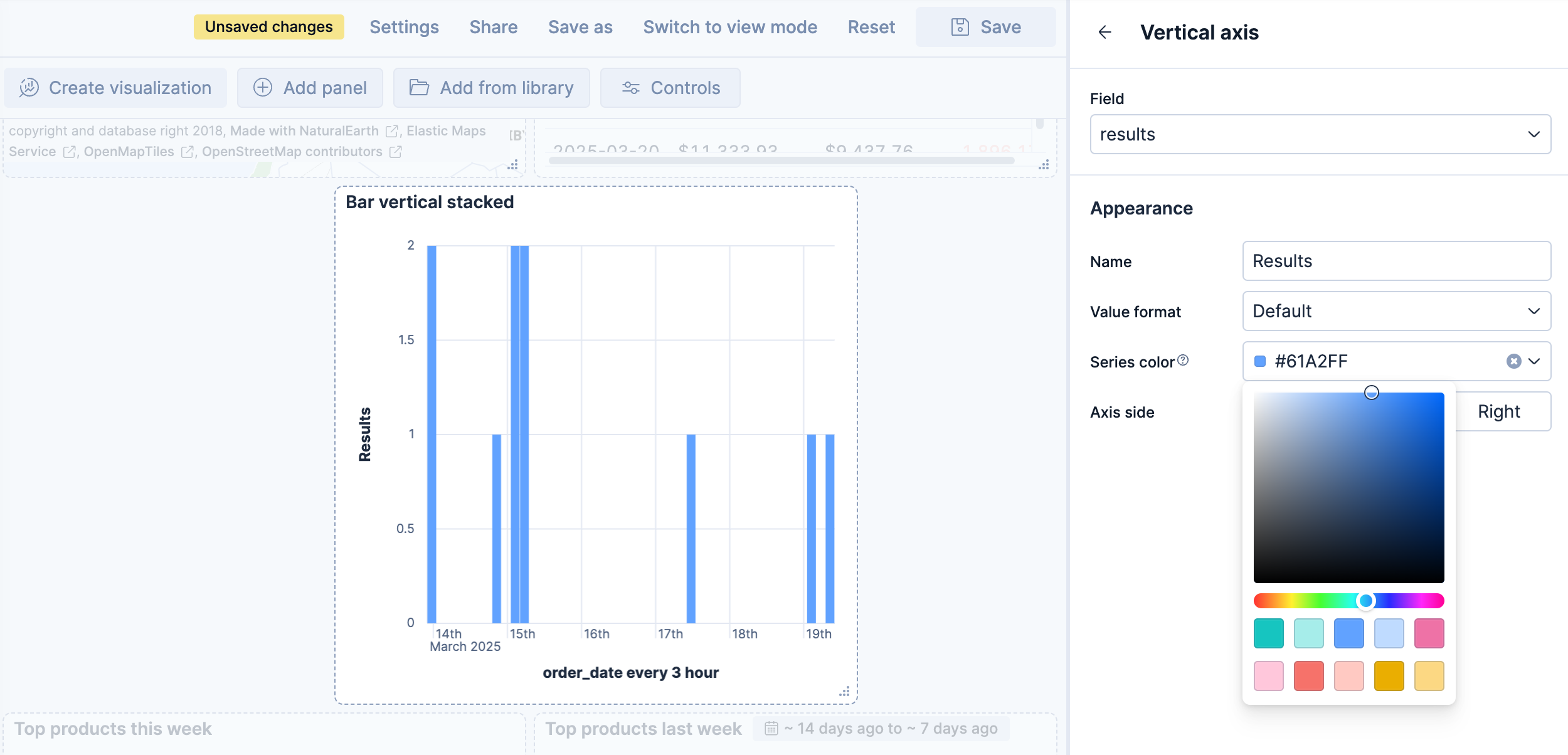
3. Return to the previous menu, then **Apply and close** the configuration to save your changes.
### Break down a chart by multiple fields
- Elastic Cloud Serverless: Generally available
- Elastic Stack: Generally available since 9.4
On bar, line, and area charts built from an ES|QL query, the **Breakdown** dimension can hold more than one field at the same time. Each unique combination of values is rendered as its own series, with the values joined by a `›` separator in the legend.
When the query groups a metric by more than one field, Kibana places the first field on the **Horizontal axis** and the remaining fields in the **Breakdown** dimension. For example, the following query counts web log events over time, broken down by host and file extension:
```esql
FROM kibana_sample_data_logs
| WHERE extension.keyword != ""
| STATS count(*) BY BUCKET(@timestamp, 100, ?_tstart, ?_tend), host.keyword, extension.keyword
```
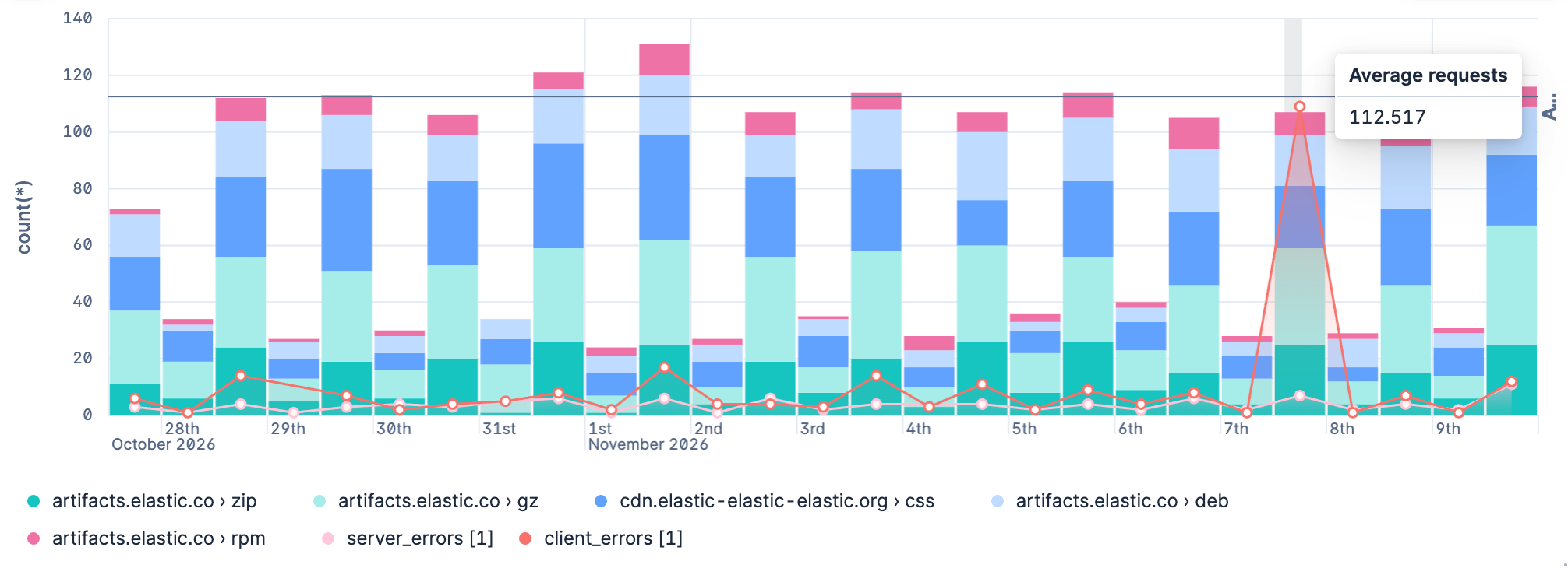
In the resulting chart, the time buckets are placed on the **Horizontal axis**, while `host.keyword` and `extension.keyword` are combined in the **Breakdown** dimension. Each legend entry represents a unique combination, such as `artifacts.elastic.co › deb` or `artifacts.elastic.co › gz`.
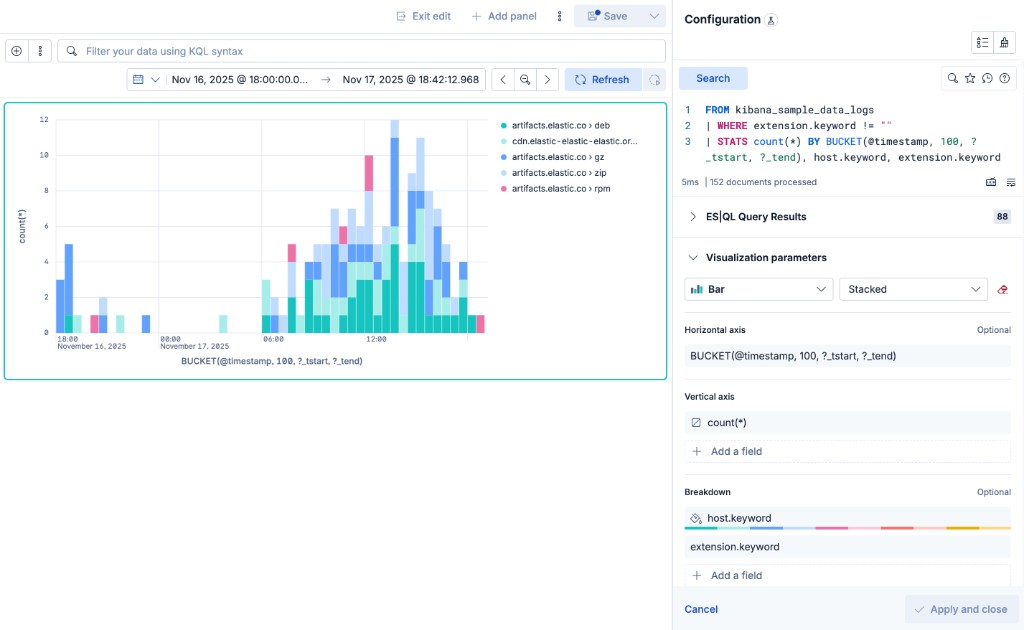
To add another field to the breakdown, select **Add a field** under **Breakdown** and choose a column from your query. You can also drag the fields inside the **Breakdown** dimension to change the order in which their values appear in the combined label.
### Add multiple layers to ES|QL charts
- Elastic Cloud Serverless: Generally available
- Elastic Stack: Planned
When you create an ES|QL visualization from a dashboard, you can combine the results of several queries on one chart by giving each query its own layer. Layers can also hold annotations and reference lines, which mark events and thresholds on top of your data.
Every ES|QL data layer has its own query and its own dimensions, so you can change one query without touching the others. To split the results of a single query into several series instead, use the [**Breakdown** dimension](#esql-viz-multi-field-breakdown).
Layers are available on bar, line, and area charts. Other chart types, such as pie or metric, use a single query.
A chart can combine these layer types:
- [**Visualization**](#add-another-visualization-as-a-layer): The results of its own query.
- [**Annotations**](#mark-events-with-annotations): An event or a period, such as a deployment, marked on a time axis.
- [**Reference lines**](#add-reference-lines): A threshold, such as a target or a budget, drawn across the chart.
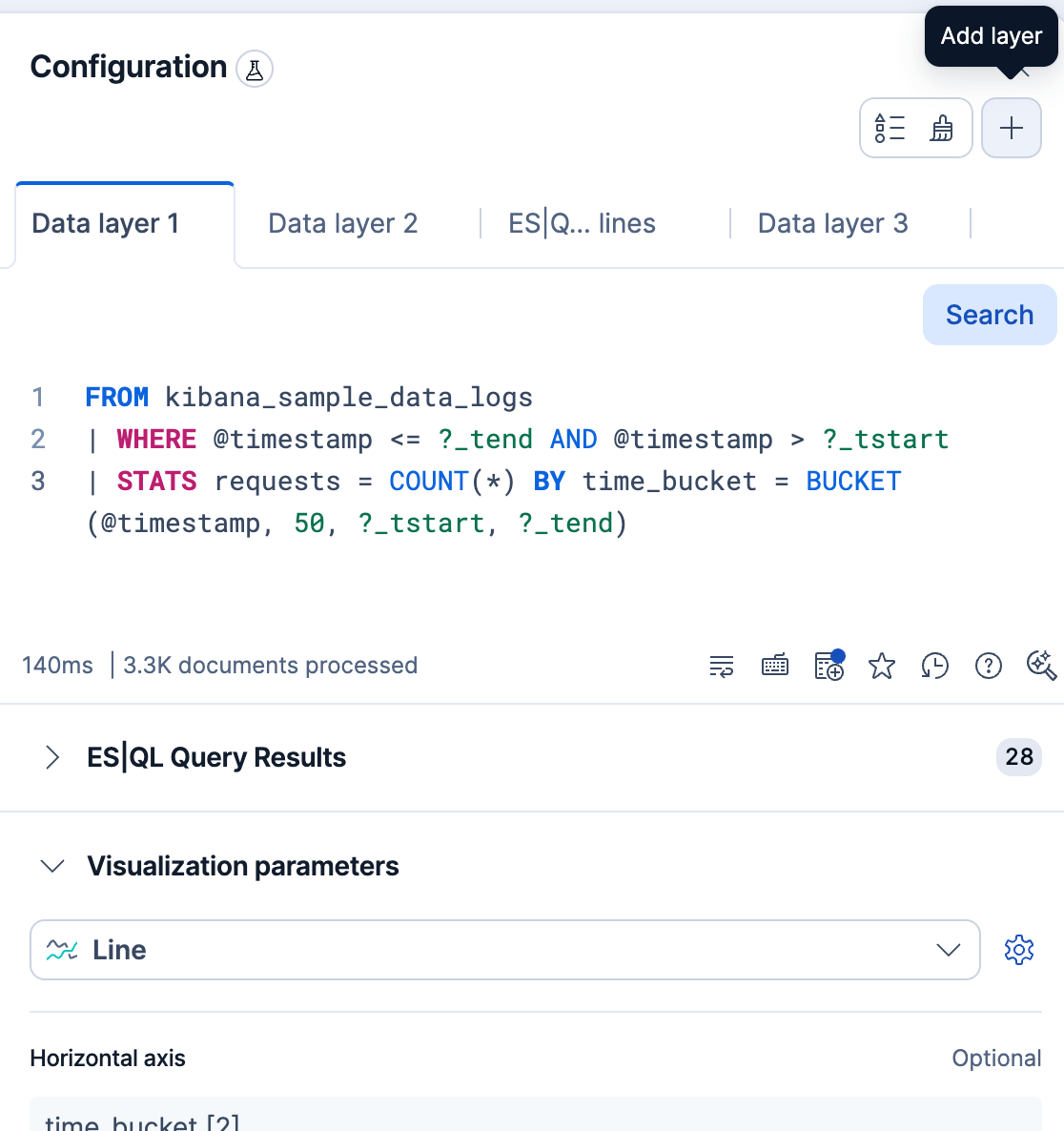
To add a layer, select `plus` **Add layer** in the editor, then select the type of layer. The new layer opens in its own tab.
#### Add another visualization as a layer
To compare two sets of results on one chart, add a layer with its own query:
1. Select `plus` **Add layer** → **Visualization**.
2. If you're asked, select the chart type for the layer. Each layer can use a different type, for example a line over bars.
3. In the new layer's tab, enter the query and run it.
4. Assign the column that holds time to the **Horizontal axis** and the column that holds the values to the **Vertical axis**.
Before you look at the chart, make sure both dimensions have a column. If the **Horizontal axis** of a layer is empty, the values of that layer don't follow time and stack at a single position. To line the layers up in time, group every query by the same time buckets and assign that column to the **Horizontal axis** of each layer.
If you edit a layer's query and its results no longer contain a compatible column for every dimension of that layer, Kibana rejects the query and shows an error. Remove the incompatible dimensions, then run the query again.
**Example: Compare server and client errors**
1. Start from the [stacked bar chart of web log events](#esql-viz-multi-field-breakdown).
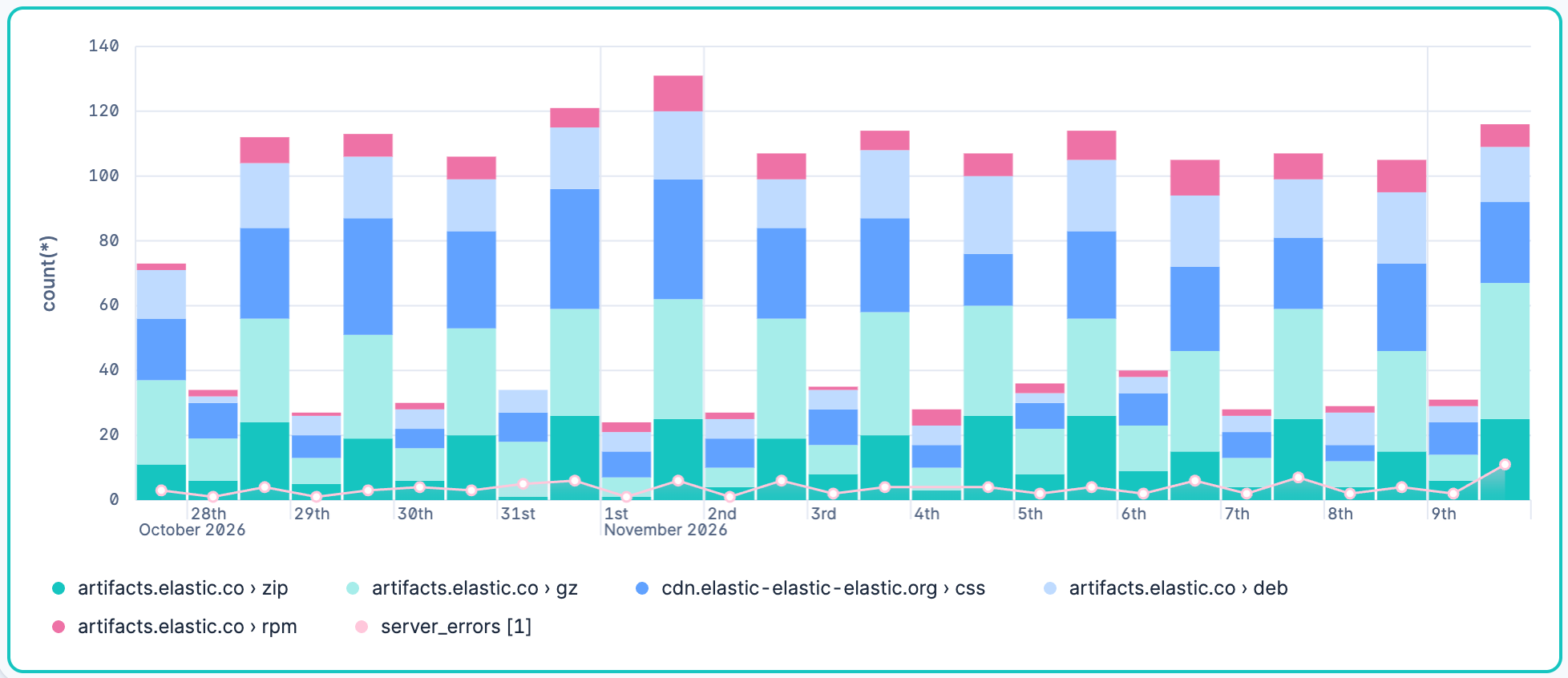
2. Add a layer for the events that returned a server error (response codes that start with 5). If you're asked for a chart type, select **Line**. Use this query:
```esql
FROM kibana_sample_data_logs
| WHERE @timestamp <= ?_tend AND @timestamp > ?_tstart AND response.keyword LIKE "5*" AND extension.keyword != ""
| STATS server_errors = COUNT(*) BY time_bucket = BUCKET(@timestamp, 100, ?_tstart, ?_tend)
```
3. In this layer, assign `time_bucket` to the **Horizontal axis** and `server_errors` to the **Vertical axis**.
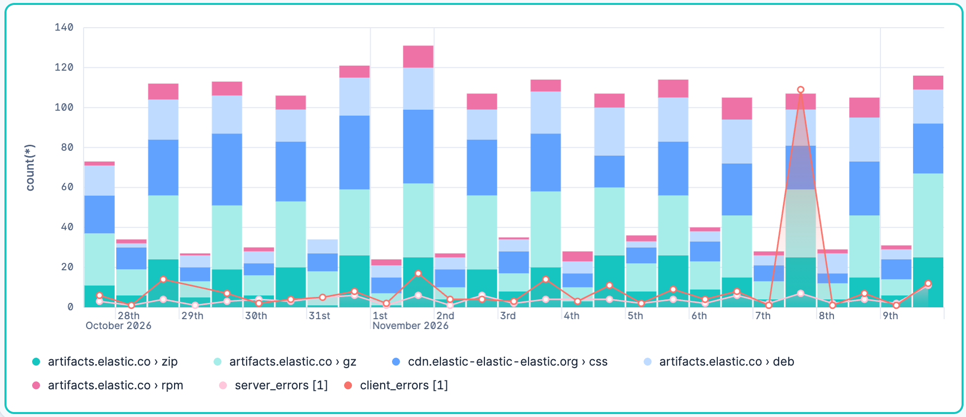
4. Add a third layer for the events that returned a client error (response codes that start with 4). Select **Line** again if you're asked for a chart type. Use this query:
```esql
FROM kibana_sample_data_logs
| WHERE @timestamp <= ?_tend AND @timestamp > ?_tstart AND response.keyword LIKE "4*" AND extension.keyword != ""
| STATS client_errors = COUNT(*) BY time_bucket = BUCKET(@timestamp, 100, ?_tstart, ?_tend)
```
5. In this layer, assign `time_bucket` to the **Horizontal axis** and `client_errors` to the **Vertical axis**.
#### Mark events with annotations
- Elastic Cloud Serverless: Preview
- Elastic Stack: Planned
Annotations mark an event or a period on a time chart, such as a deployment or an outage. The chart needs a time axis, so **Annotations** stays unavailable until the horizontal axis shows time.
In the chart example that compares server and client errors of the previous section, the client errors spike on one day. To mark the outage behind that spike:
1. Select `plus` **Add layer** → **Annotations**. Kibana creates an annotation immediately.
2. Turn on **Apply as range**, then set **From** and **To** to the start and end of the outage.
3. In **Name**, enter a label for the annotation, such as `eu-west-36 outage`.
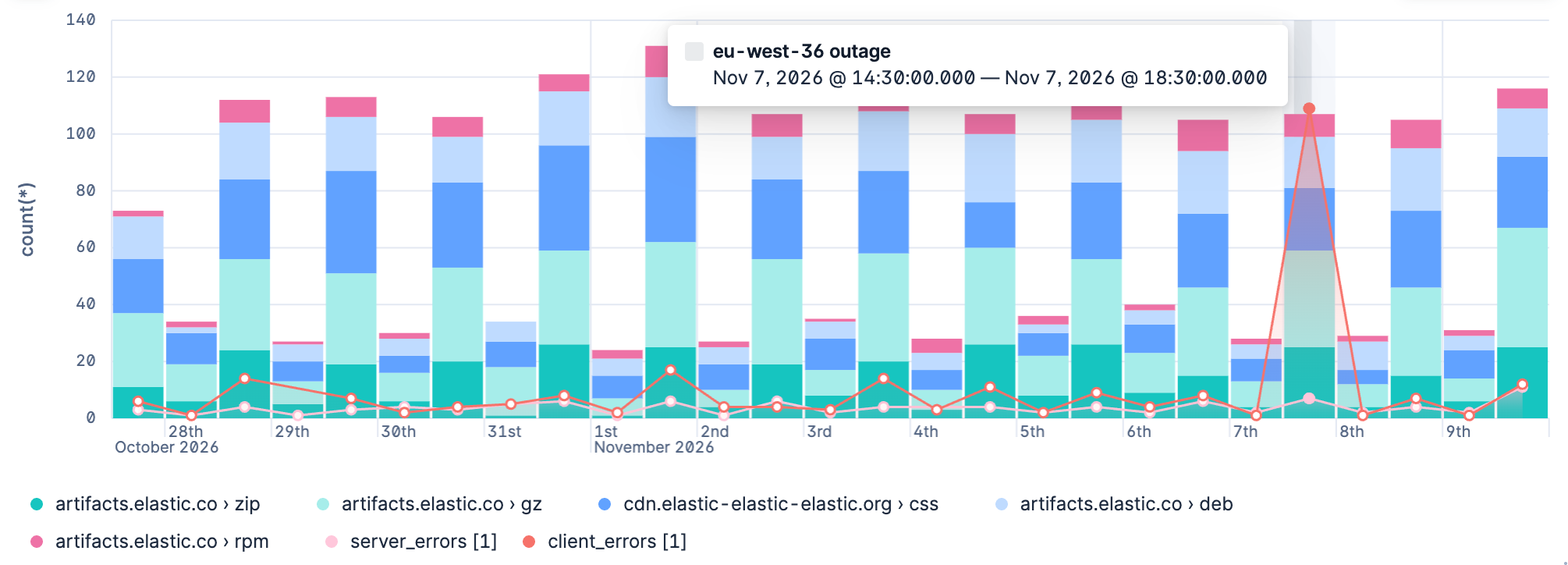
To mark a single moment instead, such as a deployment, leave **Apply as range** off and set **Annotation date**.
If you're used to adding [annotations](/elastic/docs-content/pull/9155/explore-analyze/visualize/lens#add-annotations) to visualizations created using the point-and-click editor, annotations on ES|QL visualizations work differently. You place each annotation yourself, by date or by date range. You can't base an annotation on a query or reuse one from the annotation library.
#### Add reference lines
A reference line shows a threshold, such as a target or a budget, so you can see at a glance where your data crosses it.
On ES|QL visualizations, you can define a reference line in the following ways:
- **With a fixed value**: Draw the line at a number that you choose.
1. Select `plus` **Add layer** → **Reference lines**.
2. If you're asked for a source, select **Static reference lines**.
3. Set the value where you want the line to appear.
- Elastic Cloud Serverless: Generally available Elastic Stack: Planned **With a value from an ES|QL query**: Calculate the threshold from your data, for example an average.
1. Select `plus` **Add layer** → **Reference lines** → **ES|QL reference lines**.
2. Enter a query that returns the threshold in its first row, then run it.
3. Select the column that holds the value for the line as the **Vertical axis**.
The line uses the first row of the results, and the column must contain a number. If the query returns more than one row, Kibana uses the first row and shows a warning.
The chart in the previous examples groups web log events into time buckets. To draw a line at the average number of events across those buckets, use this query. It counts the events in each time bucket, as the chart does, then averages the counts:
```esql
FROM kibana_sample_data_logs
| WHERE @timestamp <= ?_tend AND @timestamp > ?_tstart AND extension.keyword != ""
| STATS requests = COUNT(*) BY time_bucket = BUCKET(@timestamp, 100, ?_tstart, ?_tend)
| STATS average_requests = AVG(requests)
```
For this query, select `average_requests` as the **Vertical axis**.
#### Suggestions with several layers
The **Suggestions** panel is hidden while the chart has more than one layer, because applying a suggestion would replace the other layers.
### Chart configuration persistence over ES|QL query update
- Elastic Cloud Serverless: Generally available
- Elastic Stack: Generally available since 9.1
When you edit the ES|QL query and run it again, the visualization configuration persists as you defined it as long as it is compatible with the query changes.
The chart configuration resets or follows automatic suggestions when:
- Elastic Stack: Generally available since 9.2 You manually select a different chart type incompatible with the one previously selected.
- Elastic Stack: Generally available since 9.2 You create a new chart and haven't edited the visualization's options yet.
- The query changes significantly and no longer returns compatible columns.
### Query data from multiple projects
- Elastic Cloud Serverless: Generally available
- Elastic Stack: Unavailable
When [cross-project search](https://docs-v3-preview.elastic.dev/elastic/docs-content/pull/9155/explore-analyze/cross-project-search) is enabled and you have [linked projects](https://docs-v3-preview.elastic.dev/elastic/docs-content/pull/9155/deploy-manage/cross-project-search-config/cps-config-link-and-manage), your ES|QL visualization queries data based on the current [cross-project search scope](/elastic/docs-content/pull/9155/explore-analyze/cross-project-search/cross-project-search-manage-scope#cps-in-kibana).
To target specific projects from within the query, add [`SET project_routing`](https://docs-v3-preview.elastic.dev/elastic/elasticsearch/tree/main/reference/query-languages/esql/directives/set) at the beginning of your ES|QL query. When you do this, the visualization panel displays a **Custom CPS scope** badge on the dashboard, indicating that it uses a different scope than the CPS scope selector. Refer to [View data from multiple projects](/elastic/docs-content/pull/9155/explore-analyze/dashboards/using#dashboard-cps-scope) for details.
## Build specific chart types with an ES|QL query
An ES|QL query returns a table. When you use the result to build a visualization, each returned column is available as a chart dimension. Shape the query result to provide the dimensions required by the chart:
| Result column | How to produce it | Common uses |
|-----------------------|------------------------------------------------------------------------------------------|-------------------------------------------------------------|
| Grouping column | Return a source column, group values with a `BY` clause, or derive a column with `EVAL`. | Categories, rows, regions, series, and non-time axes |
| Time-bucket column | Group a time field with `BUCKET` or `DATE_TRUNC`. | The horizontal axis of a time-series chart |
| Numeric metric column | Calculate a value with a `STATS` aggregation such as `COUNT`, `SUM`, or `AVG`. | Plotted values, sizes, color intensity, metrics, and gauges |
The chart type determines the combination of columns you need. Open a page from the [visualization types](/elastic/docs-content/pull/9155/explore-analyze/visualize/lens#lens-visualization-types) list to find an ES|QL query pattern and learn how to assign its result columns to the chart dimensions.
## Build time series charts with ES|QL
A time series chart plots a metric over time. The query must return a time-bucket column for the **Horizontal axis** and a numeric metric column for the **Vertical axis**.
In this query, `WHERE` applies the dashboard time range, `BUCKET` divides that range into 50 groups, and `COUNT` returns one value for each group:
```esql
FROM kibana_sample_data_logs
| WHERE @timestamp <= ?_tend AND @timestamp > ?_tstart
| STATS requests = COUNT(*) BY time_bucket = BUCKET(@timestamp, 50, ?_tstart, ?_tend)
```
If your time field isn't named `@timestamp`, replace `@timestamp` with that field in both `WHERE` and `BUCKET`. Refer to [Use ES|QL in Kibana > Custom time parameters](/elastic/docs-content/pull/9155/explore-analyze/query-filter/languages/esql-kibana#_custom_time_parameters).
To build the chart:
1. [Create an ES|QL visualization](#_create_from_dashboard) and run the query.
2. Set the visualization type to a chart type compatible with time series, typically **Line**, **Area**, or **Bar**.
3. Assign `time_bucket` to the **Horizontal axis** and `requests` to the **Vertical axis**.
4. Select **Apply and close**.
The chart preview shows how the request count changes over time.
For more query patterns and chart settings, refer to [Build a line chart with an ES|QL query](/elastic/docs-content/pull/9155/explore-analyze/visualize/charts/line-charts#build-a-line-chart-with-esql) and [Build an area chart with an ES|QL query](/elastic/docs-content/pull/9155/explore-analyze/visualize/charts/area-charts#build-an-area-chart-with-esql).
## Compare current versus previous period with time shift
To compare the current period with a previous period of the same duration, compute both windows in one [`STATS`](https://docs-v3-preview.elastic.dev/elastic/elasticsearch/tree/main/reference/query-languages/esql/commands/stats-by) command. Use a per-aggregation `WHERE` filter for each window.
This example uses the Kibana [sample web logs](https://docs-v3-preview.elastic.dev/elastic/docs-content/pull/9155/manage-data/ingest/sample-data). It compares the last 7 days with the 7 days before that, per host. Add that data set if you don't have it yet. Sample data timestamps are relative to when you installed the data set.
To create the visualization:
1. Open a dashboard and add a new ES|QL visualization:
- Elastic Cloud Serverless: Generally available Elastic Stack: Generally available since 9.2 Select **Add** in the application menu, then select **Create visualization (query)** (**Visualization (query)** or **New panel** → **ES|QL** under **Visualizations** in earlier versions).
- Elastic Stack: Generally available from 9.0 to 9.1 Select **Add panel** in the application menu, then select **ES|QL**.
2. Set the [time filter](https://docs-v3-preview.elastic.dev/elastic/docs-content/pull/9155/explore-analyze/query-filter/filtering) to the last 15 days so both 7-day windows have data.
3. Enter the following query:
```esql
FROM kibana_sample_data_logs
| EVAL current_start = ?_tend - 7 days, previous_start = ?_tend - 14 days
| STATS
current_count = COUNT(*) WHERE @timestamp >= current_start AND @timestamp <= ?_tend,
previous_count = COUNT(*) WHERE @timestamp >= previous_start AND @timestamp < current_start
BY host.keyword
| EVAL pct_diff = CASE(
previous_count > 0,
ROUND(100.0 * TO_DOUBLE(current_count - previous_count) / previous_count, 1),
null
)
| SORT ABS(pct_diff) DESC
```
1. Bound both windows from the end of the time filter. `?_tend` stays in sync with the dashboard time filter.
2. Count events in each window in a single pass. Refer to [`STATS` with `WHERE`](https://docs-v3-preview.elastic.dev/elastic/elasticsearch/tree/main/reference/query-languages/esql/commands/stats-by).
3. Compute the percent change. `CASE` returns `null` when the previous window has no events.
4. Run the query. A visualization appears with one row per host. If Kibana suggests a different visualization type, select **Table** from the visualization type dropdown.
5. Select **Apply and close** to save the visualization to your dashboard.
To use your own data, change the `FROM` source and the `BY` grouping field. If your time field isn't `@timestamp`, replace `@timestamp` in the `STATS` filters. To apply the dashboard time filter to a custom time field, add a `WHERE` clause with `?_tstart` and `?_tend`. Refer to [Filter by time](/elastic/docs-content/pull/9155/explore-analyze/query-filter/languages/esql-kibana#esql-kibana-time-filter).
To compare a different duration or offset, change the two `EVAL` time spans. For the last hour versus the same hour a week ago, set `current_start` to `?_tend - 1 hour` and `previous_start` to `?_tend - 7 days - 1 hour`. Set the time filter to cover both windows.
To set **Time shift** in the point-and-click editor, refer to [Compare differences over time](/elastic/docs-content/pull/9155/explore-analyze/visualize/lens#compare-data-with-time-offsets).
## Add drilldowns to an ES|QL visualization
- Elastic Cloud Serverless: Generally available
- Elastic Stack: Generally available since 9.4
ES|QL visualizations support the following [drilldown types](/elastic/docs-content/pull/9155/explore-analyze/dashboards/drilldowns#drilldown-types):
- [Dashboard](https://docs-v3-preview.elastic.dev/elastic/docs-content/pull/9155/explore-analyze/dashboards/create-dashboard-drilldown) drilldowns: Open another dashboard from a data point.
- [URL](https://docs-v3-preview.elastic.dev/elastic/docs-content/pull/9155/explore-analyze/dashboards/create-url-drilldown) drilldowns: Open an external URL from a data point.
- Elastic Stack: Generally available since 9.5 Elastic Cloud Serverless: Generally available [Discover](https://docs-v3-preview.elastic.dev/elastic/docs-content/pull/9155/explore-analyze/dashboards/create-discover-drilldown) drilldowns: Open **Discover** from a data point. Dashboard filters and the dashboard KQL or Lucene query are translated into the panel's ES|QL query, so the same context applies.
Drilldowns are compatible only with indexed fields. Fields created at query time are not supported. Refer to [Values that cannot open a drilldown](/elastic/docs-content/pull/9155/explore-analyze/dashboards/drilldowns#drilldowns-requirements).
## Ignore dashboard filters
- Elastic Cloud Serverless: Generally available
- Elastic Stack: Generally available since 9.5
By default, an ES|QL visualization applies the filters and the KQL or Lucene query set at the dashboard level. To force a layer to run its query without these filters:
1. Select the `gear` **Settings** icon on the layer header.
2. Turn off **Use global filters**.
This option covers the dashboard's filter pills and the query from the search bar. The dashboard time range is a separate control that always applies, whether or not the option is turned on.
## Create an alert from your ES|QL visualization
- Serverless Elasticsearch projects: Generally available
- Serverless Observability projects: Generally available
- Serverless Security projects: Unavailable
- Elastic Stack: Generally available since 9.1
Once you've created an ES|QL panel, you can create an Elasticsearch threshold rule directly from the visualization panel, based on the data it displays. When you do this, the rule query is automatically generated and either describes the data and sets a specific threshold, or describes the data without setting a specific threshold.
Elastic Security rule types are not supported.
To create a rule with the threshold pre-specified:
- Right-click a data point in the visualization and click **Add alert rule**. This opens the **Create rule** flyout. The generated query will define a threshold that corresponds to the data point you selected.
- [Configure](https://docs-v3-preview.elastic.dev/elastic/docs-content/pull/9155/solutions/observability/incident-management/create-an-elasticsearch-query-rule) your Elasticsearch rule.
To create a rule without the threshold pre-specified:
- Open the **More actions** (three dots) menu in the upper right of the panel and select **Add alert rule**. This opens the **Create rule** flyout. The generated query will define a threshold that corresponds to the data point you selected.
- [Configure](https://docs-v3-preview.elastic.dev/elastic/docs-content/pull/9155/solutions/observability/incident-management/create-an-elasticsearch-query-rule) your Elasticsearch rule.
## Use emojis in visualizations
ES|QL query results can include emoji characters, which means you can use them in your ES|QL visualizations. Combined with `EVAL` and `CASE` functions, this opens up options like mapping values to colored status indicators (🟢, 🟠, 🔴), adding visual labels, or highlighting specific categories.
This example uses the Kibana sample web logs data to build a status table that shows the success rate per host, with a colored status indicator.
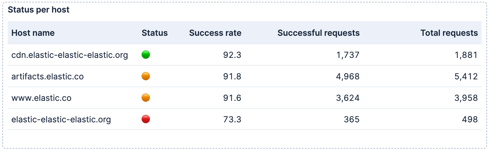
Because they're part of the query results, you can use them in any visualization type that displays text fields, such as bar charts with emoji labels or metric panels with status indicators.
Before you begin, ensure you have the sample web logs data installed. In Kibana, go to **Integrations** and search for **Sample data**. On the **Sample data** page, add **Sample web logs**.
To create the visualization:
1. Open a dashboard and add a new ES|QL visualization:
- Elastic Cloud Serverless: Generally available Elastic Stack: Generally available since 9.2 Select **Add** in the application menu, then select **Create visualization (query)** (**Visualization (query)** or **New panel** → **ES|QL** under **Visualizations** in earlier versions).
- Elastic Stack: Generally available from 9.0 to 9.1 Select **Add panel** in the application menu, then select **ES|QL**.
2. Enter the following query:
```esql
FROM kibana_sample_data_logs
| EVAL is_success = CASE(response >= "200" AND response < "300", 1, 0)
| STATS
total_requests = COUNT(*),
successful_requests = SUM(is_success)
BY host.keyword
| EVAL success_rate = ROUND(successful_requests * 100.0 / total_requests, 1)
| EVAL status = CASE(
success_rate >= 92, "🟢",
success_rate >= 90, "🟠",
"🔴"
)
| KEEP host.keyword, status, success_rate, successful_requests, total_requests
| SORT success_rate DESC
```
1. Create a binary flag: 1 for successful responses (2xx), 0 otherwise.
2. Group by host and use `SUM` to count successes.
3. Calculate the success rate as a percentage.
4. Map the success rate to emoji indicators based on thresholds.
5. Select and order the columns for the table output.
3. Run the query. A visualization appears with one row per host and an emoji status column. If Kibana suggests a different visualization type, select **Table** from the visualization type dropdown.
4. Optionally, configure the table appearance in the visualization settings:
- To reorder columns, rearrange the metrics in the **Metrics** section.
- To rename a column, select the metric and update its **Name** in the appearance options.
5. Select **Apply and close** to save the visualization to your dashboard.
6. Optionally, once the panel is saved, select the panel title to give it a meaningful name like `Status per host`.
Once you have your visualization working, you can add [controls](https://docs-v3-preview.elastic.dev/elastic/docs-content/pull/9155/explore-analyze/visualize/add-variable-controls) to filter by host or time range, use [LOOKUP JOIN](https://docs-v3-preview.elastic.dev/elastic/elasticsearch/tree/main/reference/query-languages/esql/esql-lookup-join) to enrich your data with metadata from other indices, or create [alerts](https://docs-v3-preview.elastic.dev/elastic/docs-content/pull/9155/explore-analyze/alerting/alerts/rule-type-es-query) based on the same query to get notified when status changes.