Build pie charts with Kibana
Pie charts display parts of a whole as slices, where each slice represents a data category and its size is proportional to the quantity it represents. Pie charts are ideal for showing comparisons between categories, illustrating the dominance of one category over others, and displaying percentage or proportional data.
You can create pie charts in Kibana using Lens.

Pie charts work best when:
- You have a maximum of 6 slices. More slices make the chart difficult to read.
- Values are around 25%, 50%, or 75%. These proportions are easy to perceive accurately.
- One category is significantly larger than the others.
- You want to show part-to-whole relationships at a glance.
Consider using bar charts instead when:
- You need to compare the exact size of slices.
- You have more than 6 categories.
- You need to compare multiple data sets. Use part-to-whole bar charts with percentages instead.
- Your data includes negative values.
To build a pie chart:
-
Access Lens
Lens is Kibana's main visualization editor. You can access it:
- From a dashboard: On the Dashboards page, open or create the dashboard where you want to add a pie chart, then add a new visualization.
- From the Visualize library page by creating a new visualization.
-
Set the visualization to Pie
New visualizations often start as Bar charts.
Using the Visualization type dropdown, select Pie.
-
Define the data to show
- Select the data view that contains your data.
- Configure the Slice by dimension to define how the pie is divided into slices. Drag a categorical field to create slices based on its values.
- Configure the Metric dimension to define the size of each slice. This determines the numerical value that each slice represents. Kibana automatically selects an appropriate aggregation function compatible with the selected field.
Optionally:
- Add additional Slice by dimensions to create nested slices (a multi-level or sunburst-style chart).
- Enable Multiple metrics in the layer settings to compare different measures within the same chart.
-
Customize the chart to follow best practices
Tweak the appearance of the chart to your needs. Consider the following best practices:
- Limit the number of slices
- Keep your pie chart to a maximum of 6 slices. If you have more categories, consider grouping smaller values into an "Other" category or using a different visualization type.
- Order slices meaningfully
- The largest slice should start at the 12 o'clock position and proceed clockwise in descending order. For categories with a natural order (such as satisfaction ratings), follow that order instead.
- Use color purposefully
- Apply colors to highlight important data or patterns. Use the color mapping feature to assign consistent colors to key categories across your dashboards.
- Consider using a donut
- The empty center of donut charts provides space to display additional information, such as a total or key metric. Refer to Create a donut chart for instructions.
- Label clearly
- Keep labels inside or close to slices when possible. For charts with many small slices or long labels, use the legend instead.
Refer to Pie chart settings to find all configuration options for your pie chart.
-
Save the chart
- If you accessed Lens from a dashboard, select Save and return to save the visualization and add it to that dashboard, or select Save to library to add the visualization to the Visualize library and reuse it later.
- If you accessed Lens from the Visualize library, select Save. A menu opens and lets you add the visualization to a dashboard and to the Visualize library.
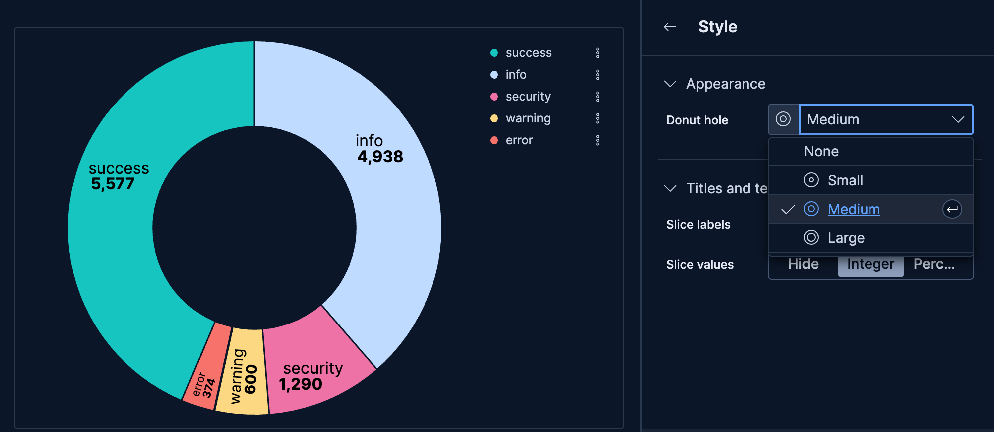
Donut charts are pie charts with a hollow center. The empty space can provide a visual focal point and space for displaying related information.
- Create a Pie chart visualization.
- Configure your Slice by and Metric dimensions.
- Select Style.
- In Appearance, set Donut hole to Small, Medium, or Large depending on how much center space you want.
By default, pie charts use a single metric with Slice by to split that metric by values in a categorical field. The Multiple metrics option lets you take a different approach: each slice represents a distinct metric you define, rather than values from your data.
This is useful when:
- You want to compare metrics that apply different filters to the same aggregation
- You need to show custom-defined categories that don't exist as values in a field
- You want to compare different calculations or formulas side by side
Imagine your web logs data includes multiple numeric fields representing different resource types, such as response_bytes, processing_time_ms, and memory_used_kb. You want to visualize how each resource contributes to overall server load.
Create a Pie chart and remove any existing Slice by dimension.
Open Layer settings:
-
Select Layer settings. -
Select , then select Layer settings.
-
Select Multiple metrics, then close the settings.
Add metrics for each resource type:
Slice Metric configuration Bandwidth Sum(response_bytes)Processing time Sum(processing_time_ms)Memory usage Sum(memory_used_kb)For each metric, select the Metric dimension and configure the field. Customize the Name to display meaningful labels in the legend.
Optionally, assign custom colors to each metric by selecting the metric and choosing a Series color.
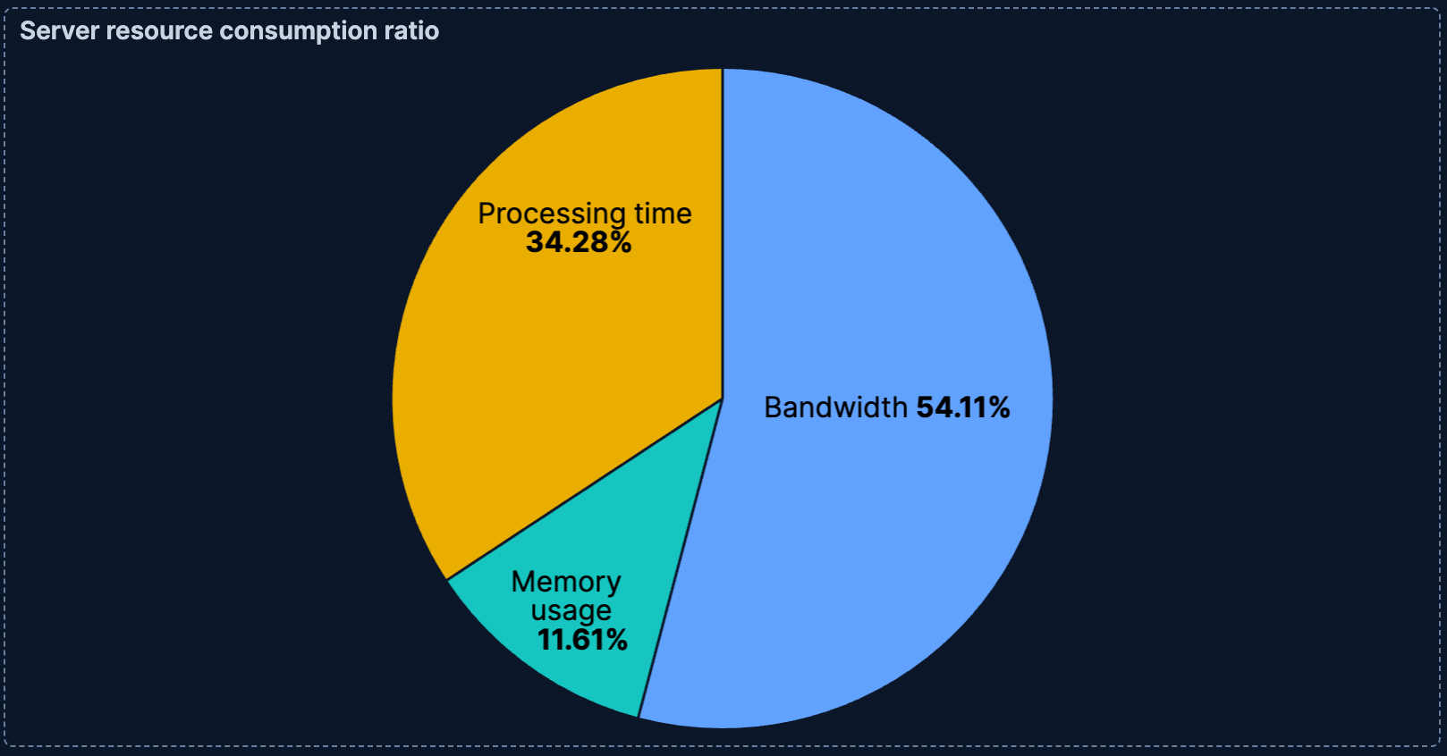
This example demonstrates the core value of multiple metrics: comparing different numeric fields that represent distinct concepts. Unlike Slice by, which splits a single metric by category values, multiple metrics lets you place fundamentally different measurements side by side.
The Kibana sample data sets don't include multiple comparable numeric fields. To try this scenario, adapt the field names to match your own data.
When you have many categories with small values, you can group them into an "Other" category to simplify the visualization.
- In the Slice by configuration, select the field.
- Use Top values to limit the number of slices displayed.
- Expand Advanced.
- Enable Group other values as "Other" to combine remaining values into a single slice.
Be careful when using "Other", as it could end up being the largest category, which might obscure the meaning of your chart. Consider whether a bar chart might be more appropriate for data with many categories.
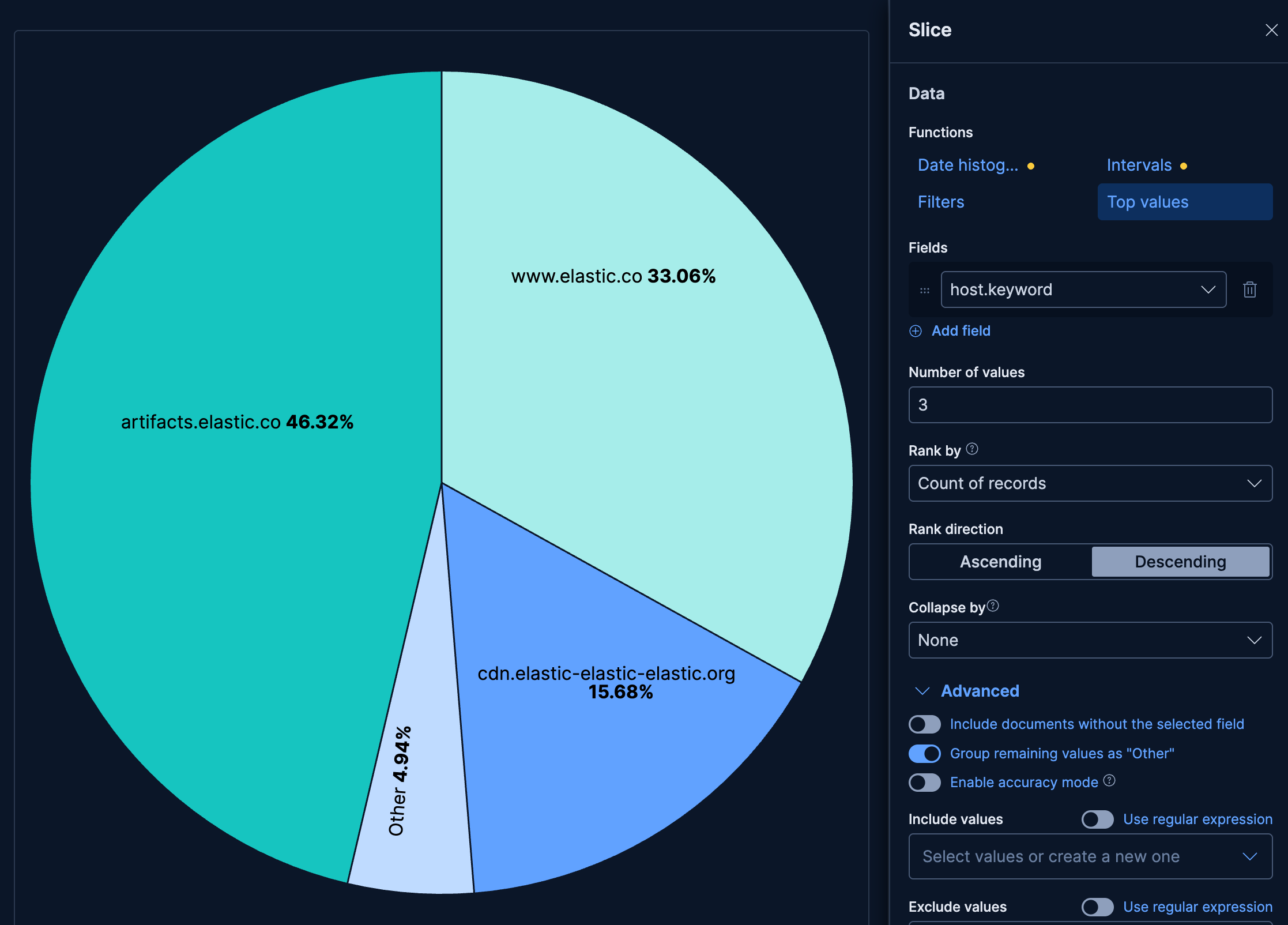
This example uses the Kibana Sample Data Logs data set. If you haven't installed it yet, refer to Sample data for instructions.
- Create a Pie chart using the Kibana Sample Data Logs data view.
- In the Slice by dimension, select
host.keywordwith Top values set to 3. - Expand Advanced and make sure that the Group other values as "Other" option is active.
- Set the Metric to the Count function.
The resulting chart shows the 3 most common hosts, with all remaining hosts combined into a single "Other" slice. This keeps the chart readable while still accounting for the full data set.
Customize your pie chart to display exactly the information you need, formatted the way you want.
The Slice by dimension defines how your pie is divided into segments. You can add up to 3 levels of slicing to create hierarchical visualizations.
- Data
-
The Slice by dimension supports the following functions:
Top values: Create slices for the most common values in a field. Configure the number of values to display, ranking criteria, and sort direction.
- Number of values: How many top values to display.
- Rank by: Specifies the dimension the top values are ranked by. Available options:
- Count of records: Rank by the number of documents containing each value. This is the default when a metric is defined.
- Alphabetical: Rank by the term key alphabetically. This is the default when no metric is defined.
- Rarity: Find terms that appear in very few documents, using a rare terms aggregation. You can configure the Max doc count to set the maximum number of documents a term can appear in to be considered rare (default: 1, max: 100). Only available for non-numeric fields and single-field terms.
- Significance: Find statistically unusual terms compared to the overall data set, using a significant terms aggregation. Only available for
keywordfields and single-field terms. - Custom: Define a custom metric aggregation to rank by (for example, rank by the sum of a numeric field rather than by count).
- Rank direction: Ascending or descending order. Disabled when Rank by is set to Rarity or Significance.
- Collapse by: Aggregate values into a single number using
Sum,Average,Min, orMax.
Advanced settingsSeveral advanced options allow you to refine the behavior of the breakdown:
- Include documents without the selected field: Off by default.
- Group remaining values as "Other": On by default.
- Enable accuracy mode: This option improves results for high-cardinality data, but increases the load on the Elasticsearch cluster.
- Include values: Values from the breakdown dimension to always show a tile for.
- Exclude values: Values from the breakdown dimension to always exclude from the displayed tiles.
Date histogram: Group data into time-based buckets (useful for showing time-based composition). Configure the time interval and how to handle date formatting.
Include empty rows: This option is on by default. Turn it off to exclude empty rows from the data.
Bind to global time picker: Associate the selected field to the Lens or dashboard main time selector.
Minimum interval: Define the time interval for aggregating the data. For example,
30s,20m,24h,2d,1w,1MDrop partial intervals: Exclude incomplete intervals from the data. This option is off by default.
- Collapse by: Aggregate values into a single number using
Sum,Average,Min, orMax.
Intervals: Create numeric ranges for continuous data. Useful for grouping numeric fields into buckets. You can define the interval granularity or specify custom ranges.
- Include empty rows: Include intervals with no matching documents. On by default.
- Collapse by: Aggregate values into a single number using
Sum,Average,Min, orMax.
How does interval granularity work?Interval granularity divides the field into evenly spaced intervals based on the minimum and maximum values for the field.
The size of the interval is a "nice" value. When the granularity of the slider changes, the interval stays the same when the "nice" interval is the same. The minimum granularity is 1, and the maximum value is histogram:maxBars. To change the maximum granularity, go to Advanced settings.
Intervals are incremented by 10, 5 or 2. For example, an interval can be
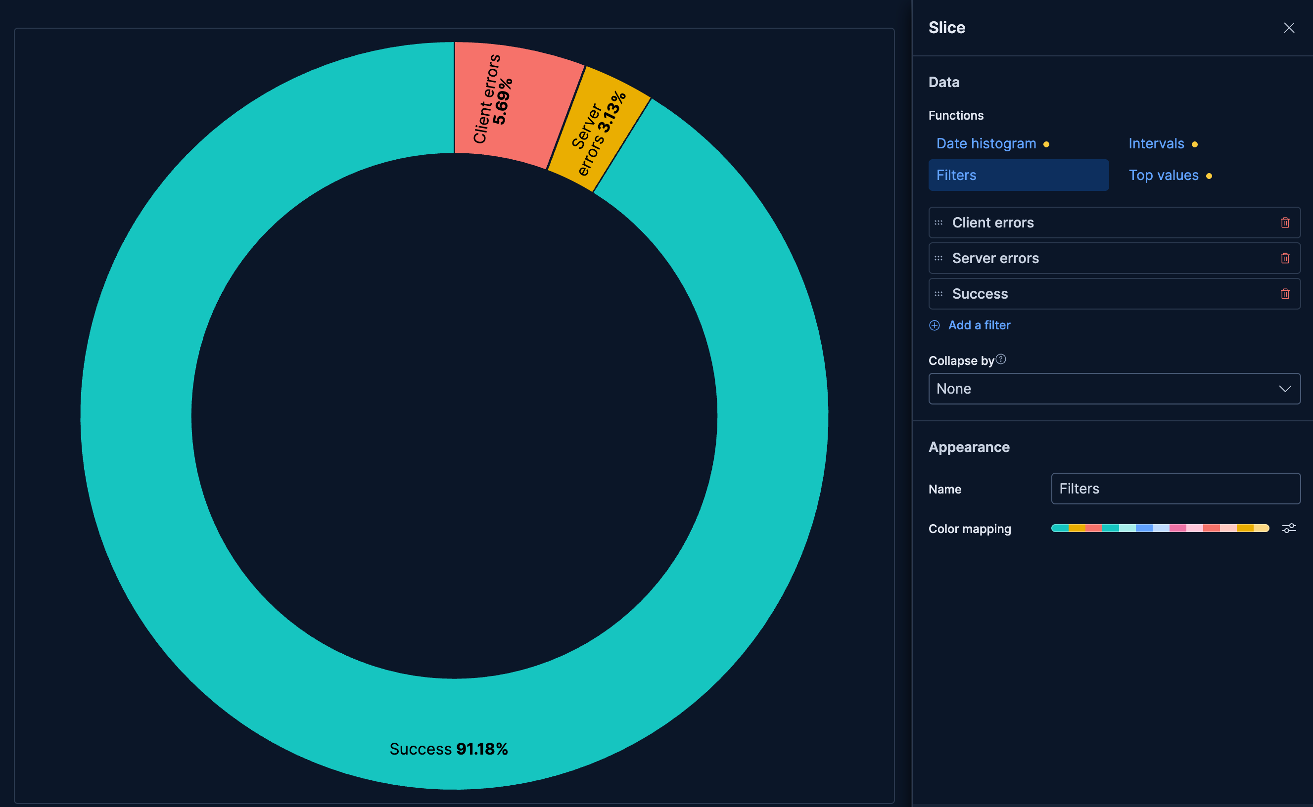
100or0.2.Filters: Define custom KQL filters to create specific slices. Each filter creates one slice in the chart.
- Collapse by: Aggregate values into a single number using
Sum,Average,Min, orMax.
- Collapse by: Aggregate values into a single number using
- Appearance
-
Configure slice-level options:
- Name: Customize the legend label.
- Color mapping: Select a color palette or assign specific colors to categories. Refer to Assign colors to terms for details.
The Metric dimension defines the size of each slice.
- Data
-
The main value that appears prominently in your chart. When you drag a field onto the chart, Kibana suggests a function based on the field type. You can change it and use aggregation functions like
Sum,Average,Count,Median, and more, or create custom calculations with formulas. Refer to Lens > Use formulas to perform math for examples, or to the Formula reference available from Lens.Advanced settingsDepending on the data you defined, several options allow you to apply additional filtering to the data taken into account to compute the final value to show.
Based on the type of visualization you're creating, only some of the following options can be available:
- Normalize by unit: Normalize the metric values to show per unit of time.
- Filter by: Specify a query.
- Reduced time range: Reduce the time range specified on the dashboard's time filter by the specified duration.
- Time shift: Shift the time range by the specified duration. This is useful if the value should use a different time range than the one selected on the dashboard.
- Hide zero values: Don't show values equal to zero. This option is on by default.
- Appearance
-
- Name: Customize the metric label displayed in tooltips and legends.
- Value format: Control how numeric values are displayed (number, percent, bytes, and more).
- Series color: When using multiple metrics without a Slice by dimension, assign a specific color to each metric.
When creating or editing a visualization, you can customize several appearance options from the
Style or Legend menus.
Appearance
- Donut hole
-
Transform your pie chart into a donut by adding a center hole:
- None: Standard pie chart with no hole (default).
- Small: Small center hole.
- Medium: Medium center hole.
- Large: Large center hole for emphasis or to display additional information.
Titles and text
- Slice labels
-
Control how labels appear on the slices:
- Hide: Do not display labels on slices.
- Inside: Display labels inside the slices.
- Auto: Automatically position labels for optimal readability (default).
- Slice values
-
Control what values appear on the slices (when labels are visible):
- Hide: Do not display values.
- Integer: Display the raw numeric value.
- Percentage: Display the percentage of the total.
When displaying percentages, you can also configure the Decimal places (0-10) for precision.
Configure elements of your pie chart's legend:
- Visibility
-
Specify whether to automatically show the legend or hide it:
- Auto: Show the legend when there are multiple slices (default).
- Show: Always show the legend.
- Hide: Never show the legend.
- Nested
- When using multiple Slice by dimensions, enable this option to show the legend in a hierarchical format that reflects the slice hierarchy.
- Statistics
- Show the Value statistic in the legend to display the numeric value alongside each legend entry.
- Label truncation
- Choose whether to truncate long legend labels, and set a limit for how many lines to display.
- Width
- Set the width of the legend.
The following examples show various configuration options for building impactful pie charts.
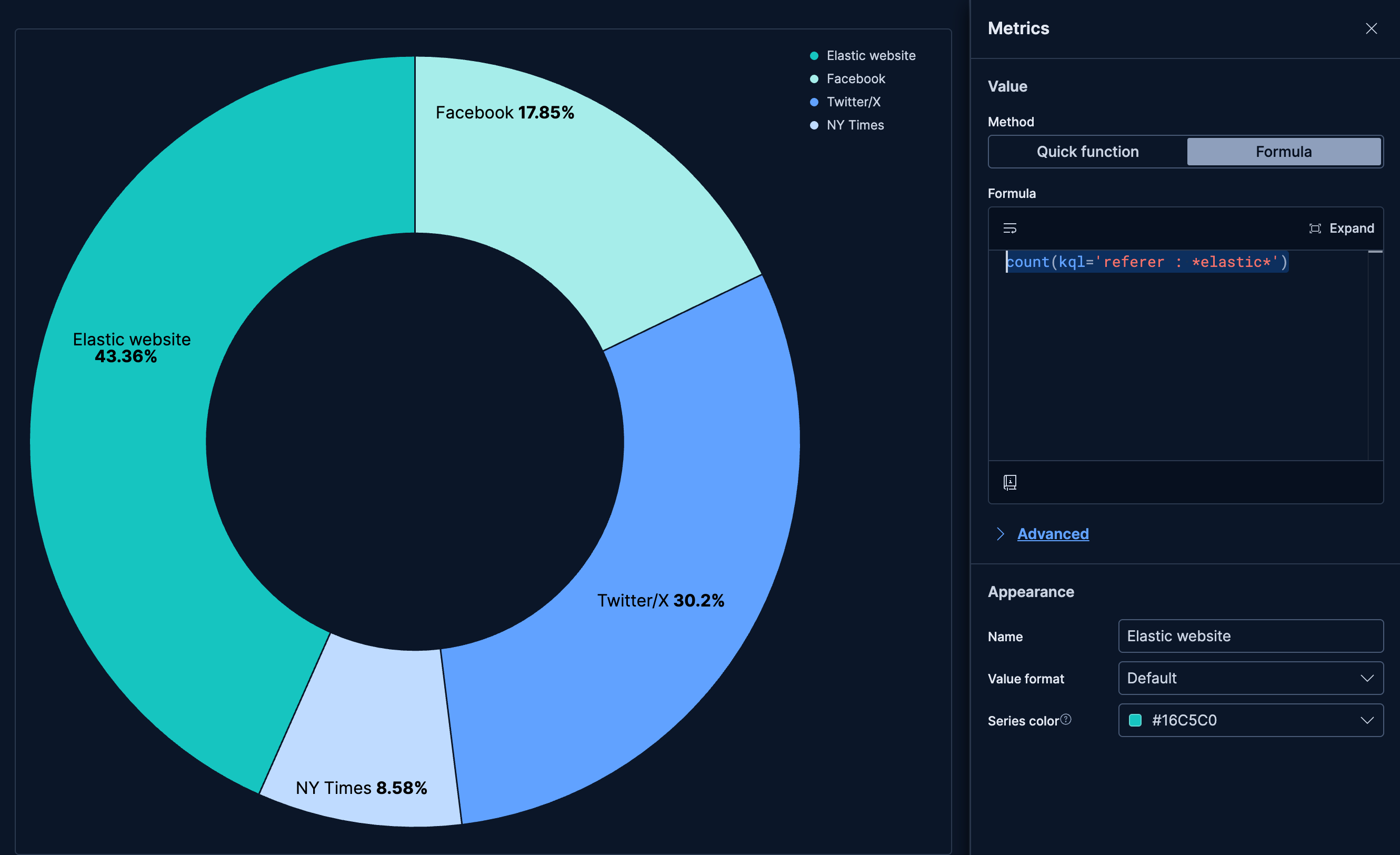
- Website traffic by source
-
Visualize the distribution of traffic sources to your website:
- Example based on: Kibana Sample Data Logs
- Configuration: Multiple metrics
- Metrics: 4 metrics based on formulas
count(kql='referer : *elastic*'), named "Elastic website"count(kql='referer : *twitter*'), named "Twitter/X"count(kql='referer : *facebook*'), named "Facebook"count(kql='referer : *nytimes*'), named "NY Times"
- Style: Donut with medium hole
- Legend: Show
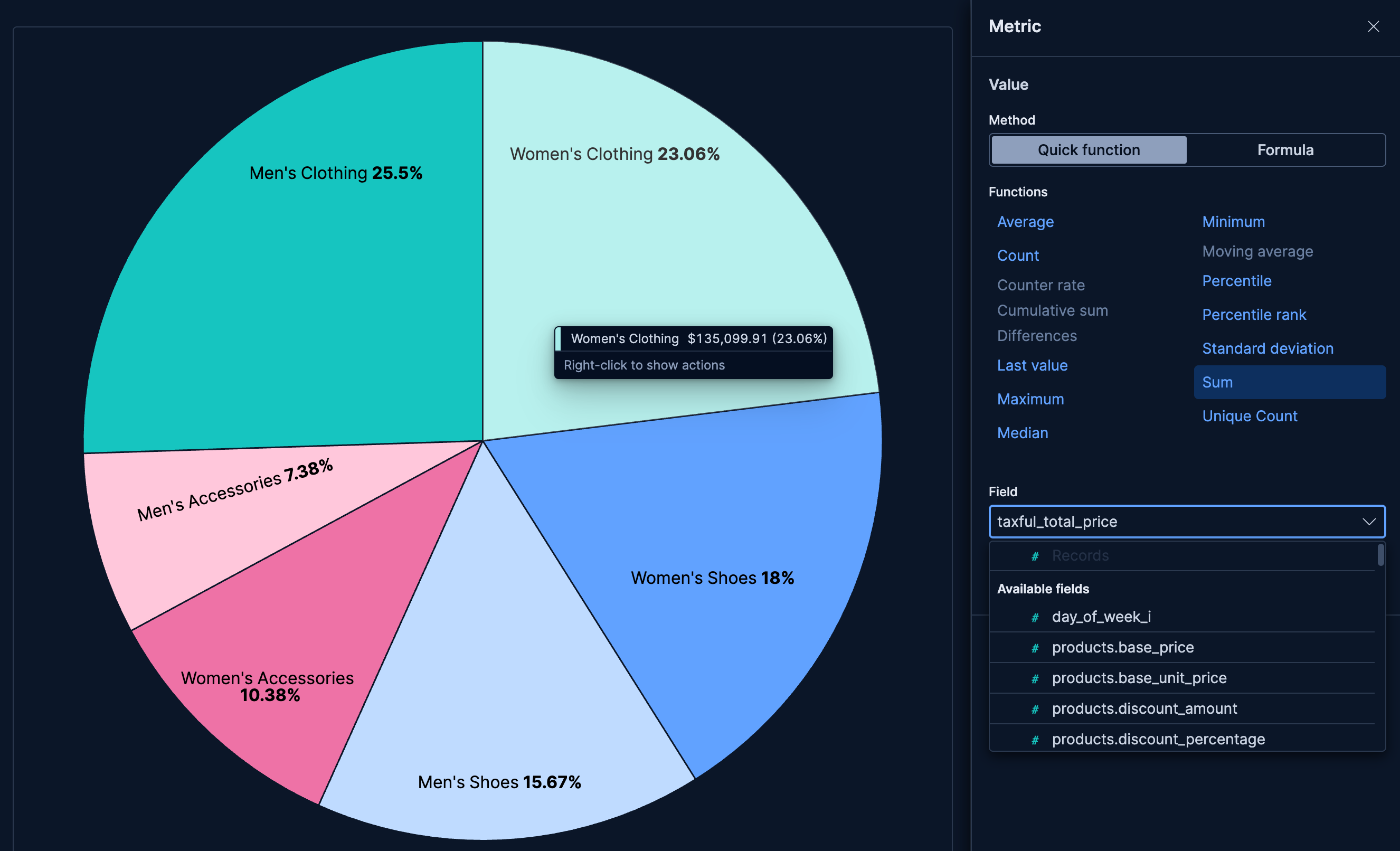
- Revenue distribution by product category
-
Show how revenue is distributed across product categories:
- Example based on: Kibana Sample Data eCommerce
- Slice by:
category.keyword(Top values, 6) - Metric: Sum of
taxful_total_price - Style: Pie (no donut hole)
- Error distribution by type
-
Display the proportion of different error types in your application:
- Example based on: Kibana Sample Data Logs
- Slice by:
error.typeusing Filters:- "Client Error":
response.keyword >= "400" AND response.keyword < "500" - "Server Error":
response.keyword >= "500" - "Success":
response.keyword >= "200" AND response.keyword < "400"
- "Client Error":
- Metric:
Count of records - Style: Donut with large hole
- Color mapping: Red for client errors, yellow for server errors, green for success
