Lens visualizations
Lens is Kibana's visualization editor for building charts, tables, maps, and metrics. It supports two modes for creating visualizations:
- Point-and-click: Configure your visualization interactively by selecting fields from a data view, choosing aggregations, and setting dimensions and display options. No query writing required. Data views are created automatically when you upload a file or add sample data; otherwise, you need to create one manually.
- Query: Write an ES|QL or PromQL query to retrieve and transform your data, then configure the visualization on top of the result. Best suited for cross-index queries, complex filtering, and custom calculations. Refer to ES|QL visualizations for details.
A skill is available to help AI agents with this topic.
With Lens, you can create the following visualization types:
| Chart type | Use when you want to... |
|---|---|
| XY charts | Plot data on axes to reveal trends, comparisons, and distributions. |
| Bar | Compare values across discrete categories or show distributions with histogram buckets. |
| Line | Show how a metric changes over time or another continuous dimension. |
| Area | Show change over time while emphasizing volume or stacked proportions. |
| Partition charts | Divide a total into segments to show how parts relate to the whole. |
| Pie | Show how parts make up a whole with a small number of slices. |
| Treemap | Show hierarchical proportions across nested categories. |
| Waffle | Show part-to-whole as a grid of equal cells where filled cells represent proportion. |
| Mosaic | Compare part-to-whole across two categorical dimensions in a tiled layout. |
| Single value charts | Highlight a key number, KPI, or progress toward a goal. |
| Metric | Highlight a single KPI or a small set of critical numbers. |
| Gauge | Show progress toward a target or status against thresholds for a single metric. |
| More charts | Additional visualizations for tabular data, spatial patterns, and text analysis. |
| Table | Present precise values, rankings, or multi-metric details in a compact layout. |
| Heat map | Reveal density or patterns across two dimensions using color intensity. |
| Tag cloud | Highlight the most frequent or important terms in a dataset. |
| Region map | Show how values vary across geographic regions (choropleth). |
You can create and manage Lens visualizations programmatically using the Visualizations API (stateful, serverless). This is useful for managing visualizations as code, automating their lifecycle, or building tooling around Lens charts.
Visualizations created through this API can be added to dashboards using the Kibana UI or the Dashboards API.
The Visualizations API is in technical preview and may change in future releases.
If you’re unsure about the visualization type you want to use, or how you want to display the data, drag the fields you want to visualize onto the workspace, then let Lens choose for you.
If you already know the visualization type you want to use, and how you want to display the data, use the following process.
-
Choose the visualization type
New visualizations generally default to Bar or Line charts. You can change that manually to the visualization type that you want.
As you drag fields into the workspace or to the layer pane, Lens automatically generates alternative visualizations. To view them, click Suggestions at the bottom of the workspace. If a suggested visualization meets your needs, click Save and return to add it to the dashboard.
-
Choose the data you want to visualize
As you drag fields to the layer pane, Lens automatically selects an aggregation function, for example Date histogram, Intervals, or Top values. Click a field to learn more about its data or to edit its appearance.
-
Customize the appearance of your visualization
In the Lens editor, use the Style and
 Legend controls in the layer pane to customize your visualization. The available controls vary by chart type. For all settings, open the dedicated page for your chart from the visualization type table.
 -
(Optional) Add layers
You can add multiple layers to a visualization, such as Visualization, Annotations, or Reference lines. Click the Add layer icon , then choose the layer type and select the data view. To duplicate or delete a layer, click
 on the layer tab.
 -
Save and add the panel
- If you accessed Lens from a dashboard, select Save and return to save the visualization and add it to that dashboard, or select Save to library to add the visualization to the Visualize library and reuse it later.
- If you accessed Lens from the Visualize library, select Save. A menu opens and lets you add the visualization to a dashboard and to the Visualize library.
Once you have created your visualization, you can edit it directly on the dashboard. Click the Edit visualization configuration icon  on the panel.
When you can create a visualization, you can change the fields list to display a different data view, a different time range, or add your own fields. To do that, open the data view dropdown and select Add a field to this data view.
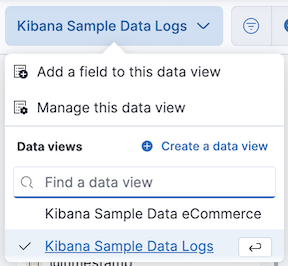
If the fields list is empty, change the time filter.
For more information about adding fields to data views and examples, refer to Explore your data with runtime fields.
You can assign specific colors to terms in your visualizations. This color mapping can be useful in several situations:
- Visual recognition and recall: Keep colors consistent for each term regardless of filters or sorting.
- Semantic meaning: Use colors to convey meaning or categorization.
- Consistency: Align with brand colors and improve overall aesthetic consistency.
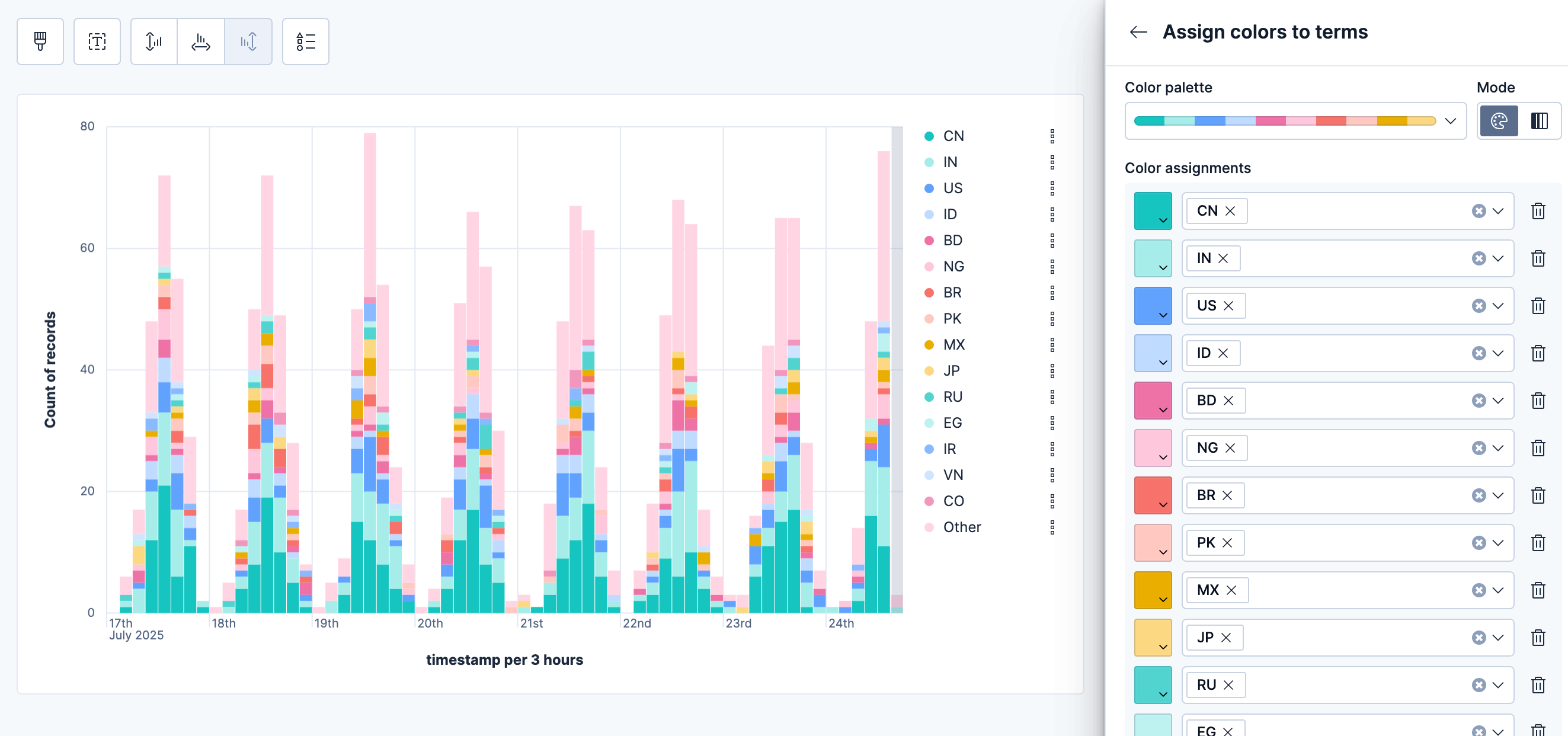
Color mapping is available for the following Lens visualization types:
- Data tables: Assign colors to terms in Rows or Metrics fields. You can apply colors to cell backgrounds or text.
- XY charts (Area, Bar, Line): Assign colors to breakdown dimensions that split your data into multiple series.
- Partition charts (Donut, Pie, Treemap, Waffle): Assign colors to the main slice or group-by dimension that defines the chart segments.
- Tag clouds: Assign colors to the tags dimension that determines the terms displayed in the cloud.
To assign colors to terms in your visualization:
- Create a visualization using one of the supported types.
- Add a categorical field that contains the terms you want to color.
- In the field configuration, look for the Color by value option:
- For data tables: Select Cell or Text
- For other chart types: This option appears when you have a categorical breakdown
- Click the Edit colors icon. In the menu that opens, keep Use legacy palettes turned off to be able to assign colors to specific terms
- Select a color palette from the available options:
- Elastic: The default and most recent palette. It is intentionally built from a color spectrum designed for flexibility and consistency, while being suited for future accessibility improvements.
-
Elastic (line optimized): A variant of the Elastic palette that reorders colors for better contrast between adjacent series in line charts. Lens automatically applies this palette when you create or switch to a line chart. Switching to a different chart type reverts to the standard palette. You can override this by manually selecting a different palette. -
Severity: A theme-aware categorical palette designed for severity-based data, with colors that adapt to both light and dark themes. - Kibana 7.0: A palette that matches the Kibana 7.0 color theme for visualizations
- Kibana 4.0: A palette that matches the Kibana 4.0 color theme for visualizations
- Elastic classic: A palette made of classic Elastic brand colors
- Select the color mode you'd like to use with this palette:
- Categorical: Assign a distinct color to each term
- Gradient: Assign gradients of the same color to each term
- Choose which terms to color. You can assign colors manually or select Add all unassigned terms for automatic assignment.
Tip
You can assign several terms to the same color.
- Choose how to handle unassigned terms: Use the selected color palette or assign a single color.
Discrete colors and gradients
Choose from discrete color sets or generate sequential or divergent gradients. Gradients work well for Likert scales and other term scales.
Theme-aware neutral colors
Use neutral gray colors that adjust automatically between light and dark themes. These help de-emphasize less important data.
Accessibility warnings
The system warns you when colors don't have enough contrast for accessibility.
Maintain consistency
Use color mapping to create consistent color schemes when the same categorical data appears across multiple visualizations in your dashboards.
Use semantic colors
Leverage color associations that users already understand (such as red for errors, green for success) to make your visualizations more intuitive.
Consider performance
Color mapping works best with fields that have a reasonable number of distinct values. Fields with hundreds or thousands of unique terms may impact visualization performance.
Plan for themes
When choosing colors, consider how they appear in both light and dark themes. Use theme-aware neutral colors when you want to de-emphasize data.
To use a keyboard instead of a mouse, use the Lens fully accessible and continuously improved drag system.
Select the field in the fields list or layer pane. Most fields have an inner and outer select state. The inner state opens a panel with detailed information or options. The outer state allows you to drag the field. Tab through the fields until you get the outer state on the field.

Complete the following actions:
To select a field, press Space bar.
To select where you want to drop the field, use the Left and Right arrows.
To reorder the fields on the layer pane, use the Up and Down arrows.
To duplicate an action, use the Left and Right arrows, then select the Drop a field or click to add field you want to use.
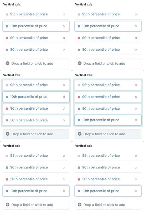
To confirm the action, press Space bar. To cancel, press Esc.
Lens formulas let you do math using a combination of Elasticsearch aggregations and math functions. For example, you can use formulas to divide two values and produce a percent value.
When you add a categorical field to your visualization, select the field to open its appearance settings, choose Formula, and set Appearance > Value format to Percent for a more accurate display.
For more details on how it works, click the Formula reference icon  on the Formula panel.
These are examples of common formulas:
- Filter ratio
-
To filter a document set, use
kql='', then compare to other documents within the same grouping:count(kql='response.status_code > 400') / count() - Week over week
-
To get the value for each grouping from the previous week, use
shift='1w'.percentile(system.network.in.bytes, percentile=99) / percentile(system.network.in.bytes, percentile=99, shift='1w')You are unable to combine different time shifts, such as
count(shift="1w") - count()andcount(shift="1w") - count(shift="1m"), with the Top values function. - Percent of total
-
To convert each grouping into a percent of the total, formulas calculate
overall_sumfor all groupings:sum(products.base_price) / overall_sum(sum(products.base_price))
Compare your real-time data to the results that are offset by a time increment. For example, you can compare the real-time percentage of a user CPU time spent to the results offset by one hour.
- In the layer pane, click the field you want to offset.
- Click Advanced.
- In the Time shift field, enter the time offset increment.
For a time shift example, refer to Compare time ranges.
To create partition charts, such as pie charts, configure one or more Slice by dimensions to define the partitions, and a Metric dimension to define the size. To create partition charts with multiple metrics, use the layer settings. Multiple metrics are unsupported for mosaic visualizations.
For detailed instructions on creating pie charts, including best practices and configuration options, refer to Build pie charts with Kibana.
- In the layer pane, click
 , then select Settings/Layer settings.
 - Select Multiple metrics.
- Click X.
Data sampling allows you to improve the visualization loading time. When you create your visualization, click the Settings/Layer settings icon and use the slider to adjust the Sampling percentage. For example, on large datasets, you can decrease loading time by using a lower sampling percentage. This increases performance but reduces accuracy.
Annotations allow you to call out specific points in your visualizations that are important, such as significant changes in the data. You can add annotations for any data view, add text and icons, specify the line format and color, and more. Click the Add layer icon , select Annotations and select the annotation method you want to use:
New annotation
- Select the data view for the annotation.
- From the fields list, drag a field to the Horizontal axis field.
To use global filters in the annotation, click the Settings/Layer settings icon on the annotations layer, and select Use global filters.
From the annotation panel, you can choose the type of placement and adjust the its appearance.
- Placement
-
- Static date — Displays annotations for specific times or time ranges. To create static annotations:
- Select Static date.
- In the Annotation date field, click
 , then select the date.
 - To display the annotation as a time range, select Apply as range, then specify the From and To dates.
- Custom query — Displays annotations based on custom Elasticsearch queries. For information about queries, check Semi-structured search. To create custom query annotations:
- Select Custom query.
- Enter the Annotation query for the data you want to display. For detailed information about queries and examples, check Semi-structured search.
- Select the Target date field.
- Static date — Displays annotations for specific times or time ranges. To create static annotations:
- Appearance
-
Configure the annotation settings, including:
- Name: Enter the name of the annotation.
- Icon decoration: Choose from various icon styles to represent your annotations on the visualization. Options include markers like circles, triangles, squares, and other symbols.
- Text decoration: Set the style for the text labels of your annotations.
- Line: Control the width/thickness of annotation lines.
- Color: Set a custom color for your annotation markers.
- Hide annotation: Temporarily hide annotations from your visualization without deleting them.
Tooltip : Add a field to the annotation tooltip
- If you created a custom query annotation, click Add field to add a field to the annotation tooltip.
Once you are done, you can add your new annotation layer to the Visualize Library so that it can be reused in other visualizations. Note that any changes made to the annotation group is reflected in all visualizations to which it is added.
Load from library
Add a library annotation group to a visualization.
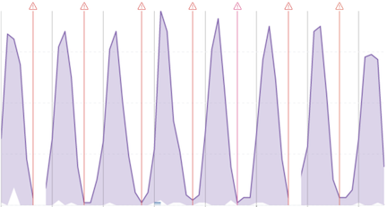
With reference lines, you can identify specific values in your visualizations with icons, colors, and other display options. You can add reference lines to any visualization type that displays axes.
For example, to track the number of bytes in the 75th percentile, add a shaded Percentile reference line to your time series visualization.
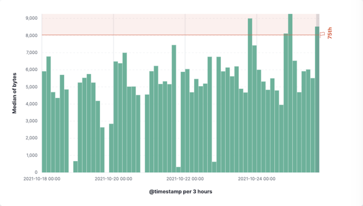
From your visualization, click Add layer > Reference lines. Click the vertical axis value, and specify the reference line you want to use by choosing one fhe following placement methods:
- Static
- To add a static reference line.
- Quick functions
- To add a dynamic reference line.
- Formula
- To calculate the reference line value with math.
You can also customize the display by adjusting the Appearance settings.
You can use the query bar to create queries that filter all the data in a visualization, or use the layer pane and legend filters to apply filters based on field values.
With the Filters function, you can apply more than one KQL filter, and apply a KQL filter to a single layer so you can visualize filtered and unfiltered data at the same time.
In the layer pane, click a field.
Click the Filters function.
Click Add a filter, then enter the KQL filter you want to apply.
To try the Filters function on your own, refer to Compare a subset of documents to all documents.
With the Filter by advanced option, you can assign a color to each filter group in Bar and Line and area visualizations, and build complex tables. For example, to display failure rate and the overall data.
- In the layer pane, click a field.
- Click Add advanced options, then select Filter by.
- Enter the KQL filter you want to apply.
Apply filters to visualizations directly from the values in the legend. Bar, Line and area, and Proportion visualizations support legend filters.
In the legend, click the field, then choose one of the following options:
- Filter for value — Applies a filter that displays only the field data in the visualization.
- Filter out value — Applies a filter that removes the field data from the visualization.
You can interact with filter pills to edit them, temporarily alter their behavior without having to remove them, or make them available in other contexts. The following options are available when selecting a filter pill:
- Pin across all apps and Unpin
-
Adds this filter to available dashboards and to apps such as Discover, Lens, Maps, and Visualize. You remove the filter if you:
- Unpin it. In this case, the filter only remains on the currently open app, unpinned.
- Remove it from any place while it's still pinned.
- Refresh your session, for example by opening a dashboard in a new tab. Pinned filters are not saved along with the dashboard, visualization, or Discover session that you added them to.
TipWhen a pinned filter can't be applied, for example if a field specified in the filter doesn't exist in the current data view, the filter is ignored and shows in a different color.
- Edit filter
- Lets you edit and update the filter.
- Exclude results and Include results
- Reverses the filter behavior.
- Temporarily disable and Re-enable
- Lets you temporarily deactivate a filter instead of requiring you to remove it. This is particularly useful for testing different filter combinations.
- Delete
- Removes the filter.
You can perform most of these actions at once for all filters in your current view using the Query menu. From that menu, select Apply to all, then choose the action you'd like to perform.
When your visualization includes one data view, you can open and explore the visualization data in Discover.
To get started, click Explore data in Discover in the toolbar.
For more information about exploring your data with Discover, check out Discover.
To view the data included in the visualization and the requests that collected the data, use the Inspector.
In the toolbar, click Inspect.
Open the View dropdown, then click Data.
- From the dropdown, select the table that contains the data you want to view.
- To download the data, click Download CSV, then select the format type.
Open the View dropdown, then click Requests.
- From the dropdown, select the requests you want to view.
- To view the requests in Console, click Request, then click Open in Console.
For answers to common Lens questions, review the following.
When should I normalize the data by unit or use a custom interval?
- Normalize by unit — Calculates the average for the interval. When you normalize the data by unit, the data appears less granular, but Lens is able to calculate the data faster.
- Customize time interval — Creates a bucket for each interval. When you customize the time interval, you can use a large time range, but Lens calculates the data slower.
To normalize the interval:
- In the layer pane, click a field.
- Click Add advanced options > Normalize by unit.
- From the Normalize by unit dropdown, select an option, then click Close.
To create a custom interval:
- In the layer pane, click a field.
- Select Customize time interval.
- Change the Minimum interval, then click Close.
What data is categorized as Other?
The Other category contains all of the documents that do not match the specified criteria or filters. Use Other when you want to compare a value, or multiple values, to a whole.
By default, Group other values as "Other" is enabled when you use the Top values function.
To disable Group other values as "Other", click a field in the layer pane, click Advanced, then deselect Group other values as "Other".
How do I add documents without a field?
By default, Lens retrieves only the documents from the fields. For bucket aggregations, such as Top values, you can add documents that do not contain the fields, which is helpful when you want to make a comparison to the whole documentation set.
- In the layer pane, click a field.
- Click Advanced, then select Include documents without this field.
When do I use runtime fields vs. formula?
Use runtime fields to format, concatenate, and extract document-level fields. Runtime fields work across all of Kibana and are best used for smaller computations without compromising performance.
Use formulas to compare multiple Elasticsearch aggregations that can be filtered or shifted in time. Formulas apply only to Lens panels and are computationally intensive.
Can I add more than one y-axis scale?
For each y-axis, you can select Left and Right, and configure a different scale.
Why is my value the incorrect color when I use value-based coloring?
Here’s a short list of few different aspects to check:
Make sure the value falls within the desired color stop value defined in the panel. Color stop values are "inclusive".
Make sure you have the correct value precision setup. Value formatters could round the numeric values up or down.
Make sure the correct color continuity option is selected. If the number is below the first color stop value, a continuity of type
BeloworAbove and below rangeis required.The default values set by the Value type are based on the current data range displayed in the data table.
- If a custom
Numberconfiguration is used, check that the color stop values are covering the current data range. - If a
Percentconfiguration is used, and the data range changes, the colors displayed are affected.
- If a custom
How do I sort by multiple columns?
Multiple column sorting is unsupported, but is supported in Discover. For information on how to sort multiple columns in Discover, refer to Explore the fields in your data.
Why is my field missing from the fields list?
The following field types do not appear in the Available fields list:
- Full-text
- geo_point
- flattened
- object
Verify if the field appears in the Empty fields list. Lens uses heuristics to determine if the fields contain values. For sparse data sets, the heuristics are less precise.
What do I do with gaps in time series visualizations?
When you create Area and Line charts with sparse time series data, open Visual options in the editor toolbar, then select a Missing values option.
Can I statically define the y-axis scale?
You can set the scale, or bounds, for area, bar, and line charts. You can configure the bounds for all functions, except Percentile. Logarithmic scales are unsupported.
To configure the bounds, use the menus in the editor toolbar. Bar and area charts required 0 in the scale between Lower bound and Upper bound.
Is it possible to display icons in data tables?
You can display icons with field formatters in data tables.
How do I inspect Elasticsearch queries in visualizations?
You can inspect the requests sent by the visualization to Elasticsearch using the Inspector. It can be accessed within the editor or in the dashboard.
How do I isolate a single series in a chart?
For area, line, and bar charts, press Shift, then click the series in the legend. All other series are automatically deselected.
How do I visualize saved Discover sessions?
Visualizing saved Discover sessions is unsupported.
How do I change the number of suggestions?
Configuring the Suggestions is unsupported.
Is it possible to have pagination in a data table?
Pagination in a data table is unsupported. To use pagination in data tables, create an aggregation-based data table.
How do I change the color for a single data point?
Specifying the color for a single data point, such as a single bar or line, is unsupported.
How does dynamic coloring work for the metric visualization?
In the color palette editor, if you select Value type: Number the colors are applied based on the Primary metric value.
The Primary metric refers to the large number displayed in each tile.
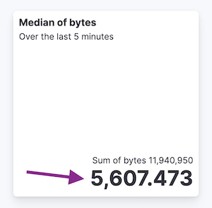
If you select Value type: Percent, the primary metric values are mapped to a range between 0 and 100 percent. The bounds of the range depend on your configuration.
The logic is as follows. If there is a Breakdown dimension for multiple visualization tiles:
- When there is a Maximum dimension, the range is from zero to the value of your Maximum dimension.
- When there is no Maximum dimension, the range is from the smallest primary metric values to the greatest primary metric values.
If there is no Breakdown dimension for a single visualization tile:
- When there is a Maximum dimension, the range is from zero to the value of your Maximum dimension.
- When there is no Maximum dimension, Value type: Percent cannot be selected because there’s no way to determine a range.