Service Map
A service map is a real-time visual representation of the instrumented services in your application’s architecture. It shows you how these services are connected, along with high-level metrics like average transaction duration, requests per minute, and errors per minute. If enabled, service maps also integrate with machine learning—displaying real-time anomaly indicators based on anomaly detection scores. All of these features can help you quickly and visually assess your services’ status.
We currently surface two types of service maps:
- Global: All services instrumented with APM agents and the connections between them are shown.
- Service-specific: Highlight connections for a selected service.
Service Maps rely on distributed traces to draw connections between services. As distributed tracing is enabled out-of-the-box for supported technologies, so are service maps. However, if a service isn’t instrumented, or a traceparent header isn’t being propagated to it, distributed tracing will not work, and the connection will not be drawn on the map.
Select the Service Map tab to get started. By default, all instrumented services and connections are shown. Whether you’re onboarding a new engineer, or just trying to grasp the big picture, drag services around, zoom in and out, and begin to visualize how your services are connected.
Customize what the service map displays using either the query bar or the environment selector. The query bar enables you to use advanced queries to customize the service map based on your needs. The environment selector allows you to narrow displayed results to a specific environment. This can be useful if you have two or more services, in separate environments, but with the same name. Use the environment drop-down to only see the data you’re interested in, like dev or production.
If you’re using EDOT or contrib OpenTelemetry, set the deployment.environment resource attribute on your instrumented services. This attribute maps to the service.environment field that populates the environment selector. Without it, services appear under an "unset" environment, meaning you can’t distinguish between production, staging, or other environments using the selector. Refer to Attributes and labels for configuration examples.
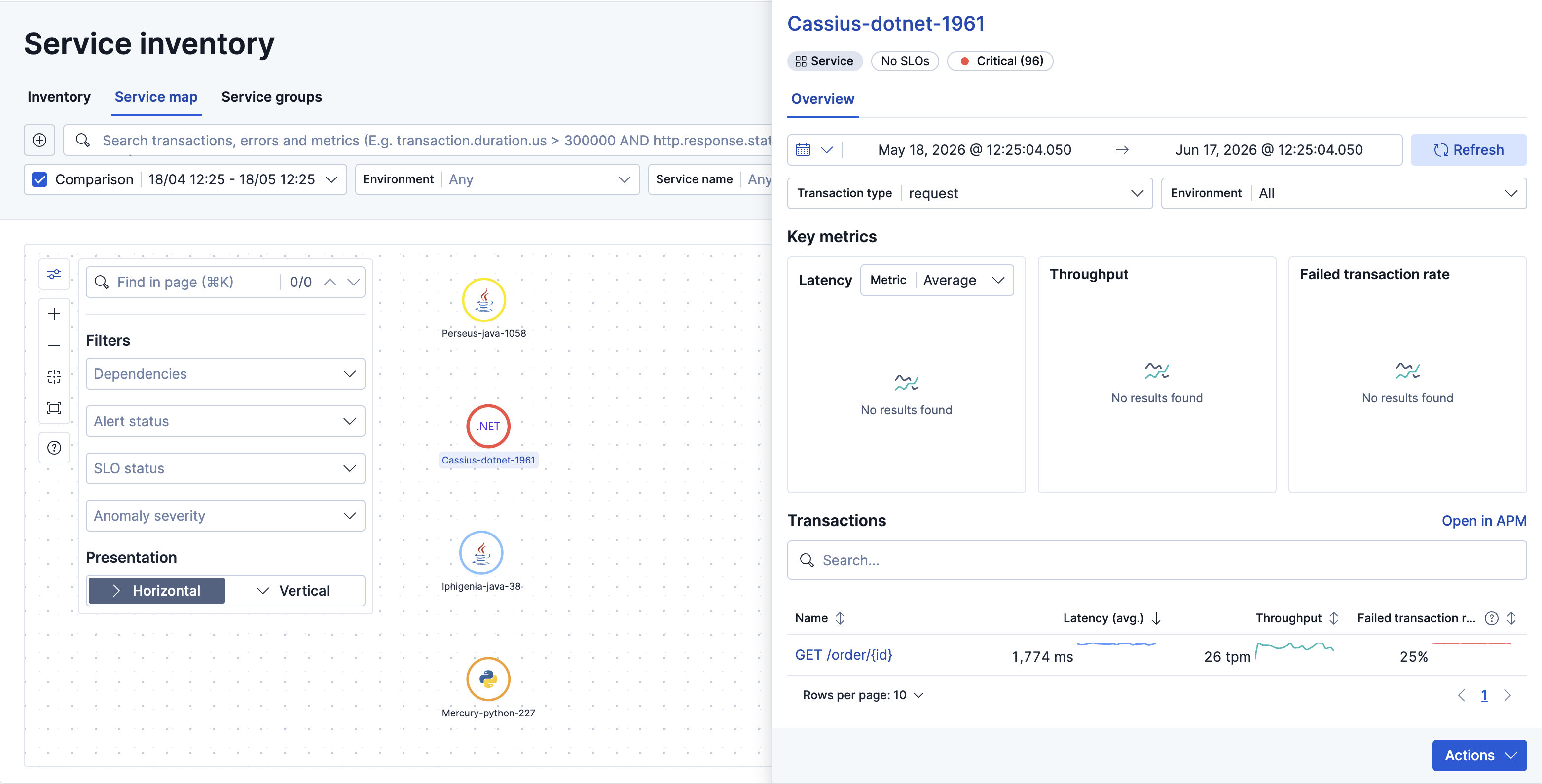
If there’s a specific service that interests you, select that service to highlight its connections. Click Focus map to refocus the map on the selected service and lock the connection highlighting. Click the Transactions tab to jump to the Transaction overview for the selected service. You can also use the tabs at the top of the page to easily jump to the Errors or Metrics overview.
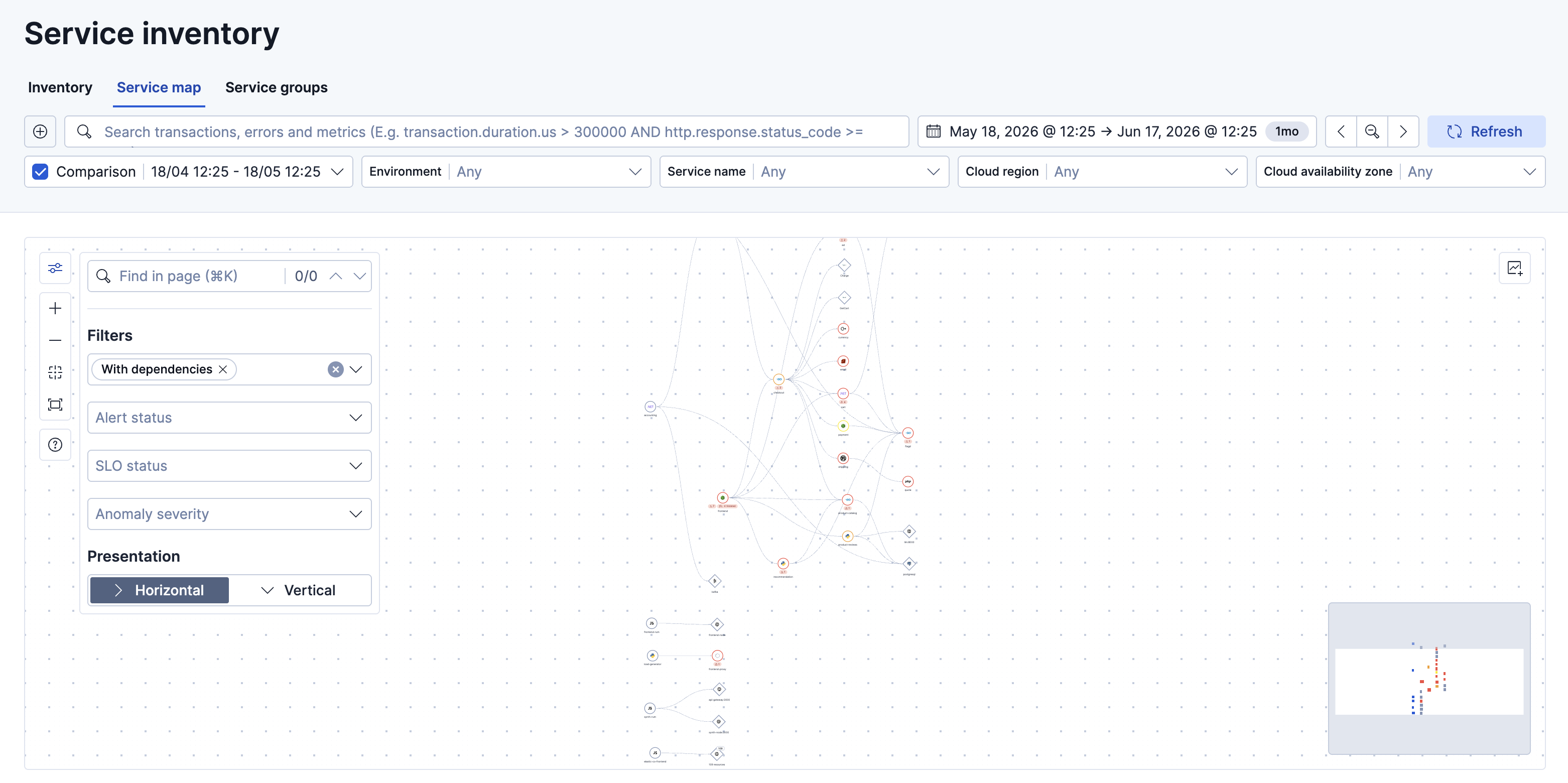
Use the map controls to adjust the layout, filter what’s displayed, and navigate large maps:
- Presentation: Switch between Horizontal and Vertical layout to best fit your architecture.
- Find in page: Search for a specific service by name to locate and highlight it on the map.
- Filters: Use the Dependencies, Alert status, SLO status, and Anomaly severity drop-downs to focus the map on specific services.
To save the current service map view to a Kibana dashboard, click the Copy to dashboard icon located in the upper-right corner of the map.
When you click an instrumented service node (circle shape), a service flyout panel opens with a summary of the service’s RED metrics and infrastructure usage. Use the footer menu to open traces, logs, alerts, or SLOs for the service without leaving the map. Dependency nodes (diamond shape) and connections still use a compact popover.
You can create machine learning jobs to calculate anomaly scores on APM transaction durations within the selected service. When these jobs are active, service maps display a color-coded anomaly indicator on each service node based on the detected anomaly score.
 |
Max anomaly score ≤25. Service is healthy. |
 |
Max anomaly score 26-74. Anomalous activity detected. Service might be degraded. |
 |
Max anomaly score ≥75. Anomalous activity detected. Service is unhealthy. |
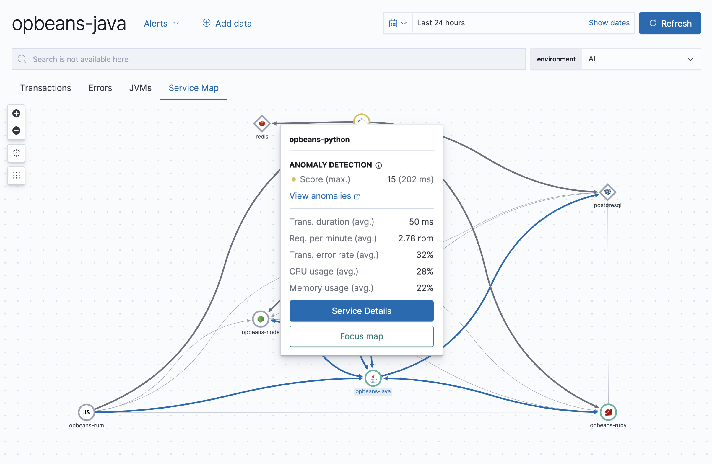
If an anomaly has been detected, click View anomalies to view the anomaly detection metric viewer. This time series analysis displays additional details on the severity and time of the detected anomalies.
To learn how to create a machine learning job, refer to Integrate with machine learning.
An interactive legend is available directly on the map. Click the (Legend) button to expand it and see an explanation of node shapes, connections, and anomaly score colors.
Nodes appear on the map in one of three shapes:
- Circle: Instrumented services. Interior icons are based on the language of the APM agent used.
- Diamond: Databases, external, and messaging. Interior icons represent the generic type, with specific icons for known entities, like Elasticsearch. Type and subtype are based on
span.type, andspan.subtype. - Grouped resources: Groups of related external resources or dependencies, such as those sharing a namespace or label.
Connections between nodes represent observed communication between services based on distributed trace data:
- One-way: Traffic flows in a single direction between services. The arrow indicates the direction of the request.
- Two-way: Traffic flows in both directions between services.
When anomaly detection is enabled, node borders are color-coded based on the maximum anomaly score detected for that service:
| Score range | Severity | Node color |
|---|---|---|
| No score | No anomaly data available | Gray |
| 0–3 | Low | White |
| 3–25 | Warning | Blue |
| 25–50 | Minor | Yellow |
| 50–75 | Major | Orange |
| 75–100 | Critical | Red |
Service Maps are supported for the following APM agent versions:
| Go agent | ≥ v1.7.0 |
| Java agent | ≥ v1.13.0 |
| .NET agent | ≥ v1.3.0 |
| Node.js agent | ≥ v3.6.0 |
| PHP agent | ≥ v1.2.0 |
| Python agent | ≥ v5.5.0 |
| Ruby agent | ≥ v3.6.0 |
| Real User Monitoring (RUM) agent (Elastic Stack only) | ≥ v4.7.0 |