AIOps Labs
AIOps Labs is a part of Machine Learning in Kibana. It provides features that use advanced statistical methods to help you interpret your data and its behavior, so you can quickly identify the causes behind unusual changes without manually digging through the data.
Each AIOps tool includes a date picker to control the time range for your analysis. Click Zoom in or Zoom out next to the date picker to quickly narrow or widen the time range.
Log rate analysis uses advanced statistical methods to identify reasons for increases or decreases in log rates and displays the statistically significant data in a tabular format. It helps you find and investigate causes of unusual spikes or drops through the analysis workflow view. You can examine the histogram chart of the log rates for a given data view and find the reason behind a particular change possibly in millions of log events across multiple fields and values.
You can find log rate analysis embedded in multiple apps. In Kibana, you can find it under Machine Learning → AIOps Labs or by using the global search field. Here, you can select the data view or saved Discover session that you want to analyze.
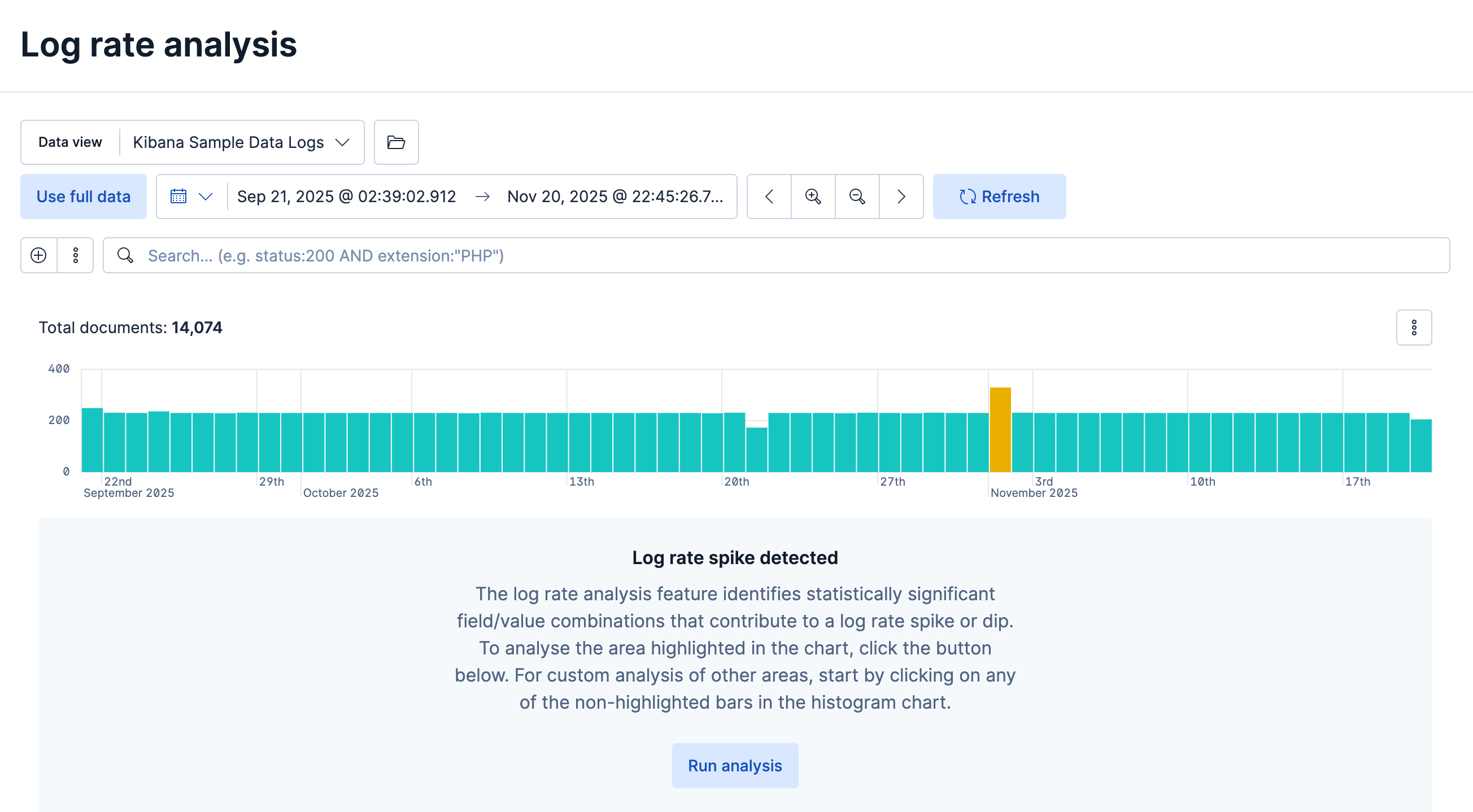
To start the analysis, select a spike or drop in the log event histogram chart. It identifies statistically significant field-value combinations that contribute to the spike or drop and displays them in a table, along with an indicator of the level of impact and a sparkline showing its shape. When you hover over a row, it displays the impact on the histogram chart in more detail.
From the Actions column, you can:
- Inspect a field in Discover
- Further investigate in Log pattern analysis
- Copy the table row information as a query filter to the clipboard
You can also click a table row to pin it, then move the cursor to the histogram chart. It displays a tooltip with exact count values for the pinned field, which enables closer investigation.
Brushes in the chart show the baseline time range and the deviation in the analyzed data. You can move the brushes to redefine both the baseline and the deviation and rerun the analysis with the modified values.
Log pattern analysis helps you to find patterns in unstructured log messages and makes it easier to examine your data. It performs categorization analysis on a selected field of a data view, creates categories based on the data, and displays them together with a chart showing the distribution of each category and an example document that matches it.
You can find log pattern analysis under Machine Learning → AIOps Labs or by using the global search field. Here, you can select the data view or saved Discover session that you want to analyze. You can also access it from Discover as an available action for any text field.
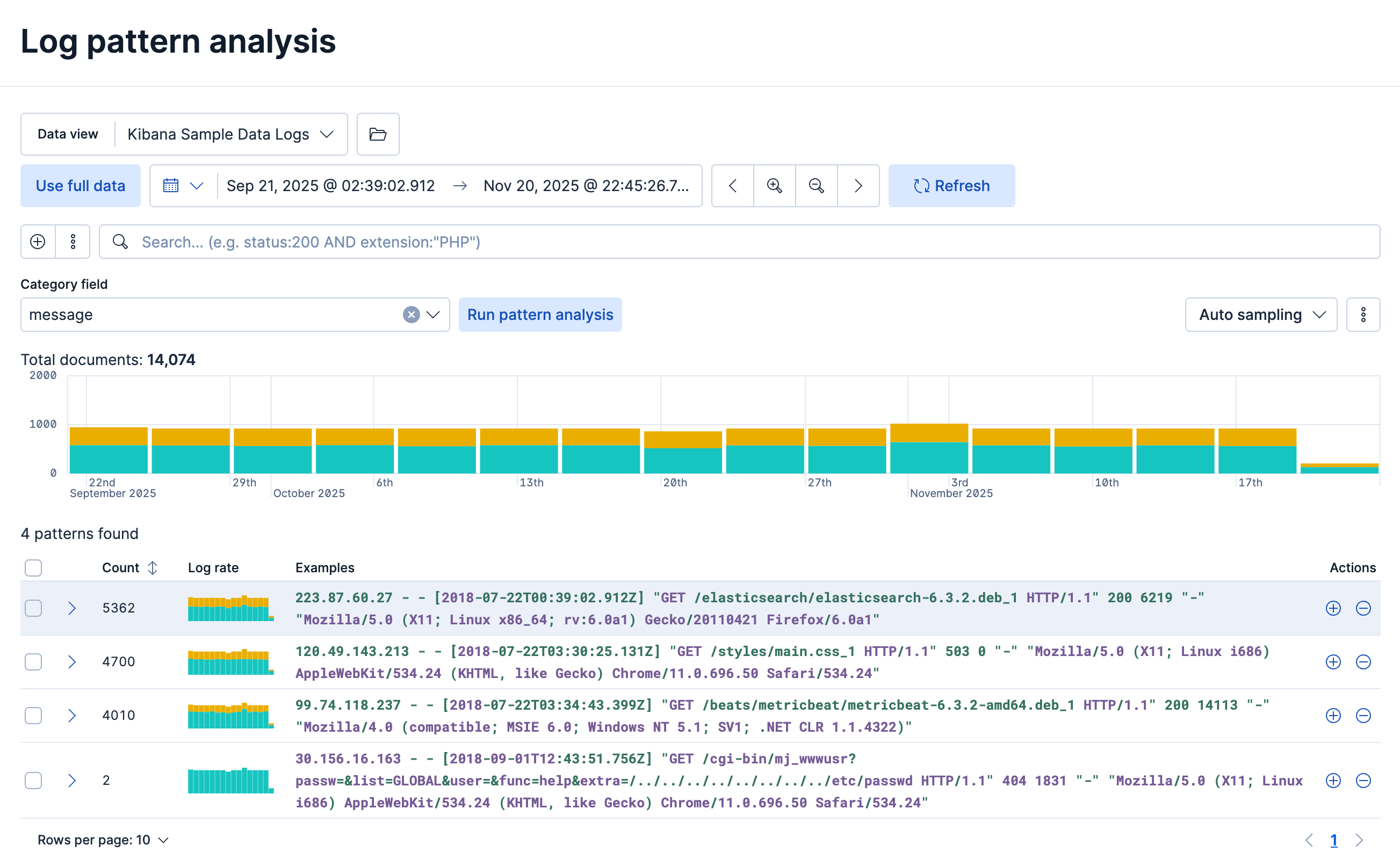
You select a field for categorization, optionally apply filters, then start the analysis, which uses the same algorithms as a machine learning categorization job. The table shows the analysis results and lets you open Discover to show or filter out the given category, which helps you further examine your log messages.
Change point detection uses the change point aggregation to detect distribution changes, trend changes, and other statistically significant change points in a metric of your time series data.
To detect change points with an ES|QL query and investigate them in Discover, refer to Detect change points in Discover. The workflow on this page uses the AIOps Labs interface.
You can find change point detection under Machine Learning → AIOps Labs or by using the global search field. Here, you can select the data view or saved Discover session that you want to analyze.
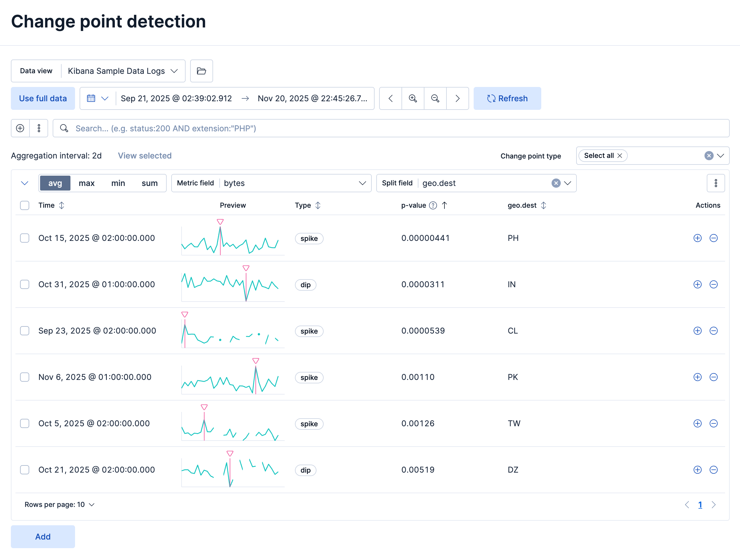
You choose a function and a metric field, and a date range, to detect change points within that range. Optionally, you can split the data by a field. If the cardinality of the split field exceeds 10,000, then only the first 10,000, sorted by document count, are analyzed. You can configure a maximum of six combinations of a function applied to a metric field, partitioned by a split field, to identify change points.
When a change point is detected, a row displays basic information including the timestamp, a preview chart, the type, its p-value, and the name and value of the split field. You can use the change point type selector to filter the results by specific types of change points.
You can further examine a selected change point in a detailed view. A chart visualizes it within the analyzed time window, which helps you interpret it. If the analysis is split by a field, Kibana shows a separate chart for every partition with a detected change point. Each chart displays the type of change point, its value, and the timestamp of the bucket where it's detected. The corresponding p-value indicates the magnitude of the change. Lower values indicate more significant changes.
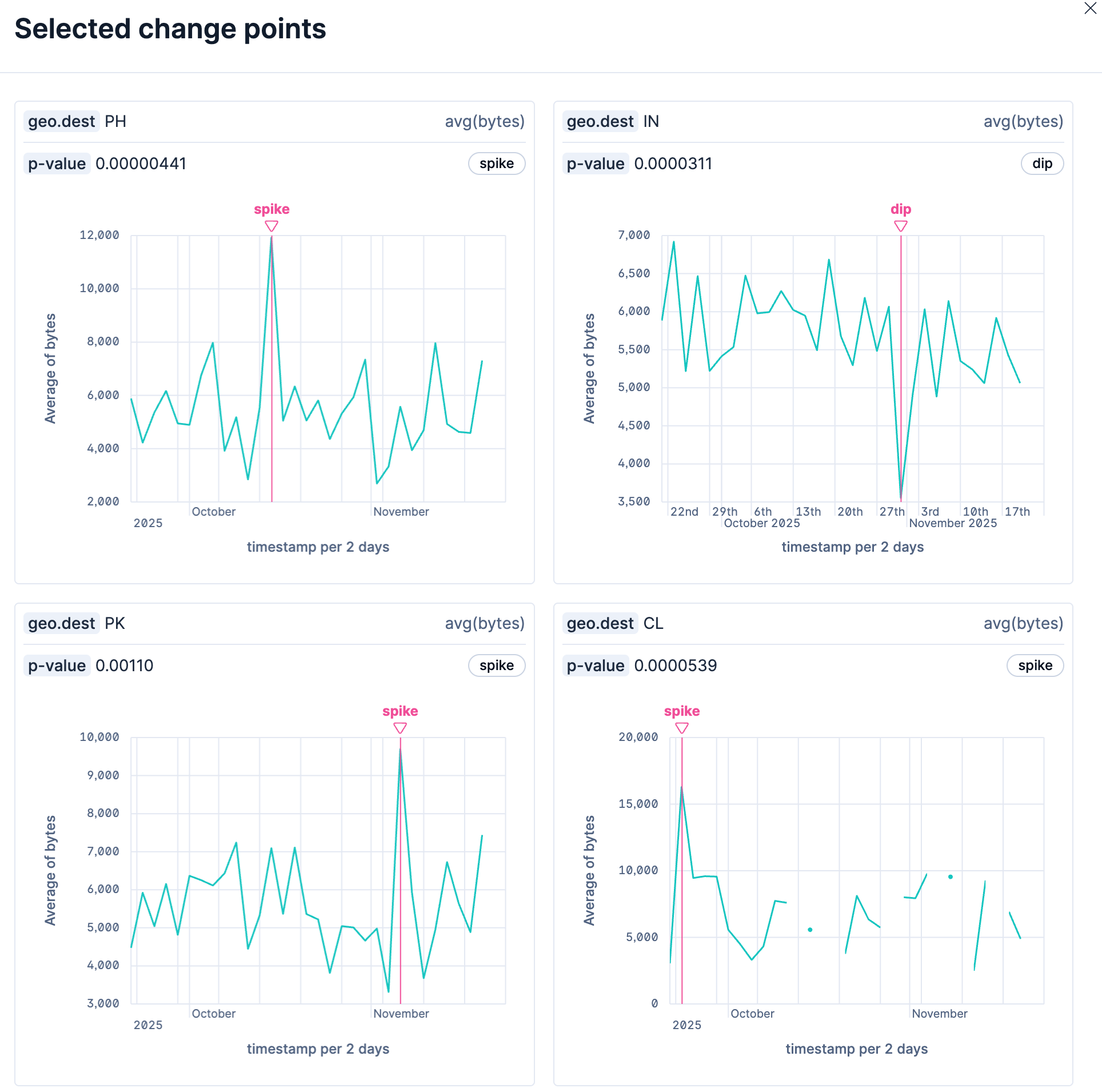
You can attach change point charts to a dashboard or a case from the context menu. If the split field is selected, you can either select specific charts (partitions) or set the maximum number of top change points to plot. You can preserve the applied time range or use the time bound from the page date picker. You can also add or edit change point charts directly from the Dashboard app.